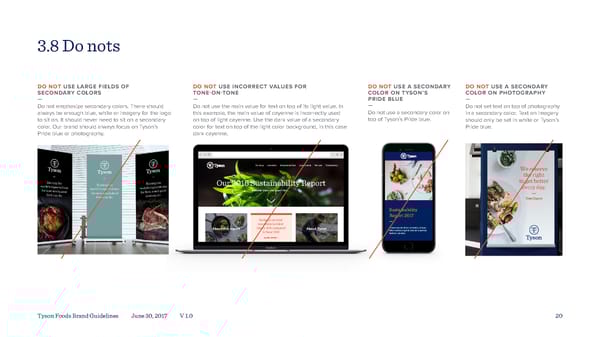
3.8 Do nots DO NOT USE LARGE FIELDS OF DO NOT USE INCORRECT VALUES FOR DO NOT USE A SECONDARY DO NOT USE A SECONDARY SECONDARY COLORS TONE-ON-TONE COLOR ON TYSON’S COLOR ON PHOTOGRAPHY — — PRIDE BLUE — Do not emphasize secondary colors. There should Do not use the main value for text on top of its light value. In — Do not set text on top of photography always be enough blue, white or imagery for the logo this example, the main value of cayenne is incorrectly used Do not use a secondary color on in a secondary color. Text on imagery to sit on. It should never need to sit on a secondary on top of light cayenne. Use the dark value of a secondary top of Tyson’s Pride blue. should only be set in white or Tyson’s color. Our brand should always focus on Tyson’s color for text on top of the light color background, in this case Pride blue. Pride blue or photography. dark cayenne. Our story Innovation Responsible food Loved brands We care Transparency Our 2016 Sustainability Report Subhead about the report here Sustainability Report 2017 Reduced our total — recordable incident About this report rate by 12% compared About Tyson Lorem ipsum dolor sit amet, consec- to fiscal 2013 tetur adipiscing elit, sed do eiusmod tempor pariatur. LEARN MORE > Workforce and culture Lorem ipsum dolor sit amet consectetuer adipiscin elit sed diam nonummy nib euismod tincidunt LEARN MORE > Tyson Foods Brand Guidelines June 30, 2017 V 1.0 More than 91 chaplains 20 provide compassionate Anial ellbein Responsibility pastoral care to team members and their amiles LEARN MORE > ie sustainability Marketplace report archive Environent SiT AR E > Home | Site Map | Privacy Policy | Terms of Use | Leal | ontact Us Copyright © 2017 Tyson Foods, Inc. Trademarks and registered trademarks are owned by Tyson Foods, Inc. or its subsidiaries
 Tyson Foods Brand Book Page 19 Page 21