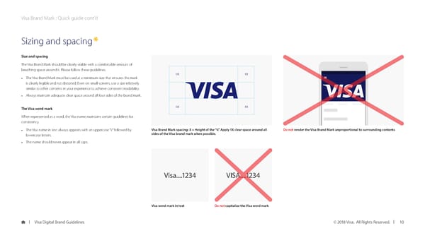
Visa Brand Mark : Quick guide cont’d Sizing and spacing* Size and spacing The Visa Brand Mark should be clearly visible with a comfortable amount of breathing space around it. Please follow these guidelines. 1X 1X • The Visa Brand Mark must be used at a minimum size that ensures the mark is clearly legible and not distorted. Even on small screens, use a size relatively similar to other contents in your experience to achieve consistent readability. • Always maintain adequate clear space around all four sides of the brand mark. The Visa word mark 1X 1X When represented as a word, the Visa name maintains certain guidelines for consistency. • The Visa name in text always appears with an uppercase “V” followed by Visa Brand Mark spacing: X = Height of the “V.” Apply 1X clear space around all Do not render the Visa Brand Mark unproportional to surrounding contents lowercase letters. sides of the Visa brand mark when possible. • The name should never appear in all caps. Visa....1234 VISA....1234 Visa word mark in text Do not capitalize the Visa word mark Visa Digital Brand Guidelines © 2018 Visa. All Rights Reserved. 10
 Visa Brand Book Page 9 Page 11