New Balance Brand Book
New Balance Athletics, Inc., best known as simply New Balance, is one of the world's major sports footwear and apparel manufacturers.
#nb
#newbalance
brand book 2007

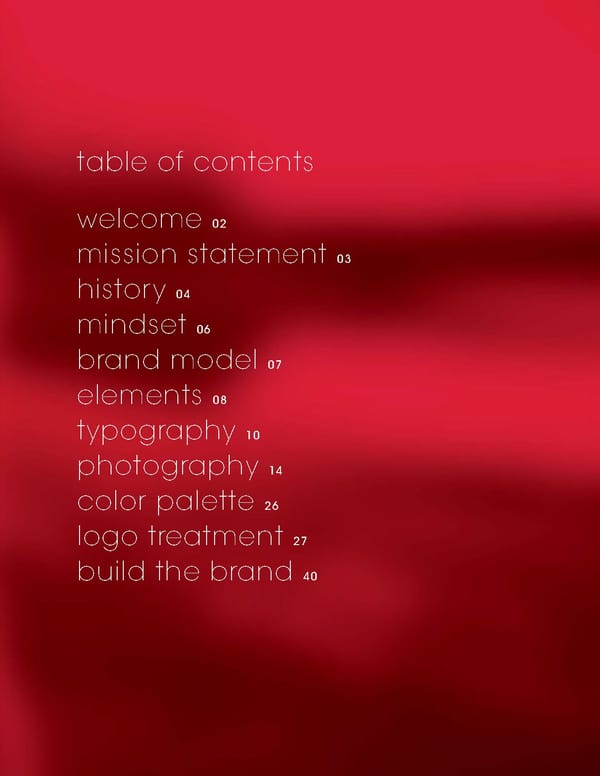
welcome 02 mission statement 03 history 04 mindset 06 brand model 07 elements 08 typography 10 photography 14 color palette 26 logo treatment 27 build the brand 40 table of contents
welcome Global Brand Guideline Contacts Marketing Services Manager Catherine Jakaitis catherine.jakaitis@newbalance.com 617-746-2233 Asia/Pacific Representative Qing Ni qing.ni@newbalance.com.hk Senior Graphic Designer Michael Hutto michael.hutto@newbalance.com 617-746-2402 Europe Representative Graham Dicken graham.dicken@newbalance.co.uk +44 1925 423000 Int’l Marketing Services Coordinator Angus Treloar angus.treloar@newbalance.com 617-779-7534 Latin America Representative Fernando Cano fernando.cano@newbalance.com (54-9-11) 5009 4715 page 02 This booklet's purpose is to explain and encourage all New Balance associates, partners and suppliers to participate in maintaining the New Balance Brand Identity as set out on the following pages. Key to the growth of the New Balance brand is its consistency in the marketplace, and the vital support of everyone involved in maintaining its presence on a daily basis. That said, the brand that endeavors to be everything to everyone inevitably ends up meaning nothing. Indeed, it’s this principle on which our company was founded. The true value and spirit of New Balance is found in the mindset of the athletes that wear our products and perform at their highest ability. There's a basic honesty to our products, they are built to perform and to improve performance, and we hope that through all our communications this message is reinforced.
new balance’s mission page 03 To be the world’s leading manufacturer of high performance athletic and active lifestyle products while operating in a socially responsible manner. Company Mission what do we do? create the best-fitting, most technologically innovative performance footwear and athletic apparel who are we talking to? people who are serious about their athletic activity what is the core benefit of new balance? better fit = better performance
new balance history 1906 William J. Riley founds New Balance (Arch Co.) in Boston, MA. Inspired by the balance created in the three claws of a chicken’s foot, Riley applies his observations to the design and development of orthopedic arch supports and footwear. He is committed to helping people with problem feet through improved shoe fit, finding early customers in “policemen and other folks who are on their feet all day.” 1950s /60s Business expands and by the early 1950s, New Balance is making specialized running shoes for local runners, including the MIT track team. In 1956, Paul and Eleanor Kidd purchase the company, manufacturing in their basement until 1962. The first New Balance production track shoe, 1961’s “Trackster,” is groundbreaking, unique in its width sizing and ripple tread. 1972 James (Jim) S. Davis purchases the company on Boston Marathon day. Through the 1970s, New Balance shoes emerge as the leader in running shoe technology. Tom Fleming wins the NY Marathon wearing 320s in 1975. The next year, 320s are the top pick by Runner’s World magazine. Over the next twenty years, New Balance grows to become a world leader in athletic performance footwear and apparel. 1998 New Balance acquires Dunham Bootmakers, and with it, outdoor footwear expertise dating back to 1885 when the Vermont-based Dunham brothers began selling their handcrafted boots to pioneers and outdoorsmen. More than a century of dedication and quality, durability and comfort earned Dunham a lasting reputation that has served as the foundation for the brand’s current line of premium outdoor performance, casual and work footwear for the active outdoor enthusiast. The story of New Balance begins at the dawn of the 20th century in Boston, Massachusetts, when William J. Riley, a 33-year-old English immigrant, committed himself to helping people with problem feet by making arch supports and prescription footwear to improve shoe fit.
page 1 2001 New Balance acquires PF Flyers, one of the most popular sneakers of the 50s and 60s. BFGoodrich developed the Posture Foundation insole (as a safe-guard against flat feet) in 1933 and created the PF Flyers brand in 1937. With a fashionable range of reissue and modern styles, New Balance takes the PF spirit of play, comfort and design to the next level. 2003 New Balance signs six licensees to help us enter and expand within key product arenas including: kid’s apparel, fitness equipment, eyewear, headwear, shoe and apparel care, and socks. 2004 New Balance launches Aravon comfort performance footwear. Presented in everyday, office and sandal collections, these casual shoes blend technologically advanced cushioning, stability and support with sophisticated style and craftsmanship. After joining forces in 2003 to create the world’s first lacrosse-specific footwear, New Balance acquires Warrior Lacrosse. Founded in 1993 by former lacrosse champion Dave Morrow, the company is a premier manufacturer of performance-oriented lacrosse products of youthful expression and unparalleled style. A seventh licensee signs on to develop sport bags for New Balance. 2005 New Balance welcomes two new licensees, one for shoelaces, one for outerwear. 2006 New Balance celebrates its Centennial year!
new balance mindset authentic / The people we cast, the locations we use, must be real . The models have to look like the people we share the running paths, base paths, foul lines and stair steppers with. Locations, likewise, must look like the places we workout in. human / The New Balance athlete is first and foremost a human being. Not a super-human pro athlete, not a super-perfect model. Human beings are imperfect and it is in their imperfections that true beauty lies. Beautiful bodies do not always come with beautiful faces. Human beings are not all alike. noble / There is nothing more noble in sports than the amateur athlete. We need to show this nobility. Through framing, casting and location we need to put the athlete in his or her rightful place. We must reflect the high-minded nature of sport. honest / There can be no room for lying or cheating in sport. No half truths or gray areas. We are rightfully proud of our products and our technologies, we are not trying to mislead our customers. Therefore, staged, posed and unnatural form should be avoided. It is more noble to express realism than the impossible or unrealistic. performance / New Balance delivers performance. Our design must reflect this. There must be a sense of action and purpose. The models must be engaged, and the style of the photography must reflect the high level at which these athletes perform. independent spirit / The New Balance athlete competes and exercises to challenge him/herself. Beyond an authentic and humanistic representation we must strive to represent his/her individuality – one mind, one goal, choosing his/her own path. authentic human noble honest performance independent spirit page 06
By using these six core brand truths to define the New Balance design vocabulary, all Brand Categories will carry clear and consistent messaging across all platforms. These words should guide design decisions while allowing for creative exploration. new balance brand model page 07 Attrib u tes Perso n ality Pro m ise So u rce of A u thority Genuine Authentic Sports Innovative Trusted Global Honest Genuine Balanced Creative Humble Independent Spirit Consistent Performance Socially Responsible Best Fit Quality Heritage Authentic Domestic Manufacture Fit Experts Privately Owned
page 08
authentic • human • noble • honest • performance • independent spirit By using these six core brand truths to define the New Balance design vocabulary, all Brand Categories will carry clear and consistent messaging across all platforms. These words should guide design decisions while allowing for creative exploration. design elements page 1 page 09 typography copy photography logo graphics
This font reflects all six of the brand truths. It has a true performance feel. Solex Black Italic is the only font in the Solex family that should be used. It should ALWAYS be used in ALL CAPS. The font should have tight kerning and leading and can be used in a variety of sizes. The font should be used in its true form with NO horizontal scaling. Solex Black Italic Headline and sub-headline font ONLY. typography / headline font S O L E X B L A C K I T A L I C A B C D E F G H I J K L M N O P Q R S T U V W X Y Z * 1 2 3 4 5 6 7 8 9 0 FONT NAME: HEADLINE CAPS: HEADLINE LOWERCASE: HEADLINE FONT WITH AVANT GARDE BODY COPY: T H E R E A R E T W O M O T I V A T I O N S I N S P O R T S , W H I C H I S Y O U R S ? T H E R E A R E T W O M O T I V A T I O N S I N S P O R T S , W H I C H I S Y O U R S ? Lorem ipsum dolor sit amet, consectetuer adipiscing elit. Phasellus a quam eget wisi faucibus consequat. In feugiat commodo quam. Duis varius imperdiet ante. Cras ac nulla. Aenean erat. Cras arcu pede, gravida sit amet, posuere in, aliquet ac, quam. Vivamus velit magna, fermentum eget, sodales bibendum, tempus et, arcu. Nullam rutrum bibendum pede. N O T A P P L I C A B L E page 10
This font has brand heritage. It connects directly to the New Balance brand. It is honest, human and easy to follow. Fonts should be used in their original form. NO horizontal scaling. There are several weights in the family to choose from. This guide has been created using just these recommended fonts. You ’ll notice as you review it that the core brand truths are reflected in its simple, legible and clean lines. typography / secondary font Avant Garde Family Secondary font to be used primarily for body copy and secondary headlines. FONT NAME: Avant Garde ABCDEFGHIJKLMNOPQRSTUVWXYZ abcdefghijklmnopqrstuvwxyz *1234567890 Avant Garde CONDENSED MEDIUM ABCDEFGHIJKLMNOPQRSTUVWXYZ abcdefghijklmnopqrstuvwxyz *1234567890 Avant Garde EXTRA LIGHT ABCDEFGHIJKLMNOPQRSTUVWXYZ abcdefghijklmnopqrstuvwxyz *1234567890 Avant Garde BOLD ABCDEFGHIJKLMNOPQRSTUVWXYZ abcdefghijklmnopqrstuvwxyz *1234567890 page 11
1 Avant Garde or Solex Black Italic headline in all caps with tight kerning. 2 Avant Garde sub-head in upper- and lowercase. 3 Avant Garde Light for call-outs (if only a few words). 4 Avant Garde Light for main body copy. 5 Avant Garde Light for legal copy at 6pt or larger. When combining all the fonts correctly, the information hierarchy created easily delineates copy importance. page 12 typography / do’s 1 2 3 4 5
These are font combinations that express what should NOT be done with the typography. 1 DON’T extend the kerning while using Solex Black Italic. DON’T use Solex Black Italic in upper- and lowercase in sub-heads. DON’T use any other form in the Solex family besides Solex Black Italic in any copy. 2 DON’T use Solex Black Italic in upper- and lowercase. DON’T use Solex Black Italic in body copy. 3 DON’T use Avant Garde in small caps or extend scaling. DON’T use all caps for body copy if more than a few words. 4 DON’T use Solex for sentences, copy longer than 15 words, or body copy. typography / don’ts page 13 D O N ’ T S P A C E I T O U T . L O R E M I P S U M D O L O R S I T A M E T , C O N S E C T E T U E R A D I P I S C I N G E L I T . P H A S E L L U S A Q U A M E G E T W I S I F A U C I B U S C O N S E Q U A T . I N F E U G I A T C O M M O D O Q U A M . D U I S V A R I U S I M P E R D I E T A N T E . C R A S A C N U L L A . A E N E A N E R A T . C R A S A R C U P E D E , G R A V I D A S I T A M E T , P O S U E R E I N , A L I Q U E T A C , Q U A M . V I V A M U S V E L I T M A G N A , F E R M E N T U M E G E T , S O D A L E S B I B E N D U M , T E M P U S E T , A R C U . N U L L A M R U T R U M B I B E N D U M P E D E . S U S P E N D I S S E L I G U L A S E M , U L T R I C I E S U T , M A L E S U A D A N O N , A C C U M S A N N O N , A N T E . DON’T STRETCH OR DISTORT. LOREM IPSUM DOLOR SIT AMET, CONSECTETUER ADIPISCING ELIT. PHASELLUS A QUAM EGET WISI FAUCIBUS CONSEQUAT. IN FEUGIAT COMMODO QUAM. DUIS VARIUS IMPERDIET ANTE. CRAS AC NULLA. AENEAN ERAT. CRAS ARCU PEDE, GRAVIDA SIT AMET, POSUERE IN, ALIQUET AC, QUAM. D O N ’ T u s e l o w e r c a s e . L O R E M I P S U M D O L O R S I T A M E T , C O N S E C T E T L I T . P H A S E L L U S A Q U A M E G E T W I S I F A U C I B U S C O N S E Q U A T . I N F E U G I A T C O M M O D O Q U A M . D U I S V A R I U S I M P E R D I E T A N T E . C R A S A C N U L L A . A E N E A N E R A T . C R A S A R C U P E D E , G R A V I D A S I T A M E T , P O S U E R E I N , A L I Q U E T A C , Q U A M . V I V A M U S V E L I T M A G N A , F E R M E N T U M E G E T , S O D A L E S B I B E N D U M , U L T R I C I E S U T , M A L E S U A D A N O N , A C C U M S A N N O N , A N T E . 1 2 3 D O N ' T U S E S O L E X F O R S E N T E N C E S O R C O P Y L O N G E R T H A N 1 5 W O R D S F O L L O W I N G T H E T I T L E . . . 4
page 14 achieve A. Portraits at the moment of achievement, rest, elation B. Achieving Personal Best C.Emotion in action – In the Moment take me there A. I want to be running, walking, [insert your activity here] there. performance A. Full body in motion B. Highlight footwear in motion on body C. Highlight apparel in motion on body product A. Catalog B. Co-op C. Beauty a. Detail b. In the environment (non-performance) c. In the studio All photography should fall into one of these four stylistic buckets: photography / what to look for
authentic • human • noble • honest • performance • independent spirit achieve A. Portraits at the moment of achievement, rest, elation B. Achieving Personal Best C. Emotion in action – In the Moment page 15 photography / achieve
page 16 authentic • human • noble • honest • performance • independent spirit take me there A. I want to be running, walking, [insert your activity here] there. photography / take me there
page 17 photography / performance authentic • human • noble • honest • performance • independent spirit performance A. Full body in motion B. Highlight footwear in motion on body C. Highlight apparel in motion on body
authentic • human • noble • honest • performance • independent spirit product A. Catalog B. Co-op C. Beauty a. Detail b. In the environment (non-performance) c. In the studio photography / product page 18
1 The athlete does not stand out from the environment (subject competes with surroundings). 2 When selecting a potential location, consider any possible distractions. Here the strong lines overpower the athlete. 3 This is a great example of an environment that is too busy. The lighting is poor, and angle and distance don’t emphasize the action. 4 The athlete appears to be unfocused and not actually doing an activity. The use of makeup is clearly visible - a more natural look is preferred. photography / don’ts 1 Can’t see product 2 Scene setup 3 Too busy 4 Too posed, over stylized page 19
Shooting product to use as hero photography Lighting should always be dramatic on both men’s and women’s hero shots. Avoid using lighting that flattens out an object. Women’s hero showcase photography should have a bright presentation, while men’s showcase photography should feel darker. photography / hero product showcase beauty shot / To specifically highlight the visual cushioning technologies in the heel. product photo / Depicts the shoe in action. Simulates the impact with the ground. page 20
Pick interesting angles to depict the shoe’s design and technology, and highlight its specific design features. Always clearly display the New Balance “N” logo on the shoe for brand recognition and reinforcement. Accurately show the shoe’s colors in all photography so that the customer can identify and locate it when shopping. static side view / Used to depict the shoe’s profile clearly. (eases in-store location for the customer) photography / hero product showcase side reveal / Shows both the design of the upper and sole of the shoe. Illustrates the technology you don’t see. page 21
photography / possibilities In certain circumstances it may be necessary to crop an image in a very unconventional proportion. For instance; on the side of a bus or in a backlit train poster. It should still be possible to make a selection that stays true to New Balance’s core values. Extreme Cropping of Imagery Shoe Closeup Always make sure the technology and brand is the focus Running Form If you can’t show everything, make sure that the subject has good form Showing Emotion Make sure to always keep the brand visible page 22
This image demonstrates the flexibility of our photography across different mediums. Different crops can be used to highlight a specific product. It can also be used to make the athlete the main image in a specific application. This is further enhanced through focus of the camera. The runner is sharp, while the background is softer and less distracting. Whatever crop you chose to make it’s important to be reflective of the New Balance core values. Getting the Most Out Images for Creative photography / possibilities Capturing the Entire Scene Different crops can be used to highlight a specific product or create a emotion: Capturing the Subject By being generous with the crop we can demonstrate the appropriate environment or sport our products are intended for. Capturing the Technology If the focus of the message is technology a tight crop enabling the viewer to see the product in detail may be advised page 23
photography / online creative library page 24 Our online creative library, MediaBin host a variety of imagery to assist you in building your own creative programs. Below illustrates how to login and browse the catalog. To connect to the New Balance MediaBin using a web browser, type the following url: https://sra.newbalance.com/ You will then be prompted to enter a login and password. If you do not have an account please contact the head of web content and development, Johnson Mon by email, johnson.mon@newbalance.com or by phone 617-746-2216. MediaBin Access Browsing the Catalog / Once connected to the MediaBin you will be able to view and download a variety of artwork: ranging from shoe and lifestyle photography, logos, and technical data.
We shoot photography that can be flexible for a variety of needs. This means we typically shoot athletes at a distance in full frame. This allows us to crop the image or remove the background completely (mask). It also allows us to use an image for horizontal and vertical needs. All the samples below demonstrate how our standard photos can be used for a variety of needs. A specific photo shoot was not required on each of these projects. General Direction for Photography photography / using your resources page 25 2006 THE LASALLE BANK n ew bala n ce CHICAGO MARATHON COMMEMORATIVE INSOLE OF THE MARATHON MAP women’s 825 Official Shoe of The LaSalle Bank Chicago Ma r athon Visual Sample 1 / Original images from photo library. Visual Sample 2 / Original image from photo library. Finished poster. Finished in-store header. Visual Sample 3 / Original image from photo library. Finished ad. Visual Sample 1 Challenge: Extreme horizontal shape. Solution: The two images were masked and placed over a graphic background that pulls the different images together. This piece now utilizes the space with imagery and athleticism. Visual Sample 2 Challenge: Create a poster. Solution: Used a horizontal image and cropped to make a vertical format. It was an image that allowed type to be placed over the photo. Visual Sample 3 Challenge: Create Advertising. Solution: Joining photography from various resources on the MediaBin creating a cohesive piece of advertising is a matter of cropping one of the many lifestyle images and mating it with the corresponding shoes.
color It's important to allow the NB logo and red square to become the eye-catching jewel on the page. Color selection should always highlight and accent the subject matter. Picking up on the colorway of a garment or shoe detail will enhance the graphic and create a more compelling and memorable piece. 1 New Balance Corporate Colors used for any presentation of logos, fonts and/or art. These colors are the basis for any layout. 2 New Balance Red (PMS 185) color break-down for CMYK. Used in most conventional print applications. 3 New Balance Red (PMS 185) color break-down for RGB. Used mostly for digital printing and on-screen presentations. 4 New Balance Red (PMS 185) in HEX. Specifically used on the web, Appropriate Usage 1 2 34 page 26
Five Point Logo The five point logo has been designed to allow consistent reproduction across all applications, such as; print, molding and stitching. The ® should always accompany the mark as shown. The small doted line around represents "clear space" that should not be violated by any other graphic or text. Providing safe harbor for the NB brand to live within. There are two options when the five point logo is accompanied by the New Balance type: Stacked and Horizontal Five Point Stacked Logo The preferred configuration for all applications. The company name should always be below the New Balance five point logo. Five Point Horizontal Logo Only use this configuration in horizontal applications. The five point logo should always precede the type as shown. The brand should only be used in one of the three formats shown above. These files are available on New Balance MediaBin. Never attempt to recreate the mark or alter/distort the mark. It’s essential that the brand is used consistently on all media internally and externally. Please ensure that any vendors using the logo are faithful to the brand when working with them. Appropriate Usage logo / corporate identity treatment page 27
The banding can build vertically or horizontally. When the banding is vertical, there should only be one level of banding with multiple boxes. When the banding is horizontal, there can be an additional level. The grid may run the entire width of the page or a part of the page. The grid may be solid in color or have transparency applied to it as long as the idea of boxes is created. logo / options An optional banding system can be created when the logo box and subsequent boxes of equal height are grouped together. preferred usage / Using white logo in NB red box. also acceptable / These three variations of the logo are also acceptable when printing black and white, or if the subject is predominately red, causing the logo not to stand out. The New Balance logo housed in the red square is an asset that is well-vested at New Balance. Wherever possible the logo should always be in white housed in the red square. There may be instances where the need for black and white or even an outline is necessary. page 28
This logo was engineered specifically for on garment id to improve quality of reproduction at small sizes and/or for situations where it is difficult to recreate the "existing nb" logo with integrity due to it's size. Including but not limited to: > Reflective Heat Transfers > Flock Logos > Embroidered Logos > Applique's NB for garment branding logo / applied to stitching Logo Treatment preferred usage Stacked Treatment preferred usage Examples of preferred usage Make sure registration mark is present page 29
logo / team At the top of the page you can see a few examples of team logos that have been created for specific sports. This is simply the NB logo with the name of the specific sport below it. The typeface used for the sport name should match that of our other team logos (Avant Garde Gothic Bold). We ask that when considering a new sport that you contact the Creative team in your region to create the logo for you—rather than have a third party generate this. Contacts for this can be found on page 1 of this book. Appropriate Usage preferred usage / Using white logo in NB red box. in practice / These three logos depict what is acceptable when depicting specific sport. The New Balance Logo should always dominate the area. example of proper use / The 2007 New Balance Team Catalog page 30
logo / brand hierarchy For example, in a NB ZIP execution that features both the NB ZIP logo, as well as the NB corporate logo, the NB ZIP logo should be more prominent in either size or position. For multi-logo executions featuring retail or promotional marks, the retail or promotional logo should not be more prominent than the NB corporate or collection logo. page 31 For executions featuring more than one logo, the main message of the communication should dictate which logo takes precedence. 1 New Balance Logo The New Balance logo should be present on all creative produced. The logo should be easy to read but does not have to be the most important mark in all instances. 2 NB ZIP Logo The focus of this ad is the NB ZIP shoe. The NB ZIP logo commands the space visually to highlight the key technology. 3 Retail and/or Promotional Logos Should you need to add a promotional logo or retail venue to creative, it should never detract from the brand or compete with the them in size. 2 1 3
page 32 > Always use the Flying NB with the word ZIP. > ZIP should never be used as a stand-alone element. > The typeface can not be re-created by typing the word ZIP. > The spacing between all three elements on the logo (NB, ZIP and icon) can not be altered. > When using the NB ZIP logo in an oval, the background can not dominate the logo. > Color should be solid fills for the logo elements. The NB ZIP logo must be used consistently. When using NB ZIP in paragraph text it should be typed in “all caps” and italicized. The first use of NB ZIP in paragraph text should include the “TM”. NBZip Guidelines ENERGY IN ENERGY OUT Stacked Treatment preferred usage Tagline Treatment preferred usage Horizontal Treatment also accepted usage Capsule Treatment also accepted usage Solitary mark least prefered logo / zip
NBx Usage Guidelines page 33 logo / new balance to the X power slug usage / NB x Logo using two color treatments in housing brand usage > The x is italicized and written as subscript following the B. > The trade mark is the same distance away from the NB as the x. > There is an optional rule surrounding the logo that is recommended as part of the logo. NBx™ may be used with or without the housing. The NB brand logo must always accompany the NBx™ logo. The NB in the NBx™ logo must remain black. The ‘x’ in the NBx™ logo must remain red along with the housing. NBx™ is the correct text usage, with the use of capitalized “NB” and a lower-case “x.” Mandatory Tagline: Everything we know about running. Raised to the X power. Secondary Tagline: NBx™ = performance x
page 34 logo / do’s 4 4 12 3 3 1 Containing various information is OK. 2 Negative space may be used to achieve the band. 3 Transparency is OK. 4 Creating bands out of other media is OK. This box allows for a structure to hold the tagline, body copy, etc. Here are some ways the band system can work.
page 35 A BC DE F These treatments express what should NOT be done with the logo. logo / don’ts A. DON’T use the logo without the branded box and band. B. DON’T customize the square housing that surrounds the logo or the bands. C. DON’T use the bands at an angle. Only place the band and branding box horizontal or vertical. The logo should always sit on a horizontal. D. DON’T color the logo with colors other than those specified. E. DON’T overlap key elements of the layout with the logo and band. (“FOR LOVE OR MONEY?” vertically is not acceptable) F. Always surround the logo with the branding box. Always define the square.
01 Abzorb ® 02 Abzorb ® DTS 03 Abzorb ® EX 04 Abzorb ® FL 05 Abzorb ® SBS 06 Acteva™ 07 Acteva™GC 08 Acteva™Lite 09 Acteva™Ultra Lite 10 Biocool ® 11 AT Tread ® 12 Bioshield ® 13 C-Cap ® 14 ComFit™ 15 Encap ® 16 Extended Web™ 17 Walking Strike Path ® 18 H2Flow™ 19 ISS ® 20 Lightning Dry ® 21 Lightning Dry ® Extreme 22 Lightning Fresh™ 23 Toe Protect™ Technology Logos Text Usage page 36 logo / technology logos 01 06 12 02 07 13 03 08 14 04 09 15 05 10 16 18 19 20 21 22 11 17 23 N is for fit™ For love or money™ Studioflex™ Tagline Text Usage
24 Ndurance ® 25 Ndri™ 26 N-Fuse™ 27 N-GRIP™ 28 NLOCK ® 29 TS2 ® 30 N-VENT™ 31 NBx™ 32 NB ZIP™ 33 Phatom Liner™ 34 Phatom Seam™ 35 TS3™ 37 Phatom Waistband™ 37 reNforce™ 38 Rock Stop™ 39 Rock Stop2™ 40 Rollbar ® 41 S Curve™ 42 Stability Web ® 43 Sure Lace™ 44 Suspension System ® 45 Thermacore™ page 37 logo / technology logos 24 30 36 25 31 37 26 32 38 27 33 39 28 34 40 41 42 43 44 45 29 35 We fit kids™ Lace Up!™ Super Team 33™ The Playground collection™ Ndividual™ Rainier™ Quick Glance™ NBEE™ ACTIVEARC ® PROCARE ® N-ERGY ® 360 FIT ®
When printing materials - be it posters, in store POP campaigns, or product literature for customer or internal use we recommend and prefer that uncoated stock be specified with a 30% post consumer waste content. Your local print resource will be able to advise you regarding options available in your area. Sourcing Recycled Papers and Materials logo / paper usage page 38
logo / kids preferred usage / Using white logo in NB red box. also acceptable / These three variations of the logo are also acceptable when printing black and white, or if the subject is predominately red, causing the logo not to stand out. preferred usage / Using white logo in NB red ball. also acceptable / These three variations of the logo are also acceptable when printing black and white, or if the subject is predominately red, causing the logo not to stand out. logo / little “n” page 39
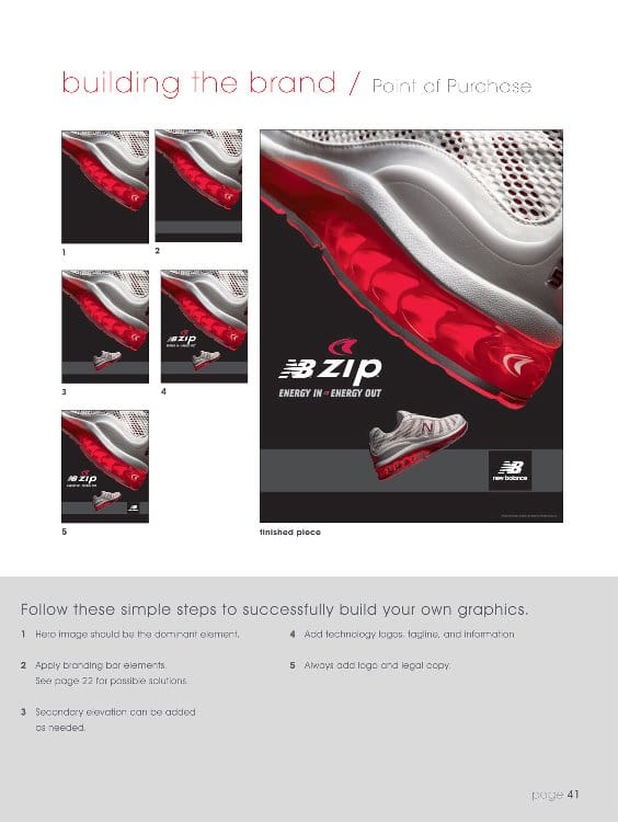
1 Select support art that is relevant to the showcased shoe or key message (i.e. lifestyle). 2 Hero image should be the dominant element. Secondary elements can be added as needed. 3 Secondary message as needed; Should not detract from brand. 4 Third level messaging that highlights technologies and functions of the shoe or apparel. 5 Always add logos, tagline and legal copy. building the brand / Advertising page 40 Follow these simple steps to successfully build your own graphics. finished piece 1 2 3 4 5


brand book 2007 ©2006 New Balance Athletic Shoe, Inc Brighton Landing, 20 Guest Street, Boston, MA 02135 Consumer Website: www.newbalance.com B2B Website: www.nbcustomers.com New Balance, NB & N are registered trademarks of New Balance Athletic Shoe, Inc. C Printed in the U.S.A. on 100% post-consumer waste.