Master media best practices for captivating visuals and impactful messages. By following these tips, you can leverage media to transform your RELAYTO experiences from informative to visually captivating, leaving a lasting impression on your readers.
Optimize Quality and File Size
Fast loading times are crucial for a positive user experience. Large media files can significantly slow down loading, frustrating viewers and potentially causing them to abandon your content.
✅ Choose the Right Format: JPEG for photos, PNG for graphics with transparency.
✅ Compression Tools: Utilize tools or software to compress your media files without significant visual degradation.
✅ Consider Resizing: For some images, resizing them can significantly reduce file size without compromising the overall message.
When using background videos, please make sure that the videos are less than 5MB in size. Video embed sizes may vary depending on the track length, but we recommend using videos that are 1 MB for every 10 seconds.
Ensure the tracks are encoded in H.264 MP4 file. The optimal setting for background video that guarantees great streaming of RELAYTO is 720p30.
💡 Tips: To understand more, read: Best Performance Guide.
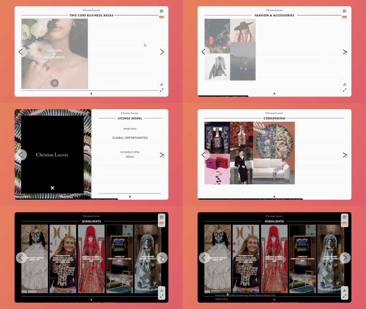
.gif)
Consistency in Design
Maintaining a consistent visual identity across these experiences is crucial for building brand recognition and fostering trust.
✅ Establish a Style Guide: Define your brand's visual identity.
✅ Color Palette Power: Choose a limited color palette that reflects your brand personality.
✅ Image Harmony: Maintain a consistent visual style for your images. This might involve using similar filters, editing styles, or choosing images with a common theme.
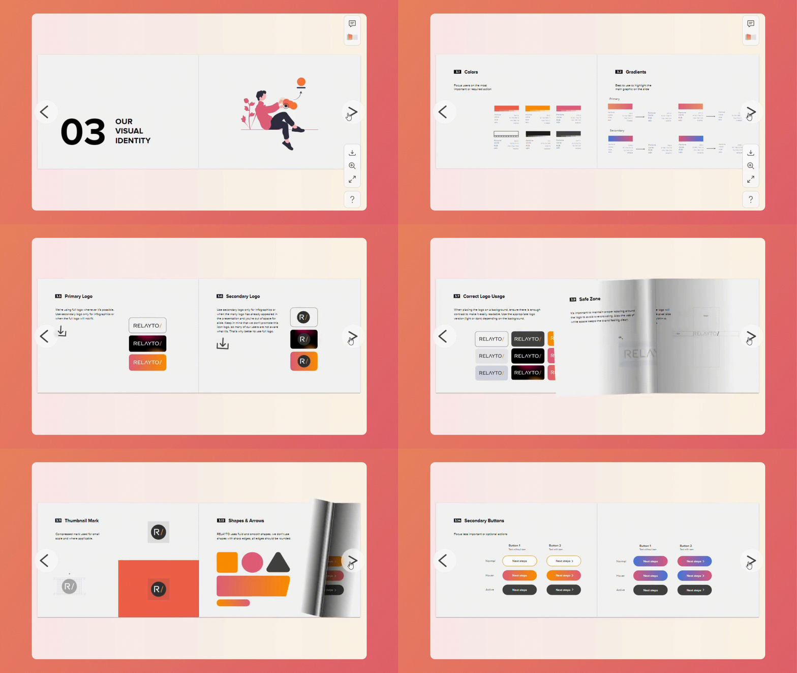
Autoplay your Videos
Autoplay can grab viewers' attention immediately, drawing them into your experience. RELAYTO automatically mutes videos set to autoplay to avoid disruption.
💡 Tips: To understand more, read: How to Add Images and Videos.
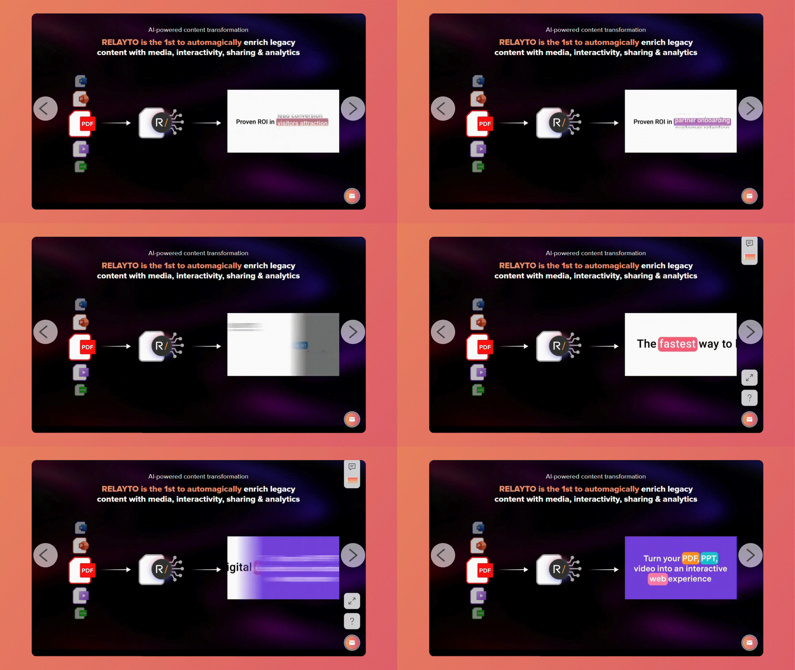
Hide Video Player Controls
Hiding controls creates a cleaner visual experience, allowing the video content to take center stage. It can be particularly effective for short, artistic videos or those where you want viewers to focus on a specific message.
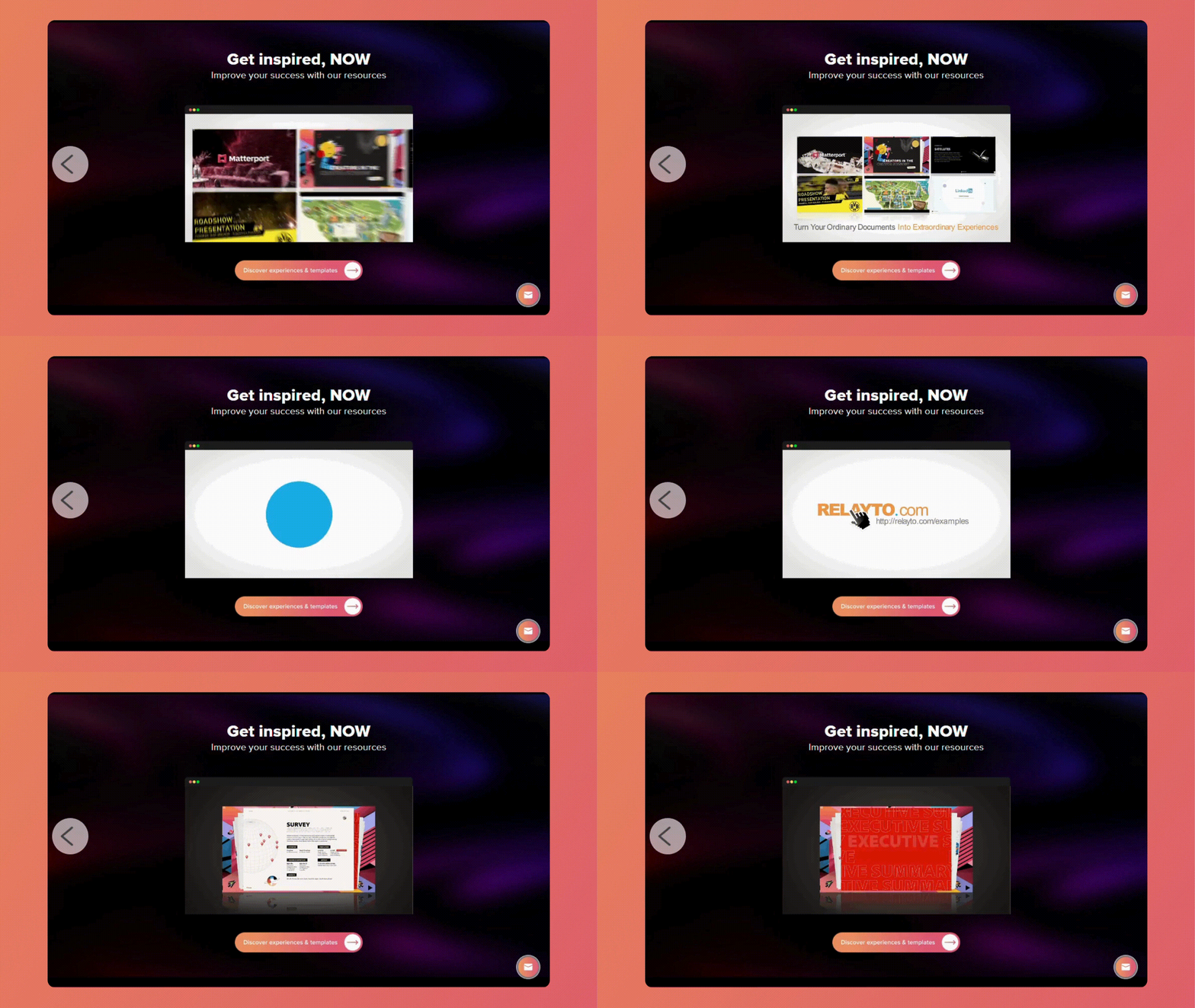
Create Engaging Thumbnails
A well-chosen GIF thumbnail can offer a quick glimpse into the experience's narrative or key message, piquing viewers' curiosity.
✅Clarity Matters: While movement is key, ensure the GIF is clear. A blurry or confusing thumbnail might backfire.
✅Short and Sweet: Keep your GIF thumbnail short (less than 5mb), ideally lasting a few seconds to capture attention without giving away the entire video.
✅Loop Seamlessly: Ensure your GIF loops smoothly to avoid an abrupt and distracting end.
💡 Tips: To understand more, read: How to Update a Thumbnail - Cover Image.
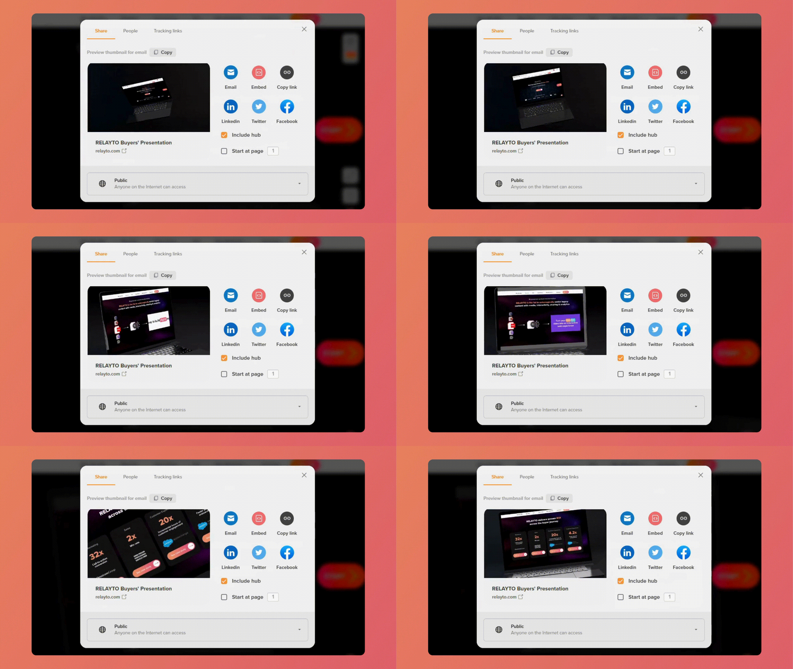
Animate your Medias
Use animation to draw attention to specific elements within an image or video, emphasizing crucial information or guiding viewers' focus. Animated media creates a more impactful and memorable experience that viewers are more likely to remember and share.
✅ Micro-interactions: Create subtle animations, like fading in elements, zooming in on images, or adding hover effects that bring your media to life.
✅ Keep it Purposeful: Avoid excessive animation that might distract viewers or slow down loading times. Every animation should serve a clear purpose within your experience.
💡 Tips: To understand more, read: A Complete Guide on Animations.
Related Articles:
📊 A Complete Guide on Analytics
Thank you for joining us in this tutorial! If you have any questions or need help, feel free to email us at [email protected] or book a call here.