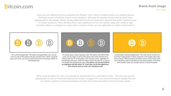
Brand Asset Usage THE COIN There are two di erent icons to represent the Bitcoin “Coin” there is a filled version or a stroked version. The filled version should be used in most situations, although the stroked version can be used when appropriate to add design variety. Good judgement should be used when determining which version to use in certain situations. There are also three color variations on the coin (yellow, gray, and white) to add versatility. Below is a diagram to show which versions of the coin are applicable in certain environments. On a white background: The yellow and gray filled coins can be On darker gray or black backgrounds: The yellow and white filled Occasionally colored backgrounds: The only version of the coin used, as well as the yellow and gray stroked coins. When using the coins can be used, as well as the yellow and white stroked coins. icon that is appropriate in these situations is the single color logo, gray coin icons, use care to ensure than the icon iseasily visible on Notice that the “B” in the yellow coin remains white, regardless of shown above. When possible, the filled version of the single color the background. the background color, while the white version has the “B” cut out of coin should be used on the Bitcoin.com brand yellow. If working it to display the background color. The yellow coin should ALWAYS with another color, the stroked version is recommended. be displayed with the white “B”. If this does not fit the application, then another version of the coin should be used. When at all possible, the coin icon should be represented on a solid field of color. The coin can also be represented on one of the photo backrounds shown on page 9. It is not recommended to display the coin on a photo, pattern or textured background other than those provided in this brand style guide. 6
 Bitcoin Brand Book Page 6 Page 8