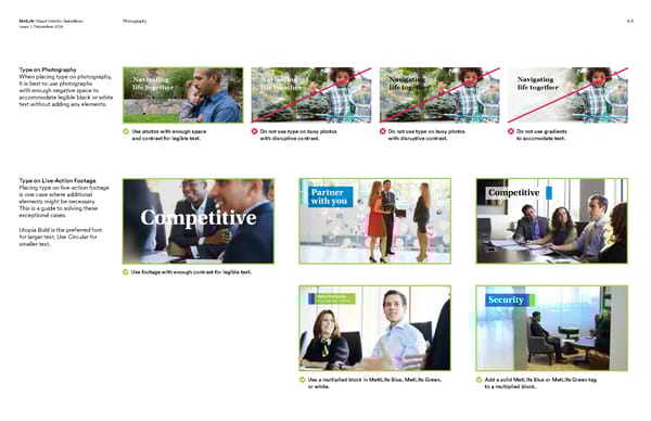
MetLife Visual Identity Guidelines Photography 6.5 Issue 1: December 2016 Type on Photography When placing type on photography, Navigating Navigating Navigating Navigating it is best to use photographs life together life together life together life together with enough negative space to accommodate legible black or white text without adding any elements. Use photos with enough space Do not use type on busy photos Do not use type on busy photos Do not use gradients and contrast for legible text. with disruptive contrast. with disruptive contrast. to accomodate text. Type on Live-Action Footage Placing type on live-action footage Partner Competitive is one case where additional elements might be necessary. with you This is a guide to solving these exceptional cases. Competitive Utopia Bold is the preferred font for larger text. Use Circular for smaller text. Use footage with enough contrast for legible text. EMPLOYEE NAME EP, Employee Position Security Use a multiplied block in MettLife Blue, MetLife Green, Add a solid MetLife Blue or MetLife Green tag or white. to a multiplied block.
 MetLife Brand Book Page 43 Page 45