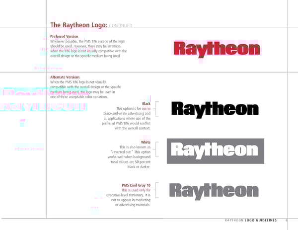
The Raytheon Logo: CONTINUED Preferred Version Whenever possible, the PMS 186 version of the logo should be used. However, there may be instances when the 186 logo is not visually compatible with the overall design or the specific medium being used. Alternate Versions When the PMS 186 logo is not visually compatible with the overall design or the specific medium being used, the logo may be used in one of three acceptable color variations. Black This option is for use in black-and-white advertising and in applications where use of the preferred PMS 186 would conflict with the overall context. White This is also known as “reversed out.” This option works well when background tonal values are 50 percent black or darker. PMS Cool Gray 10 This is used only for executive-level stationery. It is not to appear in marketing or advertising materials. RAYTHEON LOGO GUIDELINES 6
 Raytheon Brand Book Page 6 Page 8