Allentown Brand Book
Allentown is a city in Pennsylvania known for its industrial history, community spirit, and cultural attractions. It fosters a strong sense of community with diverse events and local initiatives.
Brand Guidelines Version 1.0
Logo Usage 1
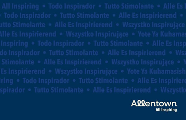
The logo reflects Allentown’s friendly, welcoming and creative nature. Timeless, not trendy, the cursive-style “l” reflects our waterways, presents a human element, and demonstrates how integral each individual is to our city’s future. The final “n” provides a sense of positive, forward-movement. 2 Logo Overview
Logo Versions Without Tagline With Tagline If space allows, our logo and themeline should be used together in all print and digital executions. This allows for a more complete communication. When using the logo with the themeline, the themeline is right-justified, locking up with the “t’ and “n.” 3 Minimum Size .75” 1” Our logo should never be scaled below a .75 inch width When used with the tagline our logo should never be scaled below a 1 inch width All Inspiring All Inspiring
Logo Clearances The minimum clear space should be equal to one “O-height” around the entire lockup. Clearances describe the padding around the logo. This padding helps our logo stand out, be recognizable, and not feel cramped or cluttered. 4 The minimum clear space should be equal to one “O-height” around the entire lockup.
A entown Logo Rules Our logo is sacrosanct and should never be changed or altered. Though it may be tempting to mix it up a bit, don’t. Follow the rules to the left to maintain a clean, clear, consistent logo and our brand standards. Do not use multiple colors in mark. Do not change the font of the mark. Do not outline the mark. Do not rotate the mark. Do not stretch or squeeze mark. Do not put mark on a background without sufficient contrast. Do not use mark over a busy background. 5 Do not alter spacing or kerning of mark.
Vector Files Open this PDF in Illustrator to access these workable vector versions of our log.
Typography 6
Headline & Body Headline Font Body Font Alternate Font Avenir Next Font Family - All weights ABCDEFGHIJKLMNOPQRSTUVWXYZ abcdefghijklmnopqrstuvwxyz 1234567890 Verdana ABCDEFGHIJKLMNOPQRSTUVWXYZ abcdefghijklmnopqrstuvwxyz1234567890 Avenir Next Condensded Bold ABCDEFGHIJKLMNOPQRSTUVWXYZ abcdefghijklmnopqrstuvwxyz1234567890 Our headline font is Avenir Next Condensed Bold, a clean, modern font that pairs nicely with our logo and works well over web and print applications. The body font is Avenir Next Font Family. All weights of the body font are included for greater design options. When Avenir Next is not readily available, use the Verdana Font Family. 7
Colors 8
Brand Colors Name Secondary Colors Primary Colors Navy Green Red Gold Blue Pantone 534 C 360 C 2347 C 1235 C 2171 C CMYK 100 85 39 33 60 0 100 0 0 100 100 0 2 27 97 0 68 20 0 0 RGB 21 48 86 114 191 68 239 0 0 248 188 31 62 164 220 Hex 153056 72BF44 EF0000 F8BC1F 11A9F5 Allentown’s primary brand palette uses our city’s flag as inspiration, then adds saturation and complimentary shades and hues for liveliness, pops of color and ample design options. This palette can be used across the entire brand. Pearl P 7-9 C 2 4 15 0 249 240 217 F9F0D9 9
Graphics 10
“All” Usage The “All” icon is a supporting graphic for our brand to convey what we’re all feeling. All festive. All Delighted. All Inspired! Do’s & Dont’s Do not use “All” icon in sentences, paragraphs or written documents Do not use any font other than Avenir Next Condensed Bold Do not overuse “All” icon. Best if used once per design Keep statements short, preferably one word following our All icon. Festive Headline Font Inspire d Allentown has it Delighted 11
Nature Icon Allentown is a natural with wooded trails, riverfront pathways, tree-lined streets and plenty of parks and green spaces. Category Icons Community Icon Allentown loves its friendly, welcoming and nurturing neighbors and newcomers. Working together we can create a bolder, brighter future. Culture Icon Inspired by a creative, innovative population, our arts scene is gowing and diverse arts, music and cultural experiences abound. To highlight key messages and areas of focus, our brand includes categories for community, culture, culinary, nature and economic development. Each category has its own clever, whimsical,and inviting icon inspired by the cursive “l” in the Allentown logo. Culinary Icon Our city is proud to share its many tastes and traditions, from ethnic festivals to award-winning restaurants to local eateries. Economic Development Icon We welcome business with a ready and able workforce, robust entrepreneurial ecosystem, and the best tax incentives on the East Coast. Digital Icon Our digital icon is only used for digital and social executions, such as social profile pictures. The digital icon does not have its own color palette, but instead uses our primary colors. 12
Illustration 13
Brand Illustration Using only our primary color palette, our brand illustrations are vibrant and bold—much like Allentown itself. This illustrative style can be used to showcase our city’s diversity, strengths and offerings, or as design elements, which allow for broader communications and interpretation. 14
Brand Illustration Rules 15 Illustrations are abstract, graphic, simple shapes; not complex Allentown-specific graphics refer to benefits, our green spaces, waterways, city life and more Use complementary design elements, such as simple shapes, lines and color blocks Only brand colors can be used in brand illustrations No one color should dominate the design, keep colors balanced When including a logo in brand illustrations, it should be navy or pearl When Creating Graphic Elements for Brand Illustrations: Select an Allentown benefit; green spaces, waterways, city life, etc. Create an abstract, one-dimensional graphic that illustrates the benefit. Use simple shapes, lines and color blocks to add interest, depth and balance. Keep it simple, do not add detail. The graphic shouldn’t be literal, but open for interpretation. Example: The Albertus Meyers Bridge or 8th Street Bridge makes a great abstract graphic by simply mimicking the shape of its arches.
Category Illustration Our category illustrations utilize a distinctive, dynamic and abstract style. By using category- specific design elements, these illustrations add depth and interest to the City of Allentown’s story. 16
Category Colors Each category features a primary color and an expanded color palette of monochromatic shades and tints. These distinctive category palettes help define and showcase specific aspects of our city and messaging. 17 EF0000 11A9F5 72BF44 F8BC1F 414696 FF2C2C 34C0F7 95EA5E FFC74A 490101 163056 186D06 FC4D00 FF4949 6DD7F7 AAF779 FCD266 6D0000 154E7C 18961E F96806 153056 FF8585 8BD8F7 C7FCA4 FCD98B 9B0202 0777AF 419E05 F79420 1D316A FCA9A9 B8E6F4 DDFCCA F9DFAA C60505 0690C6 53B718 FAA61A 303287 4F559F 040E21 777BB5 AFAED3 C8C8E8
Category Illustration Rules Illustrations should be abstract and simple, not complex Category illustrations must use the appropriate icon and color palette Additional graphics must refer to the category benefits or messaging Use simple shapes, lines, and color blocks as complementary design elements Always use high contrast colors when including our logo or type in category illustrations 18 When Creating Graphic Elements for Category Illustrations: Follow the same process as for brand illustrations; however graphics for category illustrations should refer to category messaging. Use the appropriate category icon and color palette. Keep it simple, do not add detail. The graphic shouldn’t be literal, but open for interpretation. Example: A frothy mug of beer can make a great abstract element for our culinary category by adding a color block at the top to represent the foam and circles for the bubbles.