Slack Brand Book
Slack is a communication platform designed for teams, helping organizations streamline their workflows with channels, integrations, and tools. It makes collaboration effortless by bringing messaging, file sharing, and apps into one place.
Slack Brand Guidelines




Section 2: Design elements In which we outline best practices for the use of Slack brand assets and offer useful examples. 17 Slack Brand Guidelines Design Elements
The octothorpe The octothorpe is composed of simple Octothorpe geometric shapes and four primary colors. The symbol is legible at most sizes, and a small version is provided for micro applications. The two basic shapes used in the octothorpe—a speech bubble and a lozenge—can be extracted and used as graphic elements. 19x19 Grid 18 Slack Brand Guidelines Design Elements
Our logo The Slack logo is composed of an octothorpe and a logotype set in Hellix Bold. The horizontal logo is the primary logo and should be used in most instances. The stacked logo is for large-scale use. Avoid using at small sizes, as it can become illegible. Always use the logo files provided. Do not re-create. 19 Slack Brand Guidelines Design Elements
Our logo (for small use) There is a specific logo for small sizes and should be used when the logo is rendered at a size between 50px wide Maximum Sizing for Minimum Sizing for and 90px wide. Small Use Logo Small Use Logo The small logo mark should be used at a size between 15px tall and 20px tall. 90px wide max, approx 90px wide max, approx Only the horizontal logos are appropriate for small use. Do not use the stacked logo for small use. (or approx 1.25 inches) (or approx 0.7 inches) 20px height max, approx 15px height max, approx (or approx0.28 inches) (or approx 0.2 inches) 20 Slack Brand Guidelines Design Elements
Usage on backgrounds The full-color logos should be used only on white, black, or aubergine colored backgrounds. Avoid using full-color logos on photographs unless the logo sits on a black or white area of the image. 22 Slack Brand Guidelines Design Elements
One-color use The one-color logo should be used only on photographs and color backgrounds within the Slack color palette. The one-color logo should only be used in black and white colorways. If using an aubergine background, we strongly prefer to use the full-color logo. However, if design limitations conflict with this, then the logo should appear in white on aubergine. 23 Slack Brand Guidelines Design Elements
Logo misuse Do not crop the logo Do not distort the logo Do not change the Do not use drop shadows transparency of the logo or any other effects Do not shuffle around Do not re-create using any the colors of the octothorpe other typeface Do not use different colors Do not outline logotype Do not change the size or position of the octothorpe Do not rotate any part of and logotype. the logo 24 Slack Brand Guidelines Design Elements
16 Slack Brand Guidelines Design Elements
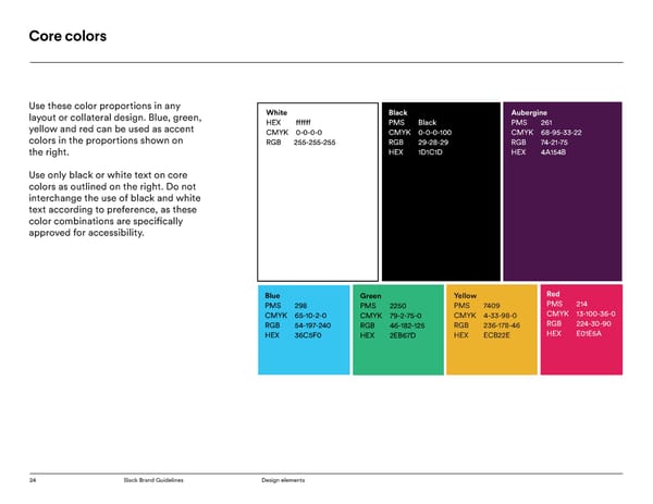
Secondary colors Do not use secondary colors for PMS 7568 C PMS 7623 C PMS 709 C PMS 489 C text. Only use white (#ffffff) or black CMYK 45-94-43-25 CMYK 27-99-95-27 CMYK 0-78-48-0 CMYK 0-19-22-0 (1C1D1C) text over secondary color RGB 124-40-82 RGB 124-40-82 RGB 242-96-106 RGB 254-212-190 backgrounds. HEX 7C2852 HEX 921D21 HEX F2606A HEX FED4BE Use the text pairings above as a guide for accessibility. PMS 2060 C PMS 2439 C PMS 495 C PMS 7604 C CMYK 24-78-19-0 CMYK 10-54-61-0 CMYK 1-32-13-0 CMYK 3-5-9-0 Secondary colors can be used with our RGB 192-91-140 RGB 222-137-105 RGB 246-187-193 RGB 244-237-228 core colors, but this should be limited. HEX C05B8C HEX DE8969 HEX F6BBC1 HEX F4EDE4 PMS 130 C PMS 3425 C PMS 2221 C PMS 661 C CMYK 0-43-100-0 CMYK 87-37-95-32 CMYK 81-23-35-1 CMYK 100-94-9-1 RGB 255-161-0 RGB 24-95-52 RGB 0-150-162 RGB 30-50-143 HEX FFA100 HEX 185F34 HEX 0096A2 HEX 1E328F PMS 7403 C PMS 576 C PMS 2225 C PMS 7689 C CMYK 0-16-59-0 CMYK 59-23-93-5 CMYK 48-0-16-0 CMYK 78-35-13-0 RGB 255-213-126 RGB 119-152-70 RGB 120-215-221 RGB 47-138-183 HEX FFD57E HEX 779846 HEX 78D7DD HEX 2F8AB7 PMS Black 3 C PMS Cool Gray 11 PMS Cool Gray C PMS 427 C CMYK 72-67-64-76 C CMYK 59-50-50-18 CMYK 7-5-5-0 RGB 29-28-29 CMYK 67-62-57-43 RGB 105-105-105 RGB 235-234-235 HEX 1D1C1D RGB 255-255-255 HEX 696969 HEX EBEAEB HEX 464145 26 Slack Brand Guidelines Design Elements
Accessible color combinations All examples shown pass the contrast standards with the exception of small White on black Blue on black blue text on an aubergine background. Never typeset small blue text on White on black Blue on black aubergine. Instead, reserve blue text on aubergine backgrounds only for larger headline typography. White on aubergine Blue on aubergine White on aubergine Blue on aubergine Text 1 on Lt Gray 1 (Active) on Lt. Gray 1 Text 1 on Lt Gray 1 (Active) on Lt. Gray 1 Headline on Lt Gray 2 (Null) on Lt. Gray 2 Headline on Lt Gray 2 (Null) on Lt. Gray 2 Black on blue Black on blue 28 Slack Brand Guidelines Design Elements
Typography: Larsseit Slack headlines are set in Larsseit. Aa Bb Cc Dd Ee Ff Gg Hh Ii Jj Kk When using Larsseit to create headings on embedded or printed collateral for Slack, always typeset it with Optical Ll Mm Nn Oo Pp Qq Rr Ss Tt Uu kerning, set the tracking to 0, and set in sentence case. Do not set in all-caps or all-lowercase. When using Larsseit Vv Ww Xx Yy Zz 0123456789 to typeset headings on the web, set the letterspacing to -1px for smaller headlines and -2px for larger headlines. Note: If converting G Slides to Keynote Thin Nymphs blitz quick vex dwarf jog. or Powerpoint, use Larsseit throughout Thin Italic DJs flock by when MTV ax quiz prog. for headlines and body text. If the Light Typografie Maamerkkinä. presentation originates in Keynote or Light Italic Saturation Pracovitějším. Power Point, follow regular brand font guidelines. Regular Brick quiz whangs jumpy veldt fox. Regular Italic Glib jocks quiz nymph to vex dwarf. Medium Požiadavkou Motorického. Medium Italic Bright vixens jump; dozy fowl quack. Bold OŻywiona Matemático. Bold Italic Quick wafting zephyrs vex bold Jim. Extrabold Architekten Zwitserland. Extrabold Italic Praktischer Revolutions. 29 Slack Brand Guidelines Design Elements
Typography: Slack Circular Typeset all text and paragraph text Aa Bb Cc Dd Ee Ff Gg Hh Ii in Slack Circular. When using Slack Circular to set text on embedded or printed collateral for Slack, always Jj Kk Ll Mm Nn Oo Pp Qq typeset it with Optical kerning, set the tracking to -10, and set in title case or sentence case (as determined by the Rr Ss Tt Uu Vv Ww Xx Yy Zz content). Do not set in all-caps or all-lowercase. 0123456789 When using Slack Circular to typeset text on the web, set the letterspacing to 0px for normal paragraphs and -0.2px for hero paragraphs. Book Brick quiz whangs jumpy veldt fox. Book Italic Glib jocks quiz nymph to vex dwarf. Medium Požiadavkou Motorického. Medium Italic Bright vixens jump; dozy fowl quack. Bold OŻywiona Matemático. Bold Italic Quick wafting zephyrs vex bold Jim. Black Architekten Zwitserland. Black Italic Praktischer Revolutions. 30 Slack Brand Guidelines Design Elements
Type specimen: Ideal stack H1 Larsseit Bold, 36/38 A better way to work H2 Larsseit Bold, 24/28 Simpler, more pleasant and more productive H3 Larsseit Bold, 18/21 The kind of thing you don’t know you need, but once you have it, you can’t live without it. It feels like the natural evolution of work. H4 Larsseit Bold, 12/15 After all, every organization needs a little Slack. P There is an enormous and heretofore largely unmet wrong inbox, you have access to none of it. Rather Share channels with companies Hero P Circular Book, demand for an easier way to coordinate and align than inboxes, all those messages are organized into and businesses you regularly work Circular Book, Style Set 2, people. That demand is why Slack is here today, and channels. Channels can correspond to anything - proj- Style Set 2, Optical Kerning, why Slack is being adopted all over the world. Email ects, teams, planning, office locations, business units, with to bring all the right people Optical Kerning, -10 Tracking is the default coordinating point for communications functional areas, temporary channels for things like -10 Tracking 7/9 and the go-to platform enterprise software develop- planning an offsite. Unlike email, Slack was designed into the same room. 10/14 ers use when they need to reach human beings, but from the bottoms-up to integrate with the software inside a company it works poorly. Enormous flows tools you use every day. Whatever tools you already of information course through it, but each person use, Slack vastly increases the value of your software CTA Text has only a tiny view. Email holds rich history: all the investment, by making it easier to access, easier to Circular Bold, decisions made, questions answered and information act upon, and easier to share. Style Set 2, shared, but if you’re new to a company, or just in the Optical Kerning, Quote Mark +20 Tracking Circular Book, 36 “ 7/9 Pull Quote We believe that the advantages are so great Larsseit Thin, 18/21 that a shift to working on Slack, or something like it, is inevitable. Attribution Marcel Gherkins Circular Bold/ Spokesperson, Slack Book Italic, 7/9 31 Slack Brand Guidelines Design Elements
21 Slack Brand Guidelines Design Elements
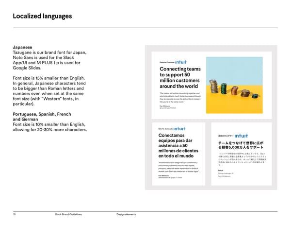
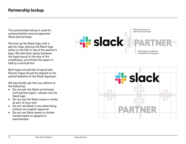
27 Slack Brand Guidelines Design Elements
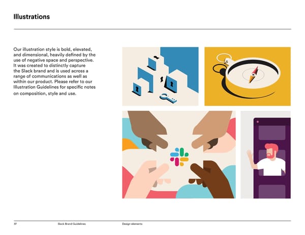
Icons Slack icons are used across different Slack.com brand touchpoints from marketing, environment to product. They provide symbolism, conceptual clarity, and visual interest in simplistic shapes and forms. Roles Events Miscellaneous 44 Slack Brand Guidelines Design Elements
Photography Like our brand voice, all photography direction is based on a spectrum of relatable to aspirational. Avatars: Relatable, human, warm, quirky, but not silly, colorful, but mature, personable. Still life: Attainable, clear, concise, human, demonstrates Slack’s personality, simple, not overly complex Lifestyle: Aspirational, alludes to collaboration, confident, clear, focused, environmentally inclusive (the subject is a part of something bigger) 47 Slack Brand Guidelines Design Elements
Video Lower thirds. Design should be clean and clear. Names should be set in Larsseit bold, titles in Circular book and backgrounds set to 80% opacity. Ending slates. All videos should end with the Slack logo, animated or still. Watermarked logos. Watermarked logos should be placed in the upper left at 50% opacity. 49 Slack Brand Guidelines Design Elements
Governance 50 Slack Brand Guidelines Design Elements
32 Slack Brand Guidelines Design Elements
1. General Terms a. Slack permits its customers, third party developers, partners and the media ("you") [confirm this list] to use its name, trademarks, logos, web pages, screenshots and other brand features (the Slack "Brand Features", "Marks" or "logos") only in limited circumstances and as specified in these Guidelines. By using Slack’s Marks, you agree to adhere to these Guidelines and specifically to the Use Requirements and Terms below. If you have a separate agreement with Slack that addresses use of the Slack brand, that agreement shall govern your use of the Slack Marks. b. The Slack marks include the Slack name and logo, and any word, phrase, image, or other designation that identifies the source or origin of any of Slack's products. c. List of trademarks: i. SLACK ii. The Slack logo iii. Where Work Happens iv. Slackbot v. Several People Are Typing 52 Slack Brand Guidelines Design Elements
2. Trademarks a. “SLACK” text usage guidelines 2. For international use, do not use the ® symbol. i. The company name is “Slack Technologies, Inc.” Instead say “Slack is a trademark and service mark ii. Do of Slack Technologies, Inc., registered in the U.S. 1. When “Slack” is used, use only as an adjective and in other countries.” at the bottom of the page followed by a description of our services on which the Slack word mark first appears. 2. Examples: Slack collaboration software, others? 3. On all marketing materials, include “Copyright 2019 3. If true, you’re welcome to say that your product Slack Technologies, Inc.” marking at bottom, right integrates with Slack (we love that!), but please don’t justified for all marketing materials. [Minimum font use our name or marks as part of yours. size to be specified (e.g., cannot be smaller than N iii. Do Not pt font -OR- needs to be legible)] 1. Don’t use “Slack” as a noun, verb, plural, or b. Logo use guidelines possessive i. Download logos at [link] 2. Don’t use the Slack marks in a way that suggests a ii. Logo usage guidelines at https://a.slack-edge. common, descriptive, or generic meaning com/0f43e/marketing/img/media-kit/Slack-Brand- 3. Don’t register a domain containing the word “slack” Guidelines.pdf or any variation thereof. Deliberate misspellings and iii. Do: transliterations are also not permitted. 1. Ensure there is adequate space between the logo 4. Do not apply for a trademark that includes the word and surrounding elements. “slack,” our logo, or any other words or marks similar 2. For the horizontal logo, the clear space around it to our own should always be greater than or equal to the size of 5. Do not use “Slack” or our other trademarks in the octothorpe. connection with advertising (search engine or 3. For the stacked logo, the clear space around it otherwise) without explicit approval from Slack should always be greater than or equal to the length 6. Don’t use the Slack logo (with or without your of one lozenge in the octothorpe. company logo) iv. Do not: iv. Marking 1. Please don’t modify the marks or use them in a 1. For usage only within the U.S., use the ® symbol on confusing way, including suggesting sponsorship the most prominent use of the word Slack (Slack®), or endorsement by Slack, or in a way that confuses and say “Slack is a registered trademark and service Slack with another brand (including your own). mark of Slack Technologies, Inc.” at the bottom 2. Don’t use any logos or similar imagery to represent of the page on which the Slack word mark first Slack other than the examples we have provided in appears. the Slack Brandfolder. 53 Slack Brand Guidelines Design Elements
2. Trademarks 3. Don’t use a Slack Asset as a substitute for your own c. Screenshots — if you don’t have a logo, please do not co-opt i. Screenshots of the Slack software and website are per- ours mitted for instructive, educational, or illustrative purpos- 4. Don’t overprint or obstruct any part of the logo es 5. Don’t add special effects to the logo, including ii. Don’t alter screenshots, except to resize animation iii. Don’t include screenshots in your product user interface 6. Don’t use old versions or any other marks or logos to iv. Don’t use screenshots that contain third-party content represent our brand without the permission of the third party 7. Don’t distribute or otherwise make available our v. Don’t use screenshots that contain an image of an logos, marks, or assets identifiable individual or other personally identifiable 8. Don’t crop the logo information 9. Don’t outline logotype 10. Don’t rotate any part of the logo 11. Don’t distort the logo 12. Don’t use drop shadows or any other effects 13. Don’t re-create using any other typeface 14. Don’t change the transparency of the logo 15. Don’t shuffle around the colors of the octothorpe 16. Don’t use different colors 17. Don’t change the size or orientation of the octothorpe and logotype in relation to each other 18. No disparaging or objectionable use is permitted 54 Slack Brand Guidelines Design Elements
3. Visual design of your website or application a. When designing your own website, we encourage you to be yourself. But please do not copy or imitate the look and feel of Slack’s products or sites. Doing so may create user confusion or imply Slack’s endorsement. b. Please do not use, display, mirror or frame (including in meta- tags or hidden text) Slack websites, or any individual element of Slack websites, or any other Slack Assets, or the layout and design of any page or form contained on a page. c. If utilizing the Slack API to support your service or application, you must avoid suggesting your service or application is produced or supported by Slack. If we believe ambiguity exists, we may request that you state clearly that your service is “not created by, affiliated with, or supported by Slack Technologies, Inc.” d. If we ask you to include such a message on your page, you must ensure that it is displayed on the initial page load and is clearly visible on either a dark or light background. Text should be a minimum of 15pt. and a minimum of 80% opacity black or white in color. 55 Slack Brand Guidelines Design Elements
4. Trade dress a. Do not use or imitate Slack’s distinctive “look and feel” or other identifiable and unique visual elements of the Slack brand assets, Slack software or www.slack.com website, including (but not limited to) the color combinations, graphics, sounds, icons, typefaces, or other stylization. 56 Slack Brand Guidelines Design Elements
5. Merchandise a. Do not use the Slack Assets or any other confusingly similar words or marks on any apparel, toy, product, or other merchandise b. If you’re interested in purchasing Slack branded goods, we sell a range of official products in the Slack Shop. All proceeds are donated to charity. 57 Slack Brand Guidelines Design Elements
6. Use requirements and terms a. Any use of Slack brand assets must conform to these guidelines. b. These guidelines may be modified at any time. Use of the Slack brand assets constitutes consent to any modifications to the guidelines. c. Slack has sole discretion in determining if use of the Slack assets violates these guidelines d. Termination: Slack may ask that you stop using the brand assets at any time. In the event of termination, use of brand assets must stop within a reasonable period from the date of the request, and in all cases no more than 7 days from the date of the request. e. Reservation of Rights: Slack is the owner of all rights in the Marks and reserves all rights save the limited license granted here. Use of the Marks pursuant to this license shall not be construed as limiting any of Slack’s rights in the Marks. f. SLACK DISCLAIMS ANY WARRANTIES THAT MAY BE EXPRESS OR IMPLIED BY LAW REGARDING THE SLACK MARKS (TO THE EXTENT PERMITTED BY LAW), INCLUDING WARRANTIES AGAINST INFRINGEMENT. g. Contact us (at help.slack.com?) to request use of brand assets in a manner inconsistent with the guidelines or for any questions. 58 Slack Brand Guidelines Design Elements
Questions? For any brand inquiries contact brand@slack-corp.com 59 Slack Brand Guidelines Design Elements
