GlobalGiving Brand Book
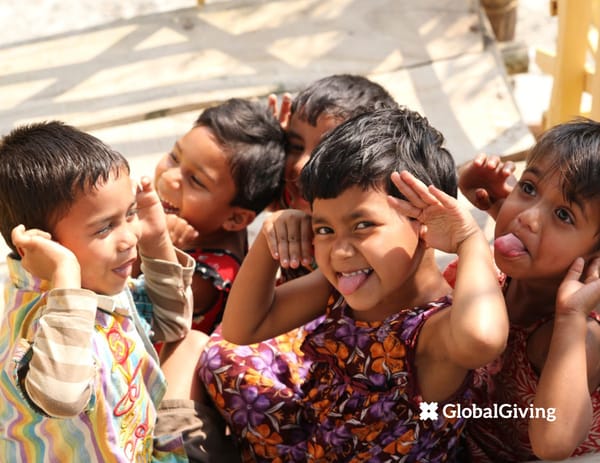
Global Giving connects donors with nonprofits around the world to support impactful projects in education, disaster relief, and more. Its platform inspires trust by showcasing the transformative power of giving.
Brand Guide Updated August 2021
Logos Colors Typography Imagery Brand Elements Identity Voice Audiences Value Proposition Grammar + Style Questions? 04 09 12 15 20 26 32 35 41 44 48 Contents
GlobalGiving is a nonprofit on a mission to accelerate community-led change. We make it easy and safe to give to local projects anywhere in the world, while providing nonprofits with the tools, training, and support they need to thrive.
4 GLOBALGIVING BRAND GUIDE Logos
5 GLOBALGIVING BRAND GUIDE Primary Logo The GlobalGiving logo is comprised of two elements: the logo icon and the wordmark. The icon has four parts— each representing a person—that come together to form a whole. Its different colors conceptually represent the diversity of our community: the staff, donors, partners, and thousands of organizations we support. The logo’s wordmark is a fully customized font and is completely unique to us. It has mild serifs that give it a structured, classic, sophisticated feel. Their rounded edges soften the font and make it friendly and accessible, just like GlobalGiving. This horizontal version of our logo is preferred for most applications. For dark backgrounds LOGOS Use only when small
6 GLOBALGIVING BRAND GUIDE Secondary Logo The stacked lock-up of our logo can be used when the main logo does not fit comfortably in the allotted space or cannot be clearly represented—like in vertical applications. Our one-color logo, both horizontal and vertical, should be used very selectively and only when small (not on large posters or where it is the main element on the page). It should only be used when the full-color logo doesn’t work well, like when placed over a photo. LOGOS Use only when small For dark backgrounds
7 GLOBALGIVING BRAND GUIDE SAFE AREA In order for our logo to retain its visual impact, please maintain a clear area around the logo, void of all imagery and graphics. This area is defined by the height of the “a” within our logo. MINIMUM SIZE To ensure legibility, clarity, and brand consistency, the width of the main logo should never be reduced to less than 1.2 inches when in full color, or one inch when in one color. COMBINING LOGOS When our logo is used in conjunction with other logos, there should be at least enough space between them to allow for the width of the icon from the GlobalGiving logo. Organization Example Logo 1 icon in between 1.0 inch (25.4 mm) 1.2 inches (30.5 mm) Using Our Logo In the interest of protecting the integrity of the GlobalGiving brand, we have created basic logo guidelines in regards to safe area, logo combinations, and size restrictions. Use discretion when scaling the logo. Be sure to err on the side of more white space so the logo has room to breathe. LOGOS
8 GLOBALGIVING BRAND GUIDE Don’t add shadows, strokes, or other effects Don’t use old versions of the logo or colors Don’t rotate, make vertical, or flip Don’t change any color or the order of the 4 colors Don’t alter proportions of the wormark and icon Don’t change aspect ratio, stretch, or squeeze Don’t alter the letters or spacing in any way Don’t make the logo into an outline Logo Misuse In order to maintain a strong, consistent, and successful brand, we ask that our logo be kept in the original state in which it was designed. Please do not add to or change anything about the logo. These usage guidelines apply to all versions of the logo. Old versions of the logo have been retired, and therefore should no longer be used in any application. LOGOS Incorrect Usage
Colors
10 GLOBALGIVING BRAND GUIDE Orange 717U # F08B1D Dark Orange 718U #E37F1C Light Orange # F8C087 Darkest Cool Gray # 293541 Lighter Cool Gray # C4C7CA Dark Cool Gray # 32404E Lightest Cool Gray # EBEEEE Cool Gray # 3E4B59 Light Cool Gray # 7D848A Dark Blue #5405U #457389 Light Blue # 80A1B6 Dark Plum # 4C2432 Plum # 683043 Darkest Warm Gray # 3E3C39 Warm Gray # 867F75 Dark Warm Gray # 5B564C Light Warm Gray # C1BAB0 Dark Green 384U # 9FA617 Light Green # D4D88D Dark Red #97341B Red #C54626 Dark Yellow 110U # E3B430 Light Yellow # FFE693 Green 383U # B2BB1E Blue 5415U # 5D87A1 Yellow 116U # FFD200 Our Palette Clean, natural, organic colors make up GlobalGiving’s primary four color palette. Orange Used sparingly to emphasize calls- to-action, important text, or website buttons. Mostly used for donor content. Blue Used for content like “learn more” buttons or hyperlinks. Mostly used for corporate partner or company content. Green Used for content related to growth or money. Mostly used for nonprofit partner content. Red Used sparingly for alerting the user of an error. Mostly reserved for disaster content. When combining colors, secondary colors should be used only when accompanied by one or more colors from the primary palette. COLORS Primary Palette Secondary Palette
11 GLOBALGIVING BRAND GUIDE Combine colors with little or no contrast Place the four color logo over a non-neutral color Combine tints + shades of the primary palette Use transparent dark colors over photos Place white logo or text over any palette color Use solid, opaque colors with text over photos Combine primary and secondary colors Place orange logo over neutral or contrasting color Combine colors that do not include primary palette colors Using the Palette Our color palettes are the foundation for beautiful designs that look great with our photos. While the usage of the colors is somewhat flexible, there are some general rules to follow: • Use our primary palette when possible, particularly orange, blue and green. • Create contrast using combinations of light and dark colors. • Darker colors can be made slightly transparent and overlayed on photos. • Use our secondary color palette sparingly, particularly the lighter colors. COLORS Correct Usage Incorrect Usage
Typography
13 GLOBALGIVING BRAND GUIDE headlines, callouts, and quotes, no italics and no all caps body copy + small text, italics and all caps okay ABCDEFGHIJKLMNOPQRSTUVWXYZ ABCDEFGHIJKLMNOPQRSTUVWXYZ ABCDEFGHIJKLMNOPQRSTUVWXYZ abcdefghijklmnopqrstuvwxyz 1234567890 !@#$%^&*()-=+ ABCDEFGHIJKLMNOPQRSTUVWXYZ ABCDEFGHIJKLMNOPQRSTUVWXYZ ABCDEFGHIJKLMNOPQRSTUVWXYZ ABCDEFGHIJKLMNOPQRSTUVWXYZ ABCDEFGHIJKLMNOPQRSTUVWXYZ abcdefghijklmnopqrstuvwxyz 1234567890 !@#$%^&*()-=+ Our Fonts Our two fonts include one serif and one sans serif—Aleo and Open Sans. They are both clear, legible, modern typefaces that work well in print and online. Each of the “font families” include many “weights” like light, regular, and bold. They can each be downloaded online for free at FontSquirrel.com (Aleo) and Google.com/fonts (Open Sans). For headlines, quotes, and larger text, Aleo is best. For body copy, subheadlines, captions, and smaller text use Open Sans. Please do not use Aleo in italics or in All Caps. TYPOGRAPHY Aleo Open Sans
14 GLOBALGIVING BRAND GUIDE Our fonts are flexible and can be used in a variety of ways. The examples here provide a general guideline on how use our fonts to maximize legibility and aesthetic appeal. Using Our Fonts TYPOGRAPHY “Lorem ipsum dolor sit amet, consectetur adipi- scing elit. Integer mollis mattis tellus. Vivamus mattis risus set convallis sollicitudin.” AUTHOR’S NAME Lorem ipsum dolor sit amet, consectetur adipiscing elit. Integer mollis mattis tellus. Vivamus mattis risus sed convallis sollicitudin. Vestibulum feugiat efficitur sodales. Mauris et lectus non ligula ullamcorper molestie. Vivamus sagittis lobortis nunc at maximus. Lorem ipsum dolor sit amet, consectetur adipiscing elit. Integer mollis mattis tellus. Vivamus mattis risus sed convallis sollicitudin. Vestibulum feugiat efficitur sodales. Mauris et lectus non ligula ullamcorper molestie. Vivamus sagittis lobortis nunc at maximus. Nullam sit amet hendrerit sapien, et sagittis sapien. Headline or Large Text Aleo: large, Regular or Light, no italics Open Sans: smaller, any weight. Quote in Aleo, byline in Open Sans, all caps. Headline Example Body Copy Example Quote Example
Imagery
16 GLOBALGIVING BRAND GUIDE The imagery we use is just as powerful as the stories we tell. We choose our photos carefully, thoughtfully, and compassionately; we take great pride in portraying people in the most positive light. We use photos that come directly from our nonprofit partners. These photos represent us best and we are proud to showcase them. Our partners have given us full permission to use their images under the GlobalGiving copyright. If you are interested in obtaining re-publishing rights for any of our projects’ photos, please email help@globalgiving.org for more information. Our Photos IMAGERY
17 GLOBALGIVING BRAND GUIDE Hopeful faces full of genuine joy People looking at the camera Personality and character Collaboration and people working Our project themes (education etc.) Animals and plants Empowered, confident people Diversity of every kind Stereotypes being challenged High quality and color Great photos are the foundation of the GlobalGiving brand. They help bring our human, authentic, personal, relationship- driven values to life. Variety and inclusiveness are important to us. Groups of photos should represent the breadth of the projects we support, demonstrating the geographical, generational, cultural, and social diversity of our nonprofit partners. We want everyone to be equally represented through our imagery. We favor photos with bright colors, bright light, contrast, depth, and dynamic composition. All photos used should be high resolution (at least 1000 pixels wide) and should follow the guidelines listed on the right. Blurry, grainy, or low quality photos should not be used even if the content is good. Choosing Great Photos IMAGERY Do use images of:
18 GLOBALGIVING BRAND GUIDE It is critical that the photos we use do not damage our brand or portray anyone negatively. Please take the time to choose photos carefully and thoughtfully. If there is any doubt about whether or not a photo is appropriate, please avoid it. On the right are some easy rules to avoid bad photo choices. While images of vulnerable people may generate cash in the short-term, they can perpetuate misconceptions that a country or its people cannot solve their own problems. We never use photos of people who are suffering, are in vulnerable situations, or are portrayed as “less than.” We make sure that every single photo we use preserve the dignity of them people portrayed. A simple rule is to always ask yourself, “Would I be happy to be portrayed this way?” Avoiding Bad Photos IMAGERY Portray people as helpless victims Show pain, discomfort, sadness, or fear Cut out essential context Have blurred or obstructed faces Are too dark to see the subjects Have text or logos over them Are poor resolution or low quality Are dull, drab, or uninspiring Are stock photography Don’t “feel” like GlobalGiving’s brand Don’t use images that:
19 GLOBALGIVING BRAND GUIDE “We, the members of the GlobalGiving Community, commit to photography, videography, and fundraising practices that uphold the dignity and safety of the people in our photos, and portray our work and communities in a responsible way.” Our project leaders and the people they serve are the heroes of GlobalGiving. Our job is to ensure that they are all represented as powerful, resilient, and equal. Not only does this reinforce our values as an organization, but it also helps shape the perceptions and perspectives of our many audiences. We have an obligation and an opportunity to change and improve the portrayal of people in difficult circumstances, and our photos play a huge role in that. Why Photo Choice is So Important IMAGERY GLOBALGIVING COMMUNITY PHOTO STANDARDS
Brand Elements
21 GLOBALGIVING BRAND GUIDE Our brand elements are clean and simple, made up of solid colors, photos, text diagonals, a custom map, simple divider lines, and large quotation marks. Diagonals, used sparingly, add interest to a composition. They can be used at any horizontal angle. Our map is used often as a large graphic element and to add texture to solid colored backgrounds. The “custom map” is made up of squares that have been angled at 45 degrees. The pattern references the diagonals in the logo icon. It also represents the concept that all of us, while uniquely different, are part of a larger whole. Our Brand Elements BRAND ELEMENTS Diamond World Map Diagonals Jumbo Quotes
22 GLOBALGIVING BRAND GUIDE Combining Our Elements BRAND ELEMENTS EXAMPLE 1 The example on the right is a page from our most current Prospectus. This full page layout in the printed booklet combines the elements of a big bright photo, dark-colored shapes that use both slight transparency and diagonals, plus white text over a dark color. Together, these elements “feel” like GlobalGiving.
23 GLOBALGIVING BRAND GUIDE BRAND ELEMENTS EXAMPLE 2 The top example on the right is a social media image used for sharing on Facebook. It combines a photo that includes eye contact, good composition, bright color, and a person portrayed in a dignified light. It also uses white Aleo text over the photo and a jumbo quotation mark for added interest. EXAMPLE 3 The bottom example on the right is a photo of one of our Gift Cards. The card itself includes the diamond world map over our brand blue. While not from one of our projects, the photo still follows our photo guidelines: bright color and light, context, high quality and in focus, and a human or personal touch. Combining Our Elements (continued)
24 GLOBALGIVING BRAND GUIDE BRAND ELEMENTS EXAMPLE 4 The example on the right is an email design that was sent to our donor audience. Its header image uses our dark navy and the diamond world map is subtly placed behind the text for added texture. Aleo it’s being used for the headline in orange and Open Sans for the body copy. Combining Our Elements (continued) Thank you, Alison
25 GLOBALGIVING BRAND GUIDE Duke Lemur Center goto.gg/donate/16887 INABLE, CORP goto.gg/donate/6491 Community Health, Housing And Social Education (CHHASE) goto.gg/donate/1342 Michael Rothwell East Africa Field Traveler inthefield@globalgiving.org mrothwell@globalgiving.org +1.202.232.5784 GlobalGiving.org Combining Our Elements (continued) BRAND ELEMENTS EXAMPLE 5 The examples on the right are from GlobalGiving’s standard stationery package. Our letterhead, business cards, and postcards feature dozens of full color project photos. We use these printed materials to show off the people behind our projects: their amazing work, their joy, their vast diversity. Like GlobalGiving’s brand, these examples include minimal design elements so the attention remains on the photos. Subtle color is used along with simple lines and iconography. Trace Foundation goto.gg/donate/13513 Maitri India goto.gg/donate/6002 The Coral Reef Alliance g o t o . g g / d o n a t e / 4 2 4 5
Identity
27 GLOBALGIVING BRAND GUIDE Our Name GlobalGiving Global Giving Globalgiving globalgiving GLOBALGIVING Global Giving Global- Giving GlobalGiving is a global community and online giving platform, hence our name. Here are a few things to remember: • In some instances, our name reads “GlobalGiving Foundation” but our preferred name is GlobalGiving. • We use GlobalGiving.org when referring to the website itself; it is not the organization’s name. It should never appear with a www preceding it. • GlobalGiving may be shortened to “GG” for internal purposes only, and should never be used for external donor, partner or business communications. Always two words, both G’s capitalized with no space. Never with a space Never just one G capitalized Never all lowercase Never all caps Never broken into two lines or hyphenated IDENTITY
28 GLOBALGIVING BRAND GUIDE Our Purpose MISSION To transform aid and philanthropy to accelerate community-led change VISION Unleashing people’s potential to create positive change THEORY OF CHANGE GlobalGiving works to ensure individual donors, companies, foundations, nonprofits and the entire social sector are more accountable to the vision and priorities of affected communities by: 1. driving more funding toward higher-impact community-led organizations, 2. exploring the relationship between community led organizations, trust, and impact, and 3. helping nonprofits IDENTITY
29 GLOBALGIVING BRAND GUIDE Our Brand is: engaging, accessible, hopeful, curious, human, substantive, forward-thinking, smart, and enthusiastic. IDENTITY
30 GLOBALGIVING BRAND GUIDE Always Open Never Settle Listen, Act, Learn. Repeat. Committed to WOW We believe in the power of great ideas and that these ideas can come from anyone, anywhere, at anytime. We have an obligation to question the rules, change them for the better, raise the bar, play a different game, and play it better than anyone thinks is possible. We continually experiment. We fail quickly and productively. We use data and feedback to guide our course. We act promptly, enthusiastically, and professionally so people are WOW-ed by their interactions with us. Our Core Values GlobalGiving has four core values that are more than just buzzwords. They’re at the center of our office culture and drive our daily work. These values take the place of manuals and rules; they serve to guide staff whether we are answering a customer call or designing an A/B test. IDENTITY
31 GLOBALGIVING BRAND GUIDE Our Audiences GlobalGiving has three main audiences: donors, companies, and nonprofits. We also have a variety of secondary audiences: strategic partners, media, our staff and Board of Directors, alumni, prospective employees, government agencies, and funders, among others. VOICE
Value Proposition
33 GLOBALGIVING BRAND GUIDE Our Value Proposition VALUE PROPOSITION • GlobalGiving is a top-rated nonprofit on a mission to accelerate community-led change. • GlobalGiving makes it possible [optional: for you/for companies/for anyone] to give to [local, vetted] nonprofits anywhere in the world. • GlobalGiving makes it possible for you to give to local organizations that are working to educate children, feed the hungry, build houses, train women (and men) with job skills, and do hundreds of other amazing things all around the world. • GlobalGiving connects nonprofits, donors, and companies in nearly every country around the world. We make it possible for local organizations to access the funding, tools, training, and support they need to make our world a better place. These are several descriptions of GlobalGiving that help convey our value to our many audiences. You’ll find them in various forms throughout our website and communications.
34 GLOBALGIVING BRAND GUIDE Our Key Messages VALUE PROPOSITION IMPACT GlobalGiving believes communities belong in the driver’s seat of change. This means we work to create a future where nonprofits are accountable first and foremost to the communities they serve; donors trust that communities know best; and social change leaders have access to flexible funding, which they are able to spend in whatever way best serves their communities. THE DONOR EXPERIENCE GlobalGiving makes it possible to support creative ideas that might never be funded through traditional development and philanthropy. Select a project that’s important to you, make a tax-deductible contribution, and then get email updates from the project leaders so you can see how your gift is making a difference. But just because you’re funding the underdog, it doesn’t mean you’re taking undue risk. We have a tested vetting process, and we make sure donors get feedback about how their contributions have been put to work and through the GlobalGiving Guarantee. GLOBALGIVING-DRIVEN FUNDS GlobalGiving typically drives millions per year to our partners in the form of matching funds, corporate partner donations, bonus rewards, gift card redemptions, and as a result of our marketing and fundraising efforts. 97% of our partners benefit from these funds. When you account for all the extra funding that GlobalGiving delivers, GlobalGiving is essentially free for our typical partner. Most nonprofits experience a 0% net fee on GlobalGiving. That means the benefits of using GlobalGiving—access to tools, training, one-on-one support, our trusted platform, and our extra funding—literally pay for themselves. DISASTERS GlobalGiving has partnerships with thousands of trusted nonprofits around the world, so when disasters happen, we can safely and quickly deliver funds to community-led organizations that are best-suited to provide relief. Since 2004, we’ve been shifting decision- making power to crises-affected communities through our unique model of trust-based grantmaking and support. VETTING The organizations that post projects on GlobalGiving go through our rigorous due diligence review, satisfy US and UK government guidelines for international grantmaking and tax deductibility, and meet anti-terrorism requirements. These key messages are at the heart of the GlobalGiving brand; they explain what makes us different and the reasons people partner with GlobalGiving.
Voice
36 GLOBALGIVING BRAND GUIDE Words are powerful. The language we use influences our feelings and decisions, drives social policies and laws, and affects people’s everyday lives. We use People First language when describing individuals and their circumstances. People First language puts a person before a disability instead of labeling them based on it. Rather than describing a group of “disabled children,” for example, describe them as “children with disabilities,” or better yet, “children who use wheelchairs,” if that is accurate. We refer to the clients and community members that our nonprofit partners serve as “constituents” or as “the people we intend to help.” Labeling them as “beneficiaries” portrays them as simply accepting handouts rather than active drivers of their own development. Our Philosophy Around Language VOICE
37 GLOBALGIVING BRAND GUIDE Promoting human development with the words we choose. Storytelling and communication are not just a means for building GlobalGiving’s brand and visibility. They are a strategic part of helping GlobalGiving achieve our mission and vision. That’s what we mean by “better” storytelling and communication: promoting equality, dignity, transparency, collaboration, and learning through the actual words, images, and narratives we share. How do we tell compelling, yet not overly- simplified stories? How do we inspire action without eliciting pity? Here are some principles from The Development Element: Layer information. Build opportunities for people to “dig deeper” through multiple layers of information on development issues. Digital media is powerful in this way. Analyze voice. No one is “voiceless.” People no longer want to hear about people in need, but from them. Enable people to tell their own stories whenever possible. Show people’s sense of agency. There’s no need to underestimate or fail to represent people’s abilities, skills, or commitment. Root out stereotypes, generalizations, victimization, and exploitation. Take two on technology. Avoid the hype of “solutions” and demonstrate the demand side for technology. Bridge the “us” versus “them” divide. Create opportunities for people to connect with the universality of the human experience without relying on pity, guilt, or shame. Make the connection between failure and results. Don’t underestimate how much donors want to see the ways you have learned from failure and that you’re making adjustments to your strategy, approach, or programs. Show who’s driving. Accountability is no longer just about reporting to donors. Demonstrate how you incorporate initiatives, feedback and decision-making into your work. Don’t skip the boring stuff. Acknowledge and show complexity. Portray multiple factors and long-term perspectives. Avoid jargon. If you can help it. (Hint: you can always help it.) Our Philosophy of Better Storytelling + Communication VOICE
38 GLOBALGIVING BRAND GUIDE Our Philosophy of Better Storytelling + Communication (continued) VOICE Changing hearts and minds (and raising money!) with our stories. Stories are some of the most powerful tools to move people to take action. But stories with purpose don’t just materialize—they’re strategically planned, creatively crafted, and purposefully designed to achieve measurable outcomes. Here are some tips on how to craft a powerful story: • Always add context and evidence. No data without a story, no story without data. • The best calls-to-action are specific, relatable, and emphasize choice, and loss aversion (“We can’t give up now, we’ll lose all this ground we’ve gained”). • Make the call-to-action achievable and meaningful. If we can convince people that they can make a difference, this belief will drive them to do something. We want to change peoples’ views of their own impact.
39 GLOBALGIVING BRAND GUIDE GlobalGiving UK + all other international locations In general, there will be one brand for GlobalGiving, and we won’t specifically call out GlobalGiving UK or GGUK (note the spacing there). If it’s necessary to distinguish locations, we can refer to GlobalGiving’s UK office or our India Partnerships Consultant. GlobalGiving Terms GlobalGiving We prefer GlobalGiving to GlobalGiving Foundation. Always one word, both G’s are capitalized, even in the web address. Do not use “GG” in anything external, unless it needs to be shortened on social media, or is part of a product name like “GG Rewards.” GlobalGiving community Our term for everyone in the marketplace; note we don’t capitalize community. There are many GlobalGiving-specific terms that we use on a regular basis. These are some basic guidelines that help create consistency throughout all of our communications. VOICE Community-led organizations The term for organizations that are deeply rooted in their communities. Note: Hyphenate community led only if the two words are functioning together as an adjective before the noun they’re describing. Examples: “The organization is community led.” “The community-led organization is part of GlobalGiving.” GlobalGiving Gift Cards Capitalize GlobalGiving Gift Cards to indicate a product with a specific name. Use eCards when referring to electronic gift cards. The terms printable cards or print-at-home cards are acceptable and don’t need to be capitalized, as those aren’t the official names. GG Rewards, Partner, Leader, Superstar The name of our system for tracking and rewarding nonprofit effectiveness. Partner, Leader, Superstar and GG Rewards Status should all be capitalized. Programs and Campaigns Capitalize the names of these programs: Field Program, Fellows Program, Accelerator Program. Capitalize the names of campaigns: GlobalGiving Bonus Day, Year-End Campaign, etc.
40 GLOBALGIVING BRAND GUIDE Please feel free to contact us with questions about our brand or the information provided in this guide. EMAIL US help@globalgiving.org CALL US US Office +1 202.232.5784 Toll Free 877.605.2314 UK Office +44 1727.224647 VISIT US IN DC 1 Thomas Circle NW Suite 800 Washington, DC 20005 USA VISIT US IN LONDON 87 Wimpole Street London W1G 9RL, UK Our Contact Information QUESTIONS? Marlena Hartz Director of Marketing + Communications mhartz@globalgiving.org Lizette Hechavarria Senior Creative + UX Designer lhechavarria@globalgiving.org