Motorola Brand Book
Motorola, Inc. was an American multinational telecommunications company based in Schaumburg, Illinois, United States. After having lost $4.3 billion from 2007 to 2009, the company split into two independent public companies, Motorola Mobility and Motorola Solutions
02.06.2017 Motorola toolkit 06/17
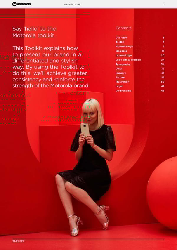
Motorola toolkit 2 02.06.2017 Say ‘hello’ to the Motorola toolkit. This Toolkit explains how to present our brand in a differentiated and stylish way. By using the Toolkit to do this, we’ll achieve greater consistency and reinforce the strength of the Motorola brand. Contents Overview 3 Toolkit 6 Motorola logo 7 Emsignia 15 Lenovo Logo 20 Logo size & position 24 Typography 34 Color 39 Imagery 46 Pattern 55 Illustration 60 Legal 62 Co-branding 63
Motorola toolkit Overview 3 Why bringing Motorola back Motorola has over 85-year history and is a much loved brand among consumers around the world. We believe this is something to embrace, not shy away from and are keen on building on this rich heritage as we continue to break the limitations of the smartphone industry. We pioneered the world’s first mobile cellphone, and then went on to dominate the cellphone world with the Razr. In an industry that was stagnant on incremental innovation for almost 10 years, with Moto Z and motomods we reimagined what a smartphone could do. Our reputation for game-changing innovations is not to be taken light of, and that’s why Motorola is the brand to look at once again. We have revitalized our iconic batwing and “hellomoto”, now it's time to live a new era for our Motorola brand. 02.06.2017
Motorola toolkit Overview 4 31.05.2017 Motorola Brand strategy Every successful brand has a model. Ours is called a ‘brand plus’. It explains in a few short sentences our motivation, what we do, what we promise, and our attitude. Our motivation To push beyond the expected and live a life less ordinary. Our attitude We are: lively not hectic, unexpected not silly, and bold not aloof. What we do Innovative products that deliver a better mobile lifestyle. What we promise We challenge convention to liberate you from the ordinary.
Motorola toolkit Overview 5 31.05.2017 The Motorola World Our world is young, spirited, and future forward. The perfect combination of style and engineering: Bold, but premium. Fashionable, yet fun . The colors, tone and casting reflect this. Whether a set or on location, we create a sharp, modern space. We always stayed grounded in reality, like the best version of the world we live in but with an unexpected and irreverent twist to it. This brand toolkit explains how to present our brand in a differentiated and stylish way. By applying it, we’ll achieve greater consistency and reinforce the strength of the Motorola brand. Say “hello” to Motorola World.
Motorola toolkit Toolkit 6 02.06.2017 gotham hellomoto "Different is better" Different is better should only be included on strategic communications or communications that reaches a large audience e.g.. TVC, OOH. Logos and Emsignia Lenovo Logo Color palette Imagery and pattern Typography Product wordmark Iconography To o l k it
Motorola toolkit Motorola logo 7 02.06.2017 Motorola logo Motorola logo Our iconic logo carries our name and character, acting as our signature for what makes us special and different. The Motorola logo is made up of the Motorola wordmark and iconic Emsignia.
Motorola toolkit Motorola logo 8 02.06.2017 Logo formats We have three different formats of the Motorola logo to allow flexibility of use across different communication mediums: – Horizontal, with Emsignia and Wordmark aligned horizontally; – Vertical logo, where Emsignia and Wordmark are aligned vertically; – Stacked Logo, where Emsignia and Wordmark are aligned in the center. These can be produced as a solid color, as outline or as breakout. Please always use official logo artworks, available to download from the Motorola Collective site. Horizontal Logo – Solid Horizontal Logo – Outline Vertical Logo – Solid Vertical Logo – Outline Stacked Logo – Solid Stacked Logo – Outline
Motorola toolkit Motorola logo 9 02.06.2017 Clear space To allow the Motorola logo to breath and be noticed, clear space rules have been defined. On most communication layouts, the clear space around the Motorola logo is defined by the width of the Lenovo logo. For size reference, please see page 18. If the Motorola logo is used by itself, e.g. TVC end frames, then the clear space is equal to half of the ‘o’ from the Motorola logo. This rule is applicable for both Flat and Outline versions of the Motorola logos. For creative layout exceptions, see Outline on page 9. Minimum size To retain visual impact minimum sizes have been defined. 0.25” 6.5mm 36px 1.12” 28.5mm 156px 0.42” 10.8mm
Motorola toolkit Motorola logo 10 02.06.2017 How we use our logo formats To maximize impact on communications you can choose between a small-scale, large-scale or stacked logo. Small-scale logo Our small-scale logo uses Flat color only to make sure we have maximum legibility. Our small scale logo can be positioned either horizontally or vertically. Large-scale logo Our large-scale logo features the Outline Emsignia only and can be positioned either horizontally or vertically. When to scale We change from the small scale to large scale logo format when the logo exceeds half of the width or height of the communication. Stacked logo The Stacked logo is used predominantly for digital and on screen landscape and squared formats (for example: TVC, animated banner end frames, social media profile pictures, etc...) Small-scale logo Large-scale logo Stacked logo
Motorola toolkit Motorola logo 11 02.06.2017 Example of TVC end frame Lorem ipsum dolor sit amet, consectetur adipiscing elit. Duis vitae justo nibh. Aenean et ornare felis. Curabitur in ligula maximus, sagittis neque sit amet, ultricies massa. Sed lorem tortor, placerat quis viverra id, sollicitudin at enim. Donec nisl dolor, ullamcorper non tempus eget, ullamcorper nec dolor. Small-scale logo Large-scale logo Stacked logo Don’t Don’t How we use our logo formats examples Don’t use the outline Emsignia logo version small as ledgibility becomes an issue Don’t use the solid Emsignia logo version large as it becomes too heavy in relationship to the wordmark
Motorola toolkit Motorola logo 12 02.06.2017 Logo versions Flat color logo The flat color logo can appear in any of the brand colors, except yellow, medium gray or light gray. Consider background colors and the product photography to create enough contrast for legibility and visual harmony. In all of the colors, the Wordmark is always used in white, except for when it’s on a yellow background – in this case the Wordmark can be black. Depending on your communication medium, or creative idea, you can use our logo in three different ways. Outline logo The Outline logo can appear in any of the brand colors. Always choose a color that helps unite the design layout. M ake sure there is sufficient contrast between the background and the ‘M’. Our clear-space rules can be broken when using the outline logo version at large scale. Imagery can interact with the Emsignia and/or wordmark with creative overlapping and see-through effects. Breakout logo The break-out Emsignia allows us to be expressive and playful. To make sure we retain our Emsignia trademark, it is important that the following overarching principles are followed: – Preserve the shape of the ‘M’ – Retain a circle containing shape around the ‘M’ – Avoid creating backgrounds that look like third logos have been created All breakout Emsignias created must be shared with the brand team for approval before using. Exceptions In exceptional cases only, we can use Flat and Outline logo versions where both the Wordmark and Emsignia are white. The Flat white logo can be used in 3D environments. All cases need approval by the brand team prior to use. Outline white logo Flat white logo
Motorola toolkit Motorola logo 13 02.06.2017 Never change the proportions of the Logo Always ensure there is enough contrast between the background and the Emsignia Always choose a background picture that allows legibility of the Logo Never use a solid yellow logo, keyline in yellow is fine Never use an Infill Emsignia with the wordmark Never use the wordmark on its own The ‘M’ inside the Flat color Emsignia should always be white Never lock-up ‘moto’ with the Emsignia, unless agreed with the Brand Team We will use the black wordmark when placing over a lightly colored image What not to do with our logo Never use the Stacked logo in a layout including product imagery and talent Never change the proportions of the Stacked logo Lorem ipsum dolor sit amet, consectetur adipiscing elit. Duis vitae justo nibh. Aenean et ornare felis. Curabitur in ligula maximus, sagittis neque sit amet, ultricies massa. Sed lorem tortor, placerat quis viverra id, sollicitudin at enim. Donec nisl dolor, ullamcorper non tempus eget, ullamcorper nec dolo Never obscure the logo with imagery that compromises its legibility Never use a different color Emsignia in the same communication
Motorola toolkit Motorola logo 14 02.06.2017 Never shorten the Wordmark Never use ‘hellomoto’ or other headlines locked up with the Emsignia What not to do with our logo (continued) Never alter the proportions of the Emsignia in the Vertical logo Never use the Emsignia as a substitute for an ‘o’ within the Wordmark Never use the Outline logo in a small format
Motorola toolkit Emsignia 15 02.06.2017 Emsignia Overview Our iconic Emsignia plays an important role within our visual identity. The Emsignia can be used either locked up with the Motorola wordmark or standalone as a graphic device. The Emsignia must never be locked with any other words. When to use which version Depending on the creative idea or communication medium, there are a number of versions of the Emsignia that can be used. 1. Solid color Emsignia 2. Outline Emsignia 4. Breakout Emsignia 5. Physical Emsignia Used in physical space only 3. Infill Emsignia Old The M is smaller inside the circle Current Always ensure you are using the current & correct artwork for the new Motorola Emsignia setting-out. Current Emsignia artwork
Motorola toolkit Emsignia 16 02.06.2017 Emsignia versions 1. Solid Emsignia The solid color Emsignia can appear in any of the brand colors, except yellow, medium gray or light gray. Always choose a color that helps unite the design layout. Consider background colors and the product photography to create visual harmony. The ‘M’ of the Emsignia must always remain white, no other color can be used. The solid color Emsignia, when locked up with the Motorola wordmark, should only be used at small scale. 2. Outline Emsignia The Outline Emsignia can appear in any of the brand colors. Always choose a color that helps unite the design layout. Consider background colors and make sure there is sufficient contrast between the background and the ‘M’. The Outline Emsignia, when locked up with the Motorola wordmark, should only be used at large scale.
Motorola toolkit Emsignia 17 02.06.2017 4. Breakout Emsignia The break-out Emsignia allows us to be expressive and playful. To make sure we retain our Emsignia trademark, it is important that the following overarching principles are followed: – Preserve the shape of the ‘M’ – Retain a circle containing shape and the ‘M’ – Avoid creating backgrounds that look like third logos have been created. All breakout Emsignias created must be shared with the brand team for approval before using. 5. Physical Emsignia The Physical Emsignia is best used in the real world such as in retail spaces, pop-ups, events or exhibitions. The same principles of legibility and content suitability apply. All Physical Emsignias created must be shared with the brand team for approval before using. 3. Infill Emsignia The Infill Emsignia can be used as a window into the Motorola world. Imagery, illustration and patterns can all be used. Our infills should always be lively, bold and unexpected. They should always reflect the Motorola color palette. The ‘M’ of the Emsignia must remain white, no other color can be used. Always make sure there is sufficient contrast between the chosen infill and the ‘M’. It is important that the ‘M’ isn’t worked into the Emsignia background. It should always sit on top of any pattern used. Avoid using infills that are obviously recognizable as products or brands. Emsignia versions (continued)
Motorola toolkit Emsignia 18 02.06.2017 When used as a graphic device, the Emsignia can be cropped as long as the complete Motorola logo also appears on the communication. Always make sure the Emsignia is recognizable. When zooming or cropping the Emsignia, make sure you see the outer circle and the ‘M’ together in a centralized position. Cropping the Emsignia Using the Motorola logo and Emsignia together When the Emsignia and the Motorola logo are used together on communication, they should always appear using the same color.
Motorola toolkit Emsignia 19 02.06.2017 Always ensure the Emsignia is not obscured by a busy background, typography, or imagery Never use inappropriate content and avoid using controversial images Always ensure the circle is retained The Emsignia should not be cropped in irregular shapes Never lock up the Emsignia with ‘moto’. For exceptions contact the Brand Team Never use the Emsignia as a logo in campaigns and events Never add elements to the Emsignia which compromise its legibility Never add elements to the Emsignia which can misinterpreted Never lock up headlines to the Emsignia Never use images that are too complicated Never use yellow a Solid color Emsignia Never use the Emsignia as a see through, apart from in 3D applications The ‘M’ in Solid color Emsignia should always be white Never alter the proportions between the Emsignia and the circle The ‘M’ should never be worked into the background of an Emsignia The ‘M’ in the Infill Emsignia should always be white Always ensure both the ‘M’ and the circle are in the same color Never change the proportions of the Emsignia Always ensure there is enough contrast between the background and the Emsignia What not to do with our Emsigna Never use a different color Emsignia in the same communication
Motorola toolkit Lenovo logo 20 02.06.2017 Lenovo logo Overview The Lenovo logo consists of a white wordmark within a container shape. The wordmark stays the same, but the color of the container shape can change. Clear space Minimum size To preserve the integrity of the Lenovo logo, always maintain a minimum clear space around the logo. The clear space for the Lenovo logo is measured by using the height of the ‘L’. The Lenovo logo retains its visual strength in a wide range of sizes. However, when the logo is reproduced too small, it is no longer legible and its impact is diminished. Print application The Lenovo logo should never be reproduced in a width smaller than 15 mm (6 in). Digital application The Lenovo logo should never be reproduced in a width smaller than 100px at 72dpi where possible. 15mm 6 in 100px
Motorola toolkit Lenovo logo 21 02.06.2017 Single color logo Where production limitations exist, a single-color Lenovo logo can be used e.g. on product packaging. Single-color logos have the wordmark cut through. This allows textures, patterns or imagery to show through the wordmark. In the event that a single color logo is required, we use either a black or white logo. Flat color logo On Motorola applications, the flat color version of the Lenovo logo should be used. It can be used in all of our colors, except yellow and light gray. The Lenovo logo should be applied in a different brand color to the Motorola logo (both the Emsignia and Wordmark). The color chosen for the Lenovo logo must be harmonious with the background color or object, but should always be visible. The Motorola logo color should always contrast with the background for maximum stand-out. Lenovo logo colors Examples in use
Motorola toolkit Lenovo logo 22 02.06.2017 Digital use The Lenovo logo must be tabbed to the right hand side of the layout. TVC use The Lenovo logo must be tabbed to the right hand side of the layout, aligned with the edge of the minimum visible area of the screen. Logo position in moving media Lorem ipsum dolor sit amet, consectetur adipiscing elit. Duis vitae justo nibh. Aenean et ornare felis. Curabitur in ligula maximus, sagittis neque sit amet, ultricies massa. Sed lorem tortor, placerat quis viverra id, sollicitudin at enim. Donec nisl dolor, ullamcorper non tempus eget, ullamcorper nec dolor. The new mot o z 2 play with moto mods Digital use TVC use
Motorola toolkit Lenovo logo 23 02.06.2017 Never use the single color logo when full color logo usage is possible The single color logo must only be applied in black or white Never orientate the Lenovo logo in the wrong direction The Lenovo logo must never be used in yellow The Lenovo logo must always appear in a different color to the Motorola Emsignia The Lenovo logo must always be placed on the right hand side The Lenovo logo must always be visible within the design The Lenovo logo should never be placed on the edge Never change the proportions of the Lenovo logo The Lenovo logo must always appear in a different color to the Motorola logo The Lenovo logo must always appear in its container shape Never use the Lenovo logo in outline format What not to do with the Lenovo logo
Motorola toolkit Logo size & position 24 02.06.2017 Logo sizes To ensure consistency across our communications, we have established fixed logo sizes for the Motorola and Lenovo logos across a wide range of print and digital formats. Size relationships have been defined for both small and large- scale Motorola logo versions: - EU standard print - US standard print - Billboards/OOH - Digital - Social media On extreme small formats, e.g. website small square or button advertisements, where the size of the application compromises the legibility of the Motorola or Lenovo logo, the Emsignia can be used by itself. For non-standard formats, see page 28 for guidance on how to size the Lenovo and Motorola logos. Example 96 sheet 12192x3048 (1:10) Logo sizes & position
Motorola toolkit Logo size & position 25 02.06.2017 Letter Half Letter Junior Legal Legal Tabloid A B E D C EU standard sizes: Small scale logo US standard sizes: Small scale logo A0 A1 A2 A3 Landscape A4 A5 DL A3 Portrait Logo sizes Format Format Motorola Lenovo dimensions logo logo width height (in) (in) (in) Half letter 5.5 x 8.5 2.2 0.87 Letter 8.5 x 11 3.35 1.26 Junior Legal 5 x 8 2.2 0.87 Legal 8.5 x 14 3.98 1.5 Tabloid 11 x 17 4.96 1.85 A 8.5 x 11 3.35 1.26 B 11 x 17 4.96 1.85 C 17 x 22 7.48 2.8 D 22 x 34 10.87 4.05 E 34 x 44 14.96 5.59 Logo sizes Format Format Motorola Lenovo dimensions logo logo width height (mm) (mm) (mm) A0 840 x 1188 388 145 A1 594 x 840 276 103 A2 420 x 594 195 73 A3 L 420 x297 139 52 A3 P 297 x 420 139 52 A4 210 x 297 88 33 A5 148 x 210 61 23 DL 100 x 210 61 23 Width Height
Motorola toolkit Logo size & position 26 02.06.2017 Example 96 sheet 12192x3048 (1:10) 96 sheet 64 sheet 32 sheet 16 sheet 12 sheet 6 sheet 48 sheet Logo sizes – EU standard sizes Format Format Motorola Lenovo dimensions logo logo width height (mm) (mm) (mm) 96 sheet 12192 x 3048 3050 1140 64 sheet 8128 x 3048 2110 790 48 sheet 6096 x 3048 1660 620 32 sheet 4064 x 3048 1230 460 16 sheet 2030 x 3048 880 330 12 sheet 3048 x 1524 830 310 6 sheet 1200 x 1800 530 200 Logo sizes – US standard sizes Format Format Motorola Lenovo dimensions logo logo width height (in) (in) (in) 96 sheet 480 x 120 120.08 44.88 64 sheet 320 x 120 83.07 31.10 48 sheet 240 x 120 65.35 24.41 32 sheet 160 x 120 48.43 18.11 16 sheet 80 x 120 34.65 12.99 12 sheet 120 x 60 32.68 12.20 6 sheet 47 x 71 20.87 7.87 Full banner Half banner S rectangle Half page L skyscraper Skyscraper Square Button S square M rectangle L rectangle Logo sizes Format Format Motorola Lenovo dimensions logo logo width height (px) (px) (px) Full banner 468 x 60 160 60 Half banner 234 x 60 160 60 Button 120 x 90 54 N/A Half page 300 x 600 179 67 L skyscraper 160 x 600 115 67 Skyscraper 120 x 600 67 67 Square 250 x 250 145 54 L rectangle 336 x 280 144 54 M rectangle 240 x 400 144 54 S rectangle 180 x 50 132 50 S square 125 x 125 54 N/A Billboards/OOH: Small scale logo Digital: Small scale logo
Motorola toolkit Logo size & position 27 02.06.2017 I Profile I Gallery I Image Y Cover Y Video Logo sizes Format Format Motorola Lenovo dimensions logo logo width height (px) (px) (px) FB* Profile 180 x 180 149 N/A FB* Cover 828 x 315 214 80 FB* Image 1200 x 630 329 123 I Profile 110 x 110 60 N/A I Gallery 161 x 161 90 N/A I Image 1080 x 1080 375 140 Y Cover 2560 x 1440 630 235 Y Video 1280 x 760 362 135 *FB = Facebook Social media: Small scale logo Small size logo colors At small sizes, ensure the Motorola logo uses a more vibrant color than the Lenovo logo. The Lenovo logo color should pick-up on a secondary color used within the photography. Platform logo adjustments The Motorola logo should always be visible regardless of display. Adjustments may need to be made for some platforms, e.g. YouTube requires the Motorola logo to be moved so that it is still seen on mobile displays. Facebook Profile Facebook Image Facebook Cover
Motorola toolkit Logo size & position 28 02.06.2017 Letter Legal Tabloid A B E D C A0 A1 A2 A3 Landscape A4 A5 DL A3 Portrait Logo sizes Format Format Motorola Lenovo dimensions logo logo width height (in) (in) (in) Half letter 5.5 x 8.5 4.92 0.87 Letter 8.5 x 11 7.64 1.26 Junior Legal 5 x 8 4.41 0.87 Legal 8.5 x 14 7.48 1.50 Tabloid 11 x 17 9.72 1.85 A 8.5 x 11 7.64 1.26 B 11 x 17 9.72 1.85 C 17 x 22 15.12 2.80 D 22 x 34 19.29 4.05 E 34 x 44 30.27 5.59 Logo sizes Format Format Motorola Lenovo dimensions logo logo width height (mm) (mm) (mm) A0 840 x 1188 743 145 A1 594 x 840 525 103 A2 420 x 594 371 73 A3 L 420 x297 262 52 A3 P 297 x 420 385 52 A4 210 x 297 188 33 A5 148 x 210 133 23 DL 100 x 210 84 23 EU standard sizes: Large scale logo US standard sizes: Large scale logo Width Height Half Letter Junior Legal
Motorola toolkit Logo size & position 29 02.06.2017 Example 96 sheet 12192x3048 (1:10) 96 sheet 64 sheet 32 sheet 16 sheet 12 sheet 48 sheet Logo sizes – EU standard sizes Format Format Motorola Lenovo dimensions logo logo width height (mm) (mm) (mm) 96 sheet 12192 x 3048 2630 620 64 sheet 8128 x 3048 2630 620 48 sheet 6096 x 3048 2630 620 32 sheet 4064 x 3048 2730 460 16 sheet 2030 x 3048 1810 330 12 sheet 3048 x 1524 1310 310 6 sheet 1200 x 1800 1060 200 Logo sizes – US standard sizes Format Format Motorola Lenovo dimensions logo logo width height (in) (in) (in) 96 sheet 480 x 120 103.54 24.41 64 sheet 320 x 120 103.54 24.41 48 sheet 240 x 120 103.54 24.41 32 sheet 160 x 120 107.48 18.11 16 sheet 80 x 120 71.26 12.99 12 sheet 120 x 60 51.57 12.20 6 sheet 47 x 71 41.73 7.87 Full banner Half banner S rectangle Half page L skyscraper Skyscraper Square Button S square M rectangle L rectangle Logo sizes Format Format Motorola Lenovo dimensions logo logo width height (px) (px) (px) Full banner 468 x 60 160 60 Half banner 234 x 60 160 60 Button 120 x 90 54 N/A Half page 300 x 600 255 67 L skyscraper 160 x 600 115 67 Skyscraper 120 x 600 67 67 Square 250 x 250 213 54 L rectangle 336 x 280 246 54 M rectangle 240 x 400 203 54 S rectangle 180 x 50 132 50 S square 125 x 125 54 N/A Billboards/OOH: Large scale logo 6 sheet Digital: Large scale logo
Motorola toolkit Logo size & position 30 02.06.2017 Logo sizes Format Format Motorola Lenovo dimensions logo logo width height (px) (px) (px) FB* Profile 180 x 180 131 N/A FB* Cover 828 x 315 262 80 FB* Image 1200 x 630 549 123 I Profile 110 x 110 60 N/A I Gallery 161 x 161 149 N/A I Image 1080 x 1080 986 140 Y Cover 2560 x 1440 1170 235 Y Video 1280 x 760 670 135 *FB = Facebook I Profile I Gallery I Image Y Cover Y Video Social media: Large scale logo Small size logo colors At small sizes, ensure the Motorola logo uses a more vibrant color than the Lenovo logo. The Lenovo logo color should pick-up on a secondary color used within the photography. Platform logo adjustments The Motorola logo should always be visible regardless of display. Adjustments may need to be made for some platforms, e.g. YouTube requires the Motorola logo to be moved so that it is still seen on mobile displays. Facebook Profile Facebook Image Facebook Cover
Motorola toolkit Logo size & position 31 02.06.2017 To ensure consistency across our communications, we have fixed logo positions for the Motorola and Lenovo logos. Motorola small-scale logo The small scale version of the Motorola logo must be positioned in the top left corner of any application. It sits against the top and left margins. Motorola large-scale logo The large scale version of the Motorola logo must be positioned at the top or left of any application. It sits at the top against the top, left and right margins when the horizon version is used, or sits on the left against the left, top and bottom margins when the vertical version is used. Lenovo logo The Lenovo logo is always positioned on the right edge of any application. Always sitting within the right margin, it can be moved up or down to allow for more flexibility when developing layouts. The Lenovo logo must not sit in the logo-free zones when space permits. How not to position the Lenovo logo Motorola large-scale logo position Motorola small-scale logo position Lenovo logo position Logo position Never position the Lenovo logo at the very top or bottom of the application. The Lenovo logo is always seen in its vertical orientation.
Motorola toolkit Logo size & position 32 02.06.2017 Scaling the Motorola logo on non-standard and extreme formats Always maintain the relative size relationships between the Motorola and Lenovo logos. This will ensure the right balance between the brands on all non-standard format applications: Small scale logo sizing Large scale logo sizing Width of Lenovo logo Width of Lenovo logo sets all four margins When sizing the Motorola and Lenovo logos on non-standard and extreme shaped formats, use the following principles: 1. Refer to the 'Logo sizes' tables shown earlier in this section to find the nearest dimensions. 2. If there is not a close size match in the 'Logo sizes' tables, use your best judgment to scale. Round the logo sizes up or down to the nearest whole number for ease of use. Refer to the examples shown throughout these guidelines as a guide. 3. Set all four margins to the width of the Lenovo logo. Lorem ipsum dolor sit amet, consectetur adipiscing elit. Morbi non lorem ligula. Duis luctus enim vitae tellus euismod, vitae pharetra lectus fi nibus. Sed sed semper orci. Skyscraper Event banners Due to the extreme shape format, the large scale Motorola logo is sized to fit exactly on its clear space, and the Lenovo logo doesn't appear. Event banners showing logos sized using best judgment and to suit the format and its purpose (i.e. strong visibility within the overall context of an event). Lorem ipsum dolor sit amet, consectetur adipiscing elit. Morbi non lorem ligula. Duis luctus enim vitae tellus euismod, vitae pharetra lectus fi nibus. Sed sed semper orci nunc sit amet neque. Small scale logo sizing The small scale Motorola logo size is determined by scaling the height of the Motorola wordmark to the width of the Lenovo logo. Large scale logo sizing The large scale Motorola logo size is determined by the margin. The margins are set by the width of the Lenovo logo. The large scale Motorola logo is scaled across the full width or height of the page from margin to margin, depending on which large scale logo version is used (horizontal or vertical).
Motorola toolkit Logo size & position 33 02.06.2017 Never use both Motorola logos in the same application Never use the small scale logo rule to size the large scale Motorola logo How not to size and position our logos Never place the small scale Motorola logo outside of the margins Always position the small scale Motorola logo in the top left corner of any application Never lock the Motorola and Lenovo logos together Never use the large scale logo rule to size the small scale Motorola logo Never lock the Motorola and Lenovo logos together Never lock the large scale Motorola logo and Lenovo logos together
Motorola toolkit Typography 34 02.06.2017 stylishmoto Typography Overview Our personality comes through not just in the words we use, but also in how those words look and feel. 1. Headlines Gotham Bold lower case Tracking: -40 Leading: 95% of the type size (e.g. 100pt type on 95pt leading) 2. Sub-headers Gotham Bold sentence case Tracking: 0 Leading: 115% of the type size (e.g. 10pt type on 11.5pt leading) 3. Body copy Gotham Book sentence case, product names in Gotham Bold Tracking: 0 Leading: 115% of the type size (e.g. 10pt type on 11.5pt leading) 4. Tagline Gotham Bold sentence case Tracking: 0 Leading: 115% of the type size (e.g. 10pt type on 11.5pt leading) 5. Legal line Gotham Book sentence case Tracking: 0 Leading: 115% of the type size (e.g. 10pt type on 11.5pt leading) 1. headlines are set in gotham bold tightly spaced lower case 2. Sub-headers are set in Gotham Bold sentence case. 3. Body copy is set in Gotham Book sentence case. When moto is included in body copy, it should be written in lowercase in Gotham Bold . 4. The tagline is set in Gotham Bold sentence case. 5. The legal line is set in Gotham Book sentence case.
Motorola toolkit Typography 35 02.06.2017 Ty p e co l o r Type should always appear in either white or black, depending on the background color. Color can be used to communicate key messages, or for emphasis. Whatever happens, your moto z force won’t crack under the pressure with the moto shattershield . Different is better Whatever happens, your moto z force won’t crack under the pressure with the moto shattershield . Different is better Typography color Examples in use moto z with moto mods ™ moto mods
Motorola toolkit Typography 36 02.06.2017 moto z moto mods moto g 5 plus moto z 2 play moto z ™ moto mods ™ moto g 5 plus moto z 2 play Product names 1. Product wordmark When 'moto' is used with a specific product name, it's important that it is written consistently across all communications. 'moto' should not be used as a stand-alone brand. 1. Product wordmark: The Motorola wordmark artwork is available to download from Motorola Collective. Product name is set in Gotham Light subscript and/or underneath at half the size of the x-height. 2. Product names in headlines: Gotham Bold Tightly spaced lower case Tracking: -40 Leading: 95% of the type size (e.g. 100pt type on 95pt leading) 3. Product names in body copy and subheads: Gotham Bold Lowercase Tracking: -20 Leading: 115% of the type size (e.g. 10pt type on 11.5pt leading) For greater emphasis in body copy you can also use one other brand color. Product names included in copy must be written on a single line where ever possible. Please refer to legal documentation around trademarking requirement when using 'moto' product names. Product names are created in Gotham Light. The only exception is 'motomods' where the artwork is available to download from Motorola Collective Generation numbers should always appear in superscript 2. Product names in headlines 3. Product names in body copy and subheads Examples of use moto z with moto mods ™ Never use product wordmarks in a paragraph. (please see page 34 for other examples of what not to do) Never lock up the product wordmark with the Emsignia How not to use the product names 1/2 x 1/2 x x-height
Motorola toolkit Typography 37 02.06.2017 hellomoto Combination words Drawing on our history, 'hellomoto' has an important role to play in building our brand recognition. 'hellomoto' can be used in headlines or in body copy, but must never be locked up with the Emsignia. It is a branding device, not a standalone brand. To maintain our trademark of 'hellomoto', it should always be written as one word. The only exception is where format space is limited, in which case it can be written over two lines. Color can also be used to create visual separation. ' hellomoto' in headlines 'hellomoto' should always be written in Gotham Bold, tightly spaced at -80pts. ' hellomoto' in copy 'hellomoto' should always be written lowercase in Gotham Book ‘hellomoto’ can also be split when an illustration or a product/talent photography is used in between the words, this can give the impression that it is still one word, and this is the only exception permitted . When 'hellomoto' is used as a headline, the Motorola logo should also be present. 'hellomoto' is not a substitutte for the Motorola logo. Building on the brand recognition of 'hellomoto', the following combinations can also be used. Adding to 'hello' 'hello' can be used in combination with other words to build emotion or focus on specific messages. 'hello' should be written in a different color for differentiation. Adding to 'moto' 'moto' can be used in combination with other words to build emotion or focus on specific messages. 'moto' should be written in a different color for differentiation. The words should express the brand personality of Motorola, or a particular feature of the product. hellomoto hellomoto hello moto uniquemoto stylishmoto hello chicago hello graduation
Motorola toolkit Typography 38 02.06.2017 Meet the razor-thin Moto Z Force, the future of smartphones. Colors must only be used as copy accent colors More than a laptop, the Yoga 910 understands your lifestyle. Never use tints Meet the razor-thin Moto Z Force, the future of smartphones.. Copy must always be legible on any chosen background MORE THAN A L APTOP, THE YOGA 910 UNDERSTANDS YOUR LIFESTYLE. the new moto c family What not to do with our typeface Never use Gotham Book in headlines Never use typography in upper case Typography should always be ranged left or right and never staggered Meet the razor-thin Moto Z Force, the future of smartphones. Never lock the product signature to the Emsignia Don't overcrowd or add unnecessary graphic elements Never use containers to display product names Never lock 'hellomoto' to the Emsignia 'hellomoto' should always be spaced at -80pt tracking and never set too open Typography should always be ranged left or right and never staggered Never use product wordmarks in body copy Never change point size on the same paragraph hellomoto
Motorola toolkit Color 39 02.06.2017 Overview Color plays an important role in creating our lively, bold, and unexpected look and feel. Black and gray are used only as accent colors. We use them when we need more contrast, e.g. within typography. White is an important color, as it provides moments of calm for our lively color combinations to stand out. When using color, do so with the mindset of simplicity – as too many colors together can create complexity and clutter. Although orange and pink are key colors in the Motorola palette, there are strict rules in how these colors together can be used: Orange must only be used with a gradient treatment when featured as the dominant color in an application e.g. as the background in a Moto Mods™ campaign. Pink can only be used as a secondary color in any application created e.g. applied as the Emsignia color in a largely yellow layout. LENOVO RED Pantone 485C CMYK 0.98.100.0 RGB 235.20.10 Web Hex #E1140A LENOVO PINK Pantone 7424C CMYK 5.90.10.0 RGB 240.65.135 Web Hex #F04187 LENOVO DARK GREY Pantone 432C CMYK 80.65.55.50 RGB 51.63.72 Web Hex 333F48 LENOVO ORANGE Pantone 1505C CMYK 0.72.100.0 RGB 255.106.0 Web Hex #FF6A00 LENOVO CYAN Pantone 637C CMYK 6 1 . 2 .7.0 RGB 70.200.225 Web Hex #46C8E1 LENOVO MEDIUM GREY Pantone 424C CMYK 57.47.4 8 .14 RGB 111.113.112 Web Hex #6F7170 LENOVO YELLOW Pantone 108C CMYK 0.5.100.0 RGB 254.230.0 Web Hex #FEE600 LENOVO GREEN Pantone 360C CMYK 61.0.95.0 RGB 106.195.70 Web Hex #6AC346 LENOVO LIGHT GREY Pantone 400C CMYK 23.20.25.0 RGB 196.190.182 Web Hex #C4BEB6 LENOVO BLUE Pantone 279C CMYK 71.37.0.0 RGB 62.141.221 Web Hex #3E8DDD LENOVO BLACK Pantone Black C CMYK 20.0.0.100 RGB 0.0.0 Web Hex #000000 WHITE Pantone N/A CMYK 0.0.0.0 RGB 255.255.255 Web Hex #FFFFFF Color
Motorola toolkit Color 40 02.06.2017 Where you use color Color has an important role to play on all our communications. It can be applied in a number of ways: 1. Backgrounds Color can be used in backgrounds, using a variety of techniques. 2. Environment Color can be used to enhance environments, to push sets from the real world into the Motorola world. 3. Objects Color can be used on objects in environments to help communicate our brand personality. 4. Talent & wardrobe Color can be used to bring vibrancy, energy, and attitude to our models and the clothes they wear. Objects Backgrounds Environments Talent & wardrobe
Motorola toolkit Color 41 02.06.2017 Gradient background Flat color background 1. Backgrounds Backgrounds form the foundation for our imagery. From solid to gradient colors we use light and shade to create depth and contrast, allowing our imagery to stand out and get noticed. Our bold and confident colors act as a bright canvas that showcase our products and messages, creating striking and distinctive communication. Deep color background Stylized background + horizon line
Motorola toolkit Color 42 02.06.2017 2. Environment Environments play an important role in grounding our imagery in reality. Whether found or created environments, color plays an integral role in making them uniquely Motorola. The Motorola world is best created by using one main color, supported by a secondary color contrasted with its natural environment of cement, stone, bricks, wood, etc. The fewer colors used, the more single minded, stylish, and focused the image becomes.
Motorola toolkit Color 43 02.06.2017 Color can be used on props to add a pop of color and contrast that adds personality to our images. Sometimes a graphic environment is found without color, but it can be transformed by adding colored objects. 3. Objects
Motorola toolkit Color 44 02.06.2017 Casting and wardrobe design are integral to our look & feel. There should be a challenger spirit to the way Lenovo Consumer models are styled. If they were in a crowd of people, they would be the first noticed. When selecting wardrobe for talent, think of the styling as almost a character in itself. It should have a vibrancy and life to it. Wardrobe isn't just about color, it should have the energy and attitude of Motorola. This is most closely represented in street fashion with a mix of costume design. 4. Talent & Wardrobe 20170516_A10_KRISTEL_ANDY_00143
Motorola toolkit Color 45 02.06.2017 Never use black and white photography Never use colors that are not from the Lenovo color palette Never use colors as duotone Never use black and white photography with special effects Never overuse the amount of colors within photography, be single minded Never use our colors as pastels Never use overcomplicated color backgrounds Never use different color palettes within photography Never use clashing color palettes within photography What not to do with color
Motorola toolkit Imagery 46 02.06.2017 We use striking imagery to help tell stories about our product features and benefits. Our imagery is always Lively, Bold, and Unexpected, conveying a premium and stylish look & feel. Our world is young, spirited, and future-forward. Grounded in reality but always vibrant. Using color, pattern, and texture to bring our brand to life. Our imagery should never be silly, hectic or aloof. Overview Imagery
Motorola toolkit Imagery 47 02.06.2017 How imagery is used Our imagery can be applied in a number of ways: 1. Backgrounds High-definition product photographs or renders. 2. Product Flat and graduated colors are used to create depth and contrast, to help our imagery to stand out. 3. Environments Found or created environments ground our imagery in reality. 4. Objects Objects play an important supporting role within our imagery. 5. Talent & wardrobe Talent and wardrobe that reflects our attitude and character. Environments Backgrounds Product Objects Talent & wardrobe
Motorola toolkit Imagery 48 02.06.2017 1. Backgrounds Backgrounds form the foundation for our imagery. From solid to gradient colors we use light and shade to create depth and contrast, allowing our imagery to stand out and get noticed. Graphic color backgrounds Our bold and confident colors act as a bright canvas that showcase our products and messages, creating striking and distinctive communications. Flat color background Gradient color background When using deep gradients, make sure that an area is true to the Motorola color. Product, pattern or photography can be applied to these backgrounds. Gradient color background Horizon line background Subtle horizon
Motorola toolkit Imagery 49 02.06.2017 1. Backgrounds Textured color backgrounds For added dimension and interest our colors can be usedas a textured background. These textures can be part of a broader architectural environment, or simply a close cropped element of texture that fills the frame. Metal shutters Painted concrete Stained wood Texture can be used to enhance our color backgrounds within photography. Painted wall Coloured plaster Coloured texture in architecture
Motorola toolkit Imagery 50 02.06.2017 2. Product Products should always be photographed or rendered in high definition. These images can be shot flat-on, angled or as detail shots. Product shots can also be displayed in stacked arrangements to demonstrate range diversity or product features and benefits. Lighting should encourage shadows, highlights and shading to give a natural depth to the shot, but shouldn’t be too dramatic. Images should have a natural tone: avoid harsh or flash lighting. Colors should look real, never fake. Screenfills should either feature an appropriate Motorola image or illustration, or, if required, specific partner imagery.
Motorola toolkit Imagery 51 02.06.2017 3. Environments Environments play an important role in grounding our imagery in reality. Found environments Sets should be built in uncluttered real locations. The architecture and design of the space should reflect the visual identity, through shape, pattern and texture The use of our color palette on objects or surfaces turn standard sets into Motorola unique sets. Created environments Sometimes creating environments within a space or studio is unavoidable. Use texture, shadow and color to emulate a real environment. The addition of objects can also help ground the environment. A clean, seamless space should be avoided.
Motorola toolkit Imagery 52 02.06.2017 4. Objects Objects play an important supporting role within our imagery. These elements can be used as visual metaphors and tools that give context to the product and story. Relatable and unexpected, but never silly or weird, these elements should push the line of everyday. Use our color palette to make them truly Motorola. Sometimes a graphic environment is found without color, but it can be transformed by adding colored objects.
Motorola toolkit Imagery 53 02.06.2017 5. Talent & wardrobe Casting and wardrobe are integral to creating unique Motorola imagery. The Motorola world is young, fresh and future-forward. Our talent should have attitude and character that reflects this. Talent Our talent should be styled but never polished. It should be clear that they, and the environment they're in, are from a real place. Character and personality can be communicated through actions as much as style. Poses and expressions should be lively, energetic and bold. When using talent for creative content, ensure imagery is never overly staged or treated. Wardrobe There is a challenger spirit to the way our models are styled. If they were in a crowd of people, they would be the first noticed. When selecting wardrobe for talent, think of the styling as almost a character in itself. It should have a vibrancy and life to it. Pattern can also help contribute to the energy and attitude. Motorola's style is most closely represented in street fashion with a mix of costume design.
Motorola toolkit Imagery 54 02.06.2017 Never use awkward angles that don't communicate product features or benefits Always use colors from the Motorola palette Never use colors in backgrounds which aren't from our color palette Never use models that don't reflect our attitude Never apply other creative elements on top of products (pattern, color block, illustration) Never use cluttered interior or exterior environments Never use wardrobe which doesn't reflect our style and brand personality Always use interesting and engaging surfaces when using texture in photography Don't over-complicate pattern, textures and color of backgrounds Do not use B&W imagery Do not use overly styled talent or too many color combinations - be single minded Do not overly pose talent Do not apply other color effects to imagery style art direction Do not use overly exaggerated expressions Do not use talent that is overly stylized and forced expressions What not to do with imagery
Motorola toolkit Pattern 55 02.06.2017 Patterns add depth, energy and movement to our communications. They help us to create a distinctive look and feel that helps us stand out from the crowd. Patterns can be applied in a variety of ways - from big and bold, to subtle and sophisticated. They can be used as metaphoric elements to help communicate product features or benefits, or purely to create bold and simple backdrops for our communications. Pattern can also appear in photography, through pattern in wardrobe and within the environments our products are placed in. Overview Pattern Avoid patterns that look unsophisticated and childish (please see page 56 for other examples) How not to use the patterns
Motorola toolkit Pattern 56 02.06.2017 How pattern is used Pattern has an important role to play throughout our communications. It can be applied in a number of ways: 1.Backgrounds Illustrative patterns that communicate product features and benefits. 2. Environment Patterns that bring energy and tone to sets when combined with surfaces or objects. 3. Wardrobe Patterns that add vibrancy and attitude to model outfits. Environment Backgrounds Wardrobe 20170516_A02_B_KRISTEL_ANDY_00103
Motorola toolkit Pattern 57 02.06.2017 1. Background Patterns can be used to help us to tell stories. Applied simply and boldly, pattern can communicate different product features and benefits, or illustrate key messages. These examples demonstrate different approaches to pattern around the concept of sound. Bold patterns
Motorola toolkit Pattern 58 02.06.2017 2. Environment 3. Wardrobe Pattern treatments can be extremely flexible. They can be applied to environments as shown in these examples – either within the construct of the set, or as animation within the environment content. Pattern can be added to either found or created environment, making them uniquely Motorola. There is a challenger spirit to the way our models are styled. If they were in a crowd of people, they would be the first noticed. When selecting wardrobe for talent, think of the styling as almost a character in itself. It should have a vibrancy and life to it. Pattern can also help contribute to the energy and attitude. The Motorola's style is most closely represented in street fashion with a mix of costume design.
Motorola toolkit Pattern 59 02.06.2017 Never create a shape for the Motorola logo to sit in Never use overly complicated patterns within illustration Never use patterns in a random way that has no relevance to the piece of communication Never use shapes around typography to accommodate pattern Never use pattern where the main communications becomes illegible Never use patterns that are stylistically distant from our visual identity direction Never overuse pattern across backgrounds and talent Never use color combinations that appear off brand Never use pattern where it fights with our logos or product Never use strong pattern behind copy Never create new brand elements Never use descriptive illustration that appears as pattern What not to do with patterns
Motorola toolkit Illustration 60 02.06.2017 Illustration Under construction
Motorola toolkit Illustration 61 02.06.2017 Never use badly drawn, overly complex hands Never use illustration styles as screenfills Never use overly complex color combinations Never use clip art icons Never use overly complex illustrations that clash with product and background Never use mixed styles of illustration Never use complex storytelling illustration Never add illustration to the Emsignia Never use unsophisticated illustration styles What not to do with illustration
Motorola toolkit Legal 62 02.06.2017 Legal 1) Moto brand elements must be the dominant branding. Moto brand elements include MOTOROLA, MOTO, (M), and Moto codes (i.e. Moto combined with another word, such as MOTOLOVE). When using the Lenovo brand, including the container logo, it must be substantially less dominant than the Moto brand elements, and separate from the Moto brand elements. 2) The appropriate Legal Entity Statement must be included. a. For materials featuring Motorola products, use “Designed and manufactured by/for Motorola Mobility LLC, a subsidiary of Lenovo” (for materials featuring both Motorola and non-Motorola products, add “Motorola branded phones are” to the beginning). b. For materials featuring the Motorola brand elements (Motorola, (M) or MOTO) and the Lenovo brand, but not Motorola products, use “Motorola Mobility LLC, a Lenovo Company” or “Motorola Mobility LLC is a subsidiary of Lenovo.” 3) Placement of Legal Entity Statement: a. TV Commercials—The Legal Entity Statement should be used prominently in close proximity to the Motorola/Lenovo logos, or at the end of the commercial. b. For Packaging—The Legal Entity Statement should be used prominently on the back of the box. Additionally, the (M), Motorola and Moto brand elements, as well as the name of the product (e.g. MOTO Z) must appear separately on the packaging. c. For internet sites, the following statement should be place prominently on the site: “Moto branded products are designed and manufactured by or for Motorola Mobility LLC, a wholly owned subsidiary of Lenovo”. d. For all other advertising materials that typically contain legal copy (e.g. a print ad) Legal Entity Statement can be incorporated at the end of the trademark statement, as a separate sentence. To ensure our legal line is always legible, it should never be reproduced in font size smaller than 4pt. The clear space for the legal line from each artwork border is measured by using the width of the ‘M’. The color of the legal line should be either white or black. Ensure that there is enough contrast between the legal line and background. Minimum size Clear space Color
Motorola toolkit Co-branding 63 02.06.2017 Co-branding Third-party content should always be placed in the top right, bottom left, or as a strip at the bottom of the communication. Third-party information should not mimic the Motorola style. Incorrect use Third party content Third party content Third party content Correct use
Motorola toolkit Brand team 64 02.06.2017 Brand team For further information regarding using the Motorola toolkit please contact the brand team. Erin Cochran North America ecochran@motorola.com Renata Silva L ATAM resilva@motorola.com Thibaut du Roure EMEA troure@lenovo.com Bridget Wu PRC wuyun2@lenovo.com Anna Ho APAC annaho@lenovo.com Nathalie Padilla npadilla@motorola.com Roberto Gomez Reyes rogomez@lenovo.com