OgilvyRED Future of Work Flipbook
OgilvyRED Think Series | 166 pages
The Future of Work: On the economy millennials will create from circumstances they have inherited By Jess Kimball Leslie, Chief Futurist APRIL 2017 OGILVYRED THINK SERIES
NEVER BEFORE HAVE AMERICAN COMPANIES TRIED SO HARD TO EMPLOY SO FEW PEOPLE. - !e Wall Street Journal February 1, 2017
INTRODUCTION A NORMALLY CHILL BARACK OBAMA ISSUES ONE HELL OF A WAKEUP CALL 4
ChameleonsEye/Shutterstock.com 5
“ We’re going to have to redesign the social compact in some fairly fundamental ways over the next 20 years. At some point, when the problem is not just Uber but driverless Uber, when radiologists are losing their jobs to AI, then we’re going to have to figure out how do we maintain a cohesive society and a cohesive democracy in which productivity and wealth generation are not automatically linked to how many hours you put in, where the links between production and distribution are broken, in some sense. Because I can sit in my office, do a bunch of stuff, send it out over the Internet, and suddenly I just made a couple of million bucks, and the person who’s looking after my kid while I’m doing that has no leverage to get paid more than ten bucks an hour.” -Barack Obama to David Remnick, November 28, 2016, !e New Yorker. 6
The Social Compact (noun) – The voluntary agreement among individuals by which, according to any of various theories, as of Hobbes, Locke, or Rousseau, organized society is brought into being and invested with the right to secure mutual protection and welfare or to regulate the relations among its members. Also known as the social contract. Images (left to right): !omas Hobbes, John Locke, Jean-Jacques Rousseau. 7
THINK ABOUT BARACK OBAMA’S WORDS FOR A MOMENT. 8
Our 44th president—a man who has been accused on many occasions of being way too even-keeled—has stated that we need to reinvent our entire society. Then he added that we’ve only got 20 years in which to do it. History fans might read Obama’s words and recall Dwight D. Eisenhower’s final remarks upon leaving office—specifically Eisenhower’s warning that the swelling postwar defense budget meant that the United States risked becoming a “military-industrial complex.” Those proved to be some sage words. It could be argued that a president leaving office is perhaps our best informed citizen, and that his or her warnings merit substantial consideration. 9
Obama is not unique in his beliefs. In recent Marx and Engels, ever the diligent futurists, years, an onslaught of the world’s brightest created a system for thinking about periods of economists and academics—Columbia University’s extreme change in human history back in the Joseph Stiglitz; Harvard University’s Thomas 1800s. Marx and Engels paid close attention to Piketty; Stanford University’s Nicholas Bloom; times of “contradiction” in modern history, specific Oxford University’s Richard Susskind; MIT’s times when the way things were socially done by Erik Brynjolfsson and Berkeley’s Emmanuel Saez the groups of regular people were very different —have sounded the same alarm, vociferously from the way things were economically organized declaring that the economy has begun rapidly by the powers-that-be. Whenever social behaviors changing, and we must alter the way society is clash the economic models, said Marx and Engels, structured to match its demands and constraints. revolution becomes an inevitability. Let’s stop there to apply this very timely idea to today… 10
MARX & NAPSTER Here’s a fun example of a Marxist “contradiction” decimating a market: remember the 2000s? I was in college at the time, and the way that we acquired our music was by illegally downloading MP3 files on Napster. At the time, the way the music industry wanted us to acquire music was to either download it from iTunes, or to buy and store it on compact discs. Hell no, we said to that! We’d rather wreck a $2,000 computer with a virus than pay $.99 for a song. So it’s easy to see, in retrospect, that there was a massive contradiction in the way that people behaved vs. the way the music market was organized. That same contradiction cleared the path for revolution, thus iTunes gave way to Spotify, and now artists you love can make between Music in the year 2000: How business was $0.006 and $0.0084 in exchange for a play. organized vs. How people behaved 11
If you don’t believe OBAMA, PIKETTY, MARX OR SEAN PARKER 12 Evan El-Amin/Shutterstock.com
!en consider… JEFF BEZOS In addition to these academics, the world’s most visionary CEOs have quietly prepared their business models for a world in which our economy is no longer structured around scarcity of resources (for example, oil and natural gas), but an unlimited abundance of them (for example, the sun). That’s a pretty huge change. Businesses built around the scarcity of resources represent a crazy percent of capitalism as we know it. 13
“ It’s probably hard to overstate how big of an impact artificial intelligence is going to have on society over the next 20 years.” -Jeff Bezos, Chief Executive Officer, Amazon The choices made by the world’s top CEOs speak volumes: there is a reason why Jeff Bezos has built his company’s new headquarters inside a working biome; why Brian Chesky has equipped Airbnb to help millions of Americans who can’t afford their (menacingly structured, subprime) mortgages with a new way to derive income from that same, ultimately unaffordable asset; why Elon Musk’s most treasured contribution to the world might be his solar-powered tiles. (And those little tiles, at scale, could decimate not 1 but 2 of the world’s 3 most valuable industries.) 14
ordering all kinds of beverages and snacks from an Amazon Airborne drone. That’s the type of use case the patent cites in its filing. These CEOs all know about the future reality to which President Obama alluded—they see that society is restructuring itself in some pretty fundamental ways—and while other companies are carrying on business as usual, those CEOs Those CEOs are not stopping, either: in December, are running around making their investments 2016, CB Insights uncovered illustrations from an and preparations. As was true when limitations Amazon patent for an “airborne fulfillment center.” of mercantilism gave way to the expanse of In other words, a patent for drones that can ferry capitalism in the late 1700s, periods of great goods to and from convenient, flying, unmanned economic tumult always yield great opportunity— warehouses. Imagine being at a ball game and for those who can see what’s happening. 15
THE CHANGE THAT IS ALREADY HERE, THE CHANGE THAT IS TO COME
In my last trend report, I posited that there is no longer such a thing as a traditional “competitive set” in business—that is, a notion that your company’s competitors are merely the other companies producing similar products. Instead, I believe your competition is everyone. I also believe that your competition is always Alphabet and Amazon, because these two guys like to gobble up industries for sport. 18 Radu Bercan/Shutterstock.com
The New York Times agrees with this thesis. Writing entertainment and finance. With the Five, unlike in January, 2017, Farhad Manjoo stated that in previous eras of tech, it is not clear that there Microsoft, Apple, Amazon, Facebook and Google are many potential disrupters among today’s have become the ‘Fearsome Five,’ with ‘no true start-ups. The battles for dominance in cloud competition’ in sight. In Mr. Manjoo’s words: “The services, artificial intelligence and data mining, Five are poised to jump beyond their corner of the voice-activated assistants, self-driving cars, virtual lagoon. Over the last few years they have begun to reality and most every other Next Big Thing are set their sights on the biggest industries outside being waged among the Five.” tech — on autos, health care, retail, transportation, Source: http://www.nytimes.com/2017/01/04/technology/techs-next-battle-the-frightful-five- vs-lawmakers.html?smprod=nytcore-ipad&smid=nytcore-ipad-share 19
OH BOY, THE HARD PART I promise that this report gets more fun soon, but first we have to talk about how truly bad things have gotten, in order to see how truly inevitable change is.
Here’s a painful reality that many of us have spent far, far too much time ignoring: 90% of America is really, really struggling right now. Not 20%, not 50%, 90%. It’s a very hard number to really understand, so here’s a series of charts that we can ponder as a collective. 22
When it comes to the pace of annual pay increases, the top 1% wages grew 138% since 1979, while wages for the bottom 90% grew 15%. Cumulative change in real annual wages, by wage group, 1979-2013 200% Top 1% 150 Bottom 90% ge since 1979 138% 100 50 owth in annual wa 15% e gr 0 -50 1980 1990 2000 2010 Cumulativ Measuring employment becomes a moot point when 90% of Americans are earning a stagnant wage. Source: EPI analysis of data from Kopczuk, Saez, and Song (2010) and Social Security Administration wage statistics. Reproduced from Figure F in Raising America’s Pay: %y It’s Our Central Economic Policy Challenge. 23
Outsized U.S. Income Inequality Persists in 2014 The incomes of the top 1% and 0.1% of U.S. families dwarf the bottom 99% $6,087,113 $6m p u o r g $4m h c a e n i e m o c$2m n i $1,260,508 e g a r e $295,845 $448,489 Av $33,068 $0 Bottom 90% Top 10% Top 5% Top 1% Top 0.1% No surprise that stagnant wages produce wild net worth and savings deficits. Source: Emmanuel Saez and !omas Pikkety’s analysis of IRS data. ©2015 Washington Center for Equitable Growth. Chart source: http://www.epi.org/publication/charting-wage-stagnation/ 24
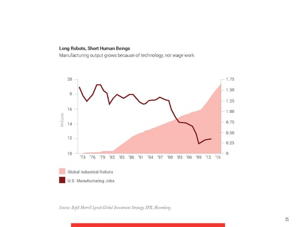
Long Robots, Short Human Beings Manufacturing output grows because of technology, not wage work 20 1.75 8 1.50 1.25 16 1.00 Millions14 0.75 0.50 12 0.25 10 ’73 ’76 ’79 ’82 ’85 ’88 ’91 ’94 ’97 ’00 ’03 ’06 ’09 ’12 ’15 0 Global Industrial Robots U.S. Manufacturing Jobs Source: BofA Merrill Lynch Global Investment Strategy, IFR, Bloomberg. 25
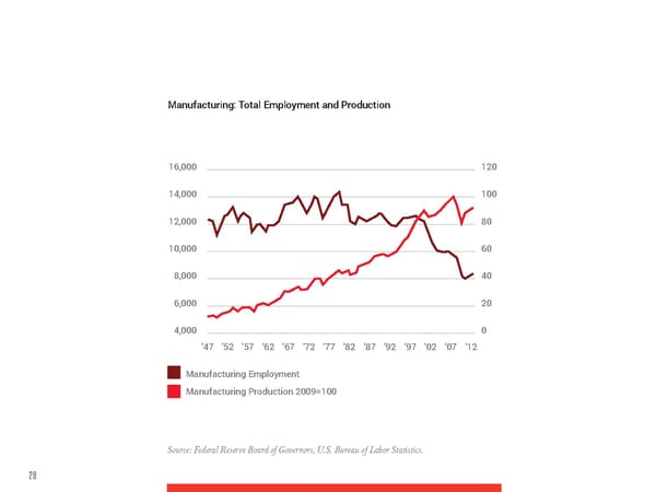
Manufacturing: Total Employment and Production 16,000 120 14,000 100 12,000 80 10,000 60 8,000 40 6,000 20 4,000 0 ’47 ’52 ’57 ’62 ’67 ’72 ’77 ’82 ’87 ’92 ’97 ’02 ’07 ’12 Manufacturing Employment Manufacturing Production 2009=100 Source: Federal Reserve Board of Governors, U.S. Bureau of Labor Statistics. 26
Where do you work? Estimates suggest a sharp increase in the percentage of the U.S. workforce that isn’t After successfully increasing employed directly by the company where they work. profits with technology, savvy CEOs are milking more money from employing less full-time 16 Independent contractors workers. The freelance economy 14 On-call workers thrives because it’s highly 12 desirable because it’s as profitable Temporary help agency workers (for companies) as it is desirable 10 (for their most expensive workers). Contract-firm workers 8 with one client Note: A janitor who is employed Contract-firm workers 6 with more than one client by a contract firm and cleans 4 five unrelated offices a week is counted as working for more 2 than one client. Data for 1995 0 and 2005 don’t include exact 1995 2005 2015 comparisons for that group. Source: Lawrence Katz (Harvard University) and Alan Krueger (Princeton University). !e Wall Street Journal. 27
With those charts in mind, we can fairly say… FOR 90% OF AMERICANS, A HARSH REALITY IS ABOUT TO GET HARSHER 28
“ The problem with the status quo “ Work hard, play hard” has been the overeager is that it isn’t static. It’s always motto of a generation in training for… what?—drawing hearts in cappuccino getting worse.” foam or plugging names and numbers into databases. The gleaming tech no-future of -from a talk with Paul Mason at !e Guardian Live, July 23, 2015 American capitalism was long ago packed up and sold to China for a few more years of borrowed junk. A university diploma is now worth no more than a share in General Motors. “ We’re not only talking about three and a We work and we borrow in order to work and half million truck drivers who may soon to borrow. Meanwhile, what we acquire isn’t lack careers. We’re talking about inventory education; it’s debt.” managers, economists, financial advisers, real estate agents.” -Communiqué from an Absent Future, 2009 -!e Great AI Awakening, !e New York Times, December 15, 2016 29
So we just looked at charts that show where we are today, now let’s talk about where we’re going. The next chart is from an Oxford Martin study on the future of employment. A note on how to read the chart, because it’s a LOT—from left to right, we see the likelihood of a computer taking a job away. The colors represent pools of workers in different sectors of industry. The reason the sectors’ colors are “smeared out” horizontally over multiple probabilities is because there’s a lot of deviation within a single sector. For example, certain kinds of construction workers face a medium likelihood of being replaced by a robot, and other kinds of construction workers face a very high likelihood. The cumulative charts we’ve just looked at are, in various combinations and permutations, often used to make the argument that capitalism has failed our post-technology society. In capitalism’s place, the aforementioned academics, CEOs and sitting president believe that we are now headed toward a post-capitalist future. 30
Low Medium High 400 33% Employment 19% Employment 47% Employment 300 millions) 200 yment ( Emplo100 0 0 0.2 0.4 0.6 0.8 1 Probability of Computerization Management, Business and Financial Office and Administrative Support Computer, Engineering and Science Farming, Fishing and Forestry Education, Legal, Community Service, Construction and Extraction Arts and Media Installation, Maintenance and Repair Healthcare Practitioners and Technical Production Service Transportation and Material Moving Sales and Related Source: http://www.oxfordmartin.ox.ac.uk/downloads/academic/!e_Future_of_Employment.pdf 31
EXAMINING POST-CAPITALISM WITH HOT DOGS ANDWIKIPEDIA
A REALLY FAST RECAP 01 Obama thinks we need to restructure the U.S.A.’s “social compact,” aka society 02 Academics agree with him 03 CEOs agree with him 04 Federal Reserve, Census & Bureau of Labor Statistics data agrees with him So what the hell does that mean—that ‘post-capitalism’ thing 34
Paul Mason, Erik Brynjolfsson, and Jeremy Rifkin believe that capitalism has failed to keep pace with the demands of technology, and therefore must be abandoned for a new model—a new social compact, if you will. These thinkers believe that capitalism was pretty well set up to navigate the past—to deal with a world where factory workers competed with other factory workers to produce the best product at the best price. Capitalism, however, doesn’t know how to cope with the one knowledge worker working in the basement, the one who writes the code that makes all those workers moot. 35
“ The art of management has been defined as knowing exactly what you want men to do, and then seeing that they do it in the best and cheapest way.” -Frederick W. Taylor 36
The “art of management,” as Frederick Taylor defined it, was built around the notions of centralization and hierarchy. In Taylor’s world, workers showed up from 9 to 5 on weekdays in order to be managed by a superior, who knew everything about what they were doing. These workers needed each other in order to be productive (the factory line can’t run with only 4 of its 20 people), and they also needed the manager to puzzle through any inefficiencies. The more efficient the group became with their time, the faster those goods got produced, the more money management made. Centralized factories—and companies—competed with each other to build the very best thing. Capitalism ‘got’ Ford vs. GM vs. Honda, for sure. What the aforementioned thinkers argue that it doesn’t ‘get’ is the Uber. 37
!e WWAAGEGE WORKER WORKER Peter Drucker would soon be replaced by the KNOWLEDGE WORKER 38
Before we delve deeper into the post-capitalist argument, it is now worth mentioning that one of post-capitalism’s founding fathers was the late, great Peter Drucker. He was the ultimate capitalist, the ultimate sharp-shooting, steel-eyed, practical exec in one hell of a suit. Peter Drucker was a legend who, in postwar America, all but invented the consulting models that minted McKinsey and its competitors. Peter Drucker was called “The Godfather of consulting” by no less than The Harvard Business Review. He was the original CEO whisperer, the man who helped boards and execs tweak their organizational practices and structures to be just that little bit more profitable and efficient. And then he saw the networked computer. 39
Through some miracle of clairvoyant intellect, their most profitable and productive when left this same man, at 80 years old, took a long look to do whatever they wanted, and that the best at the (pre-internet browser!) digital network CEOs of the future would quickly learn to accept and predicted that it would shatter capitalism this reality. altogether. Writing in 1992-1993, Peter Drucker said that the wage worker would soon be Unlike wage workers, knowledge workers replaced by the knowledge worker, and that the wouldn’t need to be managed* . “So how would trouble with these new knowledge workers would company hierarchies work?”, HBR asked Drucker, prove impossible for CEOs to manage or value. representing the question in all of its readers’ These workers wouldn’t need to all show up at heads. Well, Mr. Drucker replied, They wouldn’t. the factory at 9am. These knowledge workers The company hierarchy is dead. Mr. Drucker wrote would be decentralized. The best of them would a whole book about this whole theory, ultimately be unmanageable. In a lengthy 1992 interview with positing, that certain knowledge workers’ hours The Harvard Business Review, Drucker explained might become so valuable, they’d be worth 10,000 that the best of these women and men would be wage workers’ hours. 40
In the post-capitalism, knowledge worker economy, Wage Economy Knowledge Economy this would mean that a company could post the Paid by the hour Paid by the value of their contribution exact same profits on that 1 person while firing some or all of the other 9,999 people. Work regular hours Work whenever they want to Once those 9,999 people* Work in one location Work wherever they want were left without a way of supporting themselves, their lack of to/need to economic relevance would mark the decimating Hierarchical (Bosses/ Networked (It’s more subordinates/peers) complicated than that) blow to capitalism’s status as society’s main organizing principle. After all, capitalism can’t “organize society” if it leaves 90%+ of society out. * For those of you arguing that there are other potential outcomes for those 9,999 workers, look up Paul Krugman’s seminal 1997 “hot dog” theory; it’s extremely Googleable. Krugman’s answer, in short, is Well, yes, there are sort of other outcomes for those other workers, but ultimately no, not at sustainable scale. 41
SO WOULD THIS BE UTOPIA? UH, NO. 42
It is worth noting here that post-capitalism is not Marxism or socialism: there are still companies in a post-capitalist world, and they still make hearty profits, they just employ far far far less people and tend to give a lot more away for free (or for “close to free”) than current companies do. More on that in a while. And one of post-capitalism’s main beliefs is that society ultimately will also have to—as Obama said—create a social welfare system for the 90% or so of people who are left out of work, rendered irrelevant by machinery. 43
WAIT! THERE’S ONE MORE POST-CAPITALIST. ADAM SMITH 1723 - 1790 44
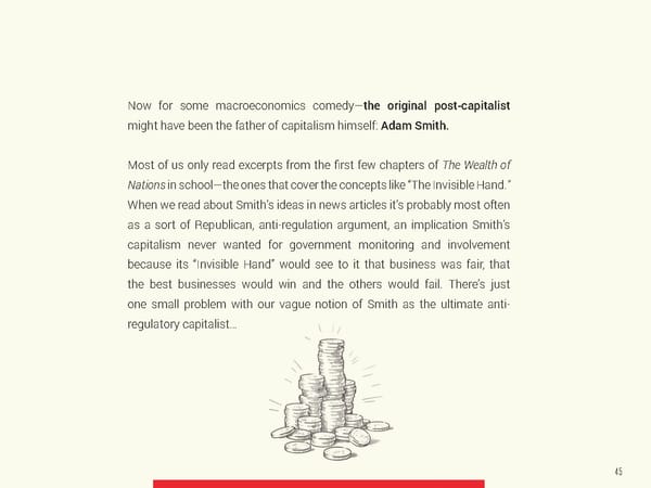
Now for some macroeconomics comedy—the original post-capitalist might have been the father of capitalism himself: Adam Smith. Most of us only read excerpts from the first few chapters of The Wealth of Nations in school—the ones that cover the concepts like “The Invisible Hand.” When we read about Smith’s ideas in news articles it’s probably most often as a sort of Republican, anti-regulation argument, an implication Smith’s capitalism never wanted for government monitoring and involvement because its “Invisible Hand” would see to it that business was fair, that the best businesses would win and the others would fail. There’s just one small problem with our vague notion of Smith as the ultimate anti- regulatory capitalist… 45
GOD IS IN THE DETAILS Smith never talks about “The Invisible Hand” as being some giant justification for ADAM SMITH’S unregulated capitalism, for governments stepping aside “INVISIBLE HAND” to ‘let businesses do what businesses do.’ Smith mentions Google Search Results: 10MM+ the concept once, in a chapter Actual Mentions in !e Wealth of Nations: 1 on regulating imported goods. 46
Smith mentioned the word ‘regulation,’ however Adam Smith, like Marx, foresaw that ever-increasing 123 times in The Wealth of Nations. Smith was a efficiencies would either render regular workers big, big fan of heavy government regulation. He to a state of unhappiness, a state of uselessness, went as far as to say that in any capitalist system or both. without government regulation, man “generally becomes as stupid and ignorant as it is possible In 2015 Katrine Marçal wrote an outstanding book for a human creature to become.” called Who Cooked Adam Smith’s Dinner? In the Smith was not the limited government capitalist text, Marçal delightfully points out that Smith was that some might like us to think he was. In fact, also something of a giant adult baby, as he lived at he was a Scottish Enlightenment thinker who home with his mother for most of his life. Marçal’s harbored deep concerns about where machines goal was to poke holes in his theories of capitalism and capitalism would ultimately lead society. as being a representation of anything exhaustive— capitalism, in the way Smith outlined it, leaves a lot of important workers out of its model. 47
Marçal’s thesis is that capitalism, as a idealogical most important work, such as child-rearing, caring system, is flawed. And likely now fatally so. for the elderly and sick, housecleaning, chores. Case in point, whilst Smith penned his various While we were able to get away without discussing theories on how the economy works, his mother “ghost work” or as I like to say, “most work,” for a was making his food and washing his clothes. In handful of decades, Marçal argues that the creep his writings, Smith conveniently valued his mother’s has been too great. Capitalism as a system no contribution to the global economy at zero. Her longer behooves our reality. work was ghost work, or what economists call ‘shadow work.’ Marçal argues that, by Smith’s definition, most of the world’s work is ghost work, and entirely left out of economic measures. (So Capitalism = A model that leaves out most work.) This ghost work is also much of society’s 48
49
SWEET LORD,WHAT DO I DO ABOUT ALL THIS? Let’s examine the future through two lenses — First, let’s look at the death of the company, as we previously understood it to exist. And then we’ll start examining how new careers are changing form to meet the demands of a different economy.
THE NEW COMPANIES
“In the next 10 years, 40% of the Fortune 500 companies will be GONE -2014 study from the John M. Olin School of Business at Washington University. 54
IT’S A BIRD, IT’S A PLANE, Is Dollar Shave Club: IT’S A… COMPANY!? A A COMPANY? A SUCCESSFUL STARTUP? They sold every product at a loss Here’s a fun business guessing game: What is Dollar Shave Club? B A NEW PRODUCT? The production was entirely outsourced to Dorco, a South Korean company (the same product can be bought directly from Dorco) C A POWERFUL BRAND? Do brands have to be profitable to be successful? 55
The internet has made it possible for venture-funded, $100MM-in-revenue retailers to pop up virtually overnight. Kleiner Perkins’ Mary Meeker warned about this new phenomena this summer. Let’s look at Mary’s report: traditional retail had a wretched 2016, and they’re about to have a far worse 2017. Why? Their businesses have become bloated, leaving them as easy for tech to undermine as the entertainment industry was in 2001. Here’s the trend, as beautifully analyzed by the prophetic Ms. Meeker: In the forthcoming chart, Ms. Meeker explains that it is now possible for an upstart company to quickly develop a quality product (say, a mattress, a la Casper), delete as many legacy costs as you can (like retail space, distribution inefficients, etc), hyper-target your advertisements using the Facebook ad exchange, and build a $100MM brand in a year or five. 56
Sales growth for select internet retailers*, USA First 5 years since inception $100 Many internet retailers/Brands @ $100MM ) $80 in Annual Sales* in <5 Years… M Took Nike 14 years, Lululemon 9 years and M ($ Under Armour 8 years s $60 e l Viral Marketing/Sharing Mechanisms a S l (Facebook/Instagram/Snapchat/Twitter…) a $40 u n + On-demand purchasing options via An $20 mobile/web + Access to Growth Capital + Millennial Appeal = Enabling Rapid $0 Growth for new products/brands/retailers) 012345 Years since inception Average Source: Federal Reserve Board of Governors, U.S. Bureau of Labor Statistics. 57
THE CONVENIENCE ‘STITCHED’ INTO THESE BUSINESSES IS OFTEN DELIGHTFUL Look at Stitch Fix. Why would anyone go to Macy’s when there’s that thing!? Clothes picked out just for me, by a real stylist, based on my needs, and sent to my home? Oh and wait, you mean Stitch Fix is just going to get better and better and better, thanks to machine learning? And Rent the Runway is going to make ‘buying’ many types of clothes (like things for parties and events) totally moot, because renting is smarter, easier and cheaper? Source: Internet Trends 2016 – Code Conference, Mary Meeker, (Short the big bloated retail stocks, now, people!) June 1, 2016, www.kpcb.com/InternetTrends 58
59
COMPETING IN THE NON-RIVAL, POST-CAPITALIST AGE 60
As mentioned earlier, a capitalist economy was built around the concept of scarcity, but post-capitalist companies must be built around abundance. This is because goods in a capitalist economy were rival, meaning that they were made from materials that were limited in supply (either labor or resource) and thus had a certain cost of reproduction. Now many of the most valuable goods of post-capitalism are non-rival—meaning that they have zero cost of reproduction. 61
Here’s a simple example, which I’ll rehash from Paul Mason’s excellent book POST-CAPITALISM: A GUIDE TO OUR FUTURE – if I drink your beer, you have to go buy another one. You can’t just click a button and reproduce your beer, because it’s gone. That’s an example of a traditional capitalist good. 62 Trong Nguyen/Shutterstock.com
Extend the beer example out to the economy, and competition occurs through the creation other, rival beer companies making other kinds of beer, with the market determining the winners and the losers. The winner is thus determined by that “Invisible Hand” thing economists have so loved talking about for so long. 63
Post-capitalism’s priciest goods, however… Information-based goods can be copied—for example, both of us could use my Kendrick DON’T WORK THIS Lamar MP3 at the same time if you stole it from me, unlike with my beer. WAY AT ALL, Hal Varian and Carl Shapiro first wrote about BECAUSE THEY’RE this idea in their crazy excellent 1998 book Information Rules. Tech companies “build” with zeros and ones, which are a type BUILT WITH of ideas that can be instantly copied for free, aka a non-rival good. Their rules are INFORMATION AND inherently, entirely different than a rival good’s governing rules. INFORMATION IS NON-RIVAL 64
Take Uber’s $70B valuation. What’s so valuable there? Largely its code. Google’s search engine and ad exchange? A pile of code. Facebook’s social networks and ad exchange? Code. Three streams of code, each producing billions and billions every quarter, and technically anyone could copy them. The network should hold intrinsic value, but many of these networks can be replicated very quickly, as Curb proved to Uber. 65
Aside from the obvious need to protect IP at all costs, these business models create other new challenges. Uber has made the specific point of being responsible for as little in the physical world as it possibly can—Uber’s drivers are left to assume the financial responsibility for their car leases. Sure it’s nice to be nimble as Uber is—it’s the business version of receiving all the benefits of marriage without having to actually care about another person—but that unlimited supply of zeros and ones can mean it’s extremely hard to create an entrenched advantage. 66
Let’s look at Uber vs. the new taxi-hailing service one of the hottest companies in the country. Curb. Built by Verifone, Curb is an Uber copycat That’s post-capitalism in action, and the immense that thanks to non-rival goods, was able to “copy complexities of competing in a world of networks paste” a bunch of Uber’s most important ideas and non-rival goods. (tethering cars to a map via GPS, etc). When Uber—long known for being cavalier— responded insensitively to President Trump’s Muslim ban, young people took to Twitter and implored each other to #deleteUber. The campaign went so viral, Uber’s often-ignored competitor Lyft became one of the 10 most downloaded apps. 200,000 Uber accounts were deleted. One day Curb didn’t exist, and then one day it did. One day Lyft was an unpopular step sibling to its private stock superstar older brother Uber, and the next day (literally, the very next day) Lyft was 67
COMBINATORIAL INNOVATION: THE INNOVATION MODEL OF POST-CAPITALIST, NON-RIVAL GOODS-BASED COMPANIES Innovation has always been “combinatorial” in nature, aka reliant on several things being invented and popularized at once. We wouldn’t have mass media without the telephone, radio and electricity. The term “combinatorial innovation” refers to a different kind of convergence—one where the “puzzle piece”—like nature of technologies mean that companies can open up their code to each other and almost instantly create something new. Combinatorial also refers to the abundance of technologies and systems that many companies can instantly build upon. So it’s not just innovation because Uber can team up with restaurants and create Uber Eats, it’s the existence of GPS, peer economies, big data cloud servers, etc etc etc. 68
Here’s a chart that’s frequently used to show how combinatorial innovation works: Internet Social Mobile Foundation Cloud Logistics internet Energy internet Big Data - Analytics Maker Economy 3D Printing Autonomous Vehicles Renewable Energy Sharing Economy Accelerators Connected Healthcare Internet of Things New Generation Automation Cognitive Systems Smart Cities Robotics Next Generation Education Smart Homes Connected Car Unknown Smart Grid Technology Progression Disruptive Scenarios New Economic Paradigm Source: Frank Diana 69
LET’S PUT COMBINATION INNOVATION IN HISTORICAL PERSPECTIVE FOR A MOMENT 70
The economists Richard Lipsey and Kenneth Carlaw created a set of constraints around what defines a very important technology, which they call a “General Purpose Technology.” By its definition, a General Purpose Technology, or GPT, is: 01 A single, recognizable generic technology 02 Initially has much scope for improvement but comes to be widely used across the economy 03 Has many different uses 04 Creates many spillover effects A GPT can be a product, a process or an organizational system. 71
Let’s look at the qualifying General Purpose Technologies that man created before the computer: GPT Spillover Effects Date Classification Domestication of plants Neolithic Agricultural Revolution 9000-8000 BC Process Domestication of animals Neolithic Agricultural Revolution, Working Animals 8500-7500 BC Process Smelting of Ore Early metal tools 8000-7000 BC Process Wheel Mechanization, Potter’s wheel 4000-3000 BC Product Writing Trade, Record keeping 3400-3200 BC Process Bronze Tools & Weapons 2800 BC Product Iron Tools & Weapons 1200 BC Product Water wheel Inanimate power, Mechanical systems Early Middle Ages Product Three-Masted Sailing Ship Discovery of the New World, Maritime Trade, Colonialism 15th Century Product Printing Knowledge economy, Science education, Financial credit 16th Century Process Factory systems Industrial Revolution, Interchangeable arts Late 18th Century Organization Steam Engine Industrial Revolution, Machine Tools Late 18th Century Product Railways Suburbs, Commuting, Flexible location of factories Mid 19th Century Product Iron Steamship Global agricultural trade, International tourism, Dreadnought Battleship Mid 19th Century Product Internal Combustion Engine Automobile, Airplane, Oil Industry, Mobile warfare Late 19th Century Product Electricity Centralized power generation, Factory electrification, Telegraphic communication Late 19th Century Product Automobile Suburbs, Commuting, Shopping Centers, Long-distance domestic tourism 20th Century Product Airplane International tourism, International sport leagues, Mobile warfare 20th Century Product Mass Production Consumerism, Growth of U.S. economy 20th Century Organization 72
Okay, so that’s a lot of recognizable stuff. Notice, however, “hitting” at the same time spurred an Industrial the vast gaps of time in between each innovation—wherein Revolution, then what can 10 simultaneous new society has centuries, and sometimes millennia, to adjust technologies do? to the new stuff altering their existences. That’s basically the question society is about to Oh look, there’s the three-masted sailing ship. answer over the course of the next 10+ years. That’s pretty cool! Those people’s grandkids invented the next thing on that list: the printing Here we get at many economists’ arguments for press. As we know, it was a big deal. Martin Luther Trump-ism; the election was largely decided by a forever altered Europe in 1517 with a (printed) few Midwest “Rust Belt” states, places wherein list of theses questioning the church’s power. In the key issue was the economy. Trump’s promise the late 1700s, when the invention of the steam of an economic time machine—and his past- engine and the factory system collided, the tense sloganeering of “Great Again”—was actually change was so societally tumultuous that, among addressing the most pressing societal issue of myriad consequences, the Luddites protested the the day: jobs. His team just seems to lack the Industrial Revolution for years. understanding Obama’s had—that dependable jobs, real middle class jobs, protected by unions, tenure That’s why the “combinatorial” word is so potent and benefits—aren’t ever coming back again. in combinatorial innovation: if 1-2 technologies 73
TAKE WAZE ALL THE WAYS WAZE Many of us had access GPS and digitized street maps well before Waze existed, by way of Mapquest or IS COMBINING perhaps a Garmin device in our car. These products could effectively tell us where we wanted to go. What makes Waze special is that it layered together many TECHNOLOGY non-rival goods to make a delicious sandwich that can tell us where we want to go as efficiently as possible, in TO MAKE A NEW that exact moment. SUPER-TECHNOLOGY As Paul Mason argues in his book Postcapitalism: A Guide To Our Future, there’s no Waze without DARPA. There’s no Waze without Google, even before Google bought the thing. The products had to combine. Adam Smith never imagined such situations. (Marx, to some extent, did, in a text called Fragment on Machines). Waze was only made possible through the existence of other semi-open source, semi-free things. 74
WITH TRADITIONAL GPS A network of 24 geosynchronous GPS satellites built and maintained by the U.S. government DIGITAL STREET MAPS A global API created by Alphabet LOCATION COORDINATES FOR CARS Broadcast by the Waze app—this is a little of the special sauce that they added A SOCIAL NETWORK For users to chat about traffic conditions through a series of alerts 75
DID HISTORY REWRITE ITSELF? At one point in his 1993 book, Peter Drucker argues that Marxism was “wrong” because ON MARXISM, THE PROLETARIAT, Marx’s predictions of revolution never happened at the scale he imagined. Or as Harari writes in AND THE QUIET COMPROMISES 2016, we never bore witness to Marx’s prediction of “an increasingly violent conflict between the OF THE BOURGEOISIE proletariat and the capitalists, ending with the inevitable victory of the former and the collapse of the capitalist system.” In Yuval Noah Harari’s outstanding new book HOMO DEUS, he reflects on the rampant similarities Harari goes on to make the fascinating argument of today to Marx’s time—the few holding all the that because Marx wrote Das Kapital and people wealth and power, the many attempting, often in actually read it, he prevented the very future vain, to alter that reality. he predicted! 76
In Harari’s words (and I strongly recommend reading the entire book): “Marx forgot the capitalists know how to read. At first only a handful of disciples took Marx seriously and read his writings. But as these socialist firebrands gained adherents and power, the capitalists became alarmed. They too perused Das Kapital, adopting many of the tools and insights of Marxist analysis. In the twentieth century everybody from street urchins to presidents embraced a Marxist approach to economics and history. Even diehard capitalists who vehemently resisted the Marxist prognosis still made use of the Marxist diagnosis. […] As people adopted the Marxist diagnosis, they changed their behavior accordingly. Capitalists in countries such as Britain and France strove to better the lot of the workers, strengthen their national consciousness and integrate them into the political system. Consequently, when workers began voting in elections and the Labour gained power in one country after another, the capitalists could sleep soundly in their beds. As a result, Marx’s predictions came to naught. This is the paradox of historical knowledge.” 77
Ah, the power of reading 78
Speaking of reading (or the present cultural lack situation. “Malcolm X had it straight when he said thereof), let’s turn to my favorite economist- the first step in revolution is massive education of slash-humorist, Joe Bageant. Mr. Bageant wrote the people,” Joe wrote. 2007’s mind-altering book Deer Hunting With Jesus: Dispatches From America’s Class War. In his final blog post (entitled “America: Why are r peeps so dum?”), written in 2010, Joe Bageant The book audaciously predicted that America wrote that “Societies declining into obsolescence was becoming so unequal, soon the labor class understandably resist looking forward, and hang would find a way to rise up and revolt against the onto their past mythologies.” I often wonder country’s ruling class. Mr. Bageant, a journalist, what Joe would have written if he’d lived to see was raised in rural Virginia. (You can think of the golden 757 touring America, and the crowds his writing as a less personal, more researched of people proudly sporting their made-in-China predecessor to the 2016 bestseller Hillbilly Elegy). American greatness hats. With typical Bageant After George W. was elected for his first term, Joe sprite, he carried on: “Meanwhile, here we are, began writing about how his New York City friends American riders on the short bus, barreling into didn’t know or care about his Virginia friends— the Grand Canyon. With typical American gunpoint Joe’s original American community and family. optimism, we’ve convinced ourselves we’re in Joe’s writing very thoughtfully worries about his an airplane.” Virginian friends’ declining relevance in the global economy—and their lack of understanding of this I write this section not to provide answers, but context. 79
WAIT PEOPLE ENJOY WORKING FOR FREE? 80
Does anyone pay you to update Facebook in the afternoon, adding to its value and intelligence? How about YouTube? Twitter? Instagram? Wikipedia? 250 million new photos are uploaded each day to Facebook. 43,000 hours of new YouTube videos are added each day. Then there’s the starred reviews on Amazon, Tripadvisor and Yelp. You see what I’m getting at: little bits of unpaid labor are cumulatively adding up to something powerful. 6 OF THE INTERNET’S 10 MOST VISITED SITES ARE CREATED ENTIRELY FROM USER GENERATED CONTENT, OR, IN OTHER WORDS, UNPAID LABOR. (The Majority of) Movies: Made by unionized workers, for agreed wages (The Majority of) YouTubes: Made by regular people in their down time 81
!is is a super confusing notion for capitalism, because That’s $2 trillion released from the labor market capitalism doesn’t have a reason as for why someone over to the non-labor market—thus those tasks would want to complete unpaid labor. More complex is becoming the same type of shadow work that Smith the fact that these unpaid, unmeasured labor pools can eat away at the revenue streams from the traditional, didn’t account for his own mother completing— paid labor pools. thanks to computer networks. Things people do for free. The work that people are willing to do for free is capable of eating entire industries. Research done by the authors of The Second Machine Age (the source of the above perspective Here’s an example of what I mean—think about on unpaid labor markets) estimates that “a correct the movie that a couple doesn’t go see in the accounting for computer-related intangible assets theater because they spent their Saturday evening would add over $2 trillion to the official estimates watching funny YouTubes, instead. Let’s say many of the capital assets in the United States economy.” of those YouTubes were made by people who were All those YouTubes providing entertainment in the never paid to post them—they merely captured place of movies, Wikis usurping encyclopedias, funny, interesting stuff that happened for the sake craigslist ads circumnavigating the newspaper ads. of sharing it with the world. 82
83
Think about how Kodak must feel about those aforementioned Facebook photos—or the fact that 3.5 billion photos were taken last year. (!at’s a full 10% of the 3.5 trillion photos taken since 1838). Money is still made off of photos—lord knows the kids at Instagram have the bank accounts to prove that one—there’s just less of it to go around. This is the reality of companies of the future. 84 urbanbuzz/Shutterstock.com
85
LESS PEOPLE, SAME PROFITS 86
This is a Foxconn Foxbot. Foxconn employs over a million Chinese workers, but 60,000 of those employees were just terminated and replaced with robots. Foxconn wants to build the world’s smartphones as a fully automated factory. No human employees working the assembly line. That’s its goal for the future. (Hey Trump: this future’s inevitable.) 87
FOXCONN IS NOT SOME CRAZY OUTLIER 88
Image courtesy of Rethink Robotics, Inc. 89
“To train Baxter, you grab it by the wrist and guide the arm through the motions you want it to carry out. As you do this, the arm seems weightless, its motors are working so that you don’t have to. The robot also maintains safety; the two arms can’t collide (the motors resist you if you try and make this happen) and they automatically slow down if Baxter senses a person within their range. Baxter has a few obvious advantages over human workers. It can work all day every day without This is Baxter, the humanoid robot needing sleep, lunch, or coffee breaks. It also won’t that made a memorable cameo in demand healthcare from its employer or add to the payroll tax burden. And it can do two completely the book The Second Machine Age unrelated things at once.” 90 Image courtesy of Rethink Robotics, Inc.
The trouble with cheaper and cheaper technology In 1964, the nation’s most valuable company, is that employs less people. Ford cites the example AT&T, was worth $267 billion in today’s dollars of one of their factories—a facility in Gaffney, South and employed 758,611 people. Alphabet is worth Carolina that produces 2.5 million pounds of cotton $370 billion but has only about 60,000 employees. yarn a week. It has fewer than a hundred and fifty Facebook is worth two hundred and seventy billion workers. The New York Times ran a story about * dollars and employs just thirteen thousand people . the Gaffney factory with the headline “U.S. textile plants return, with floors largely empty of people.” It’s not just that companies will be able to profit with less on staff, the companies able to harness the best talent will be able to compete in more and more categories. I sometimes joke that the… Fortune 500 is becoming the Fortune 5. 91
“ The most important thing happening in Silicon Valley right now is not disruption. Rather, it’s institution-building — and the consolidation of power — on a scale and at a pace that are both probably unprecedented in human history.” -“!e Great AI Awakening,” !e New York Times, December 15, 2016 92
According to !e Economist, “The share of GDP generated by America’s 100 biggest companies rose from about 33% in 1994 to 46% in 2013. The five largest banks account for 45% of banking assets, up from 25% in 2000.” 93
94 Nataliya Hora/Shutterstock.com
A casual segue to a chat about AI “ Should robots pay taxes? It may sound strange, but a number of prominent people have been asking this question lately. As fears about the impact of automation grow, calls for a “robot tax” are gaining momentum. Earlier this month, the European parliament considered one for the EU. Benoît Hamon, the French Socialist party presidential candidate who is often described as his country’s Bernie Sanders, has put a robot tax in his platform. Even Bill Gates recently endorsed the idea. The proposals vary, but they share a common premise. As machines and algorithms get smarter, they’ll replace a widening share of the workforce. A robot tax could raise revenue to retrain those displaced workers, or supply them with a basic income.” -Ben Tarnoff, !e Guardian, “Robots won’t just take our jobs – they’ll make the rich even richer,” March 2, 2017 95
OKAY, SO, THIS WHOLE AI THING A 2016 Forrester report writes that robots, or AI, will eliminate 6% of all U.S. jobs by 2021. AI of course is not some single technology, some futuristic meta-app. Rather AI is a collection of technologies that are applied to specific tasks. Of course, we don’t know exactly how this “AI” future will play out, just like how in 2007 we didn’t know exactly what apps the iPhone would ultimately yield. There are three predominant theories of what will end up happening when it comes to AI: it usurps us, it enhances us, it rules us. There’s plenty of room for a future that combines 1 and 2. 96
When will AI really happen? (Think back to the section on General Purpose Technologies, and how all previous generations of civilization either had 0, 1, or sometimes 2 In 2015, the blogger Tim Urban saw his posts on brand-new technologies to contend with—verses the “The AI Revolution” go extremely viral (to the point number of new technologies that we have today, that Elon Musk then asked Mr. Urban to blog about and we will have tomorrow…) Tesla’s work. Talk about good compliments!) Equally good are these 4 charts: Mr. Urban’s blog, called “Wait But Why?” is well- known for its extremely researched explanations of really hard to comprehend things. Here’s the chart that became most well-known from his report on the current state of AI, and its likely future: Source: http://waitbutwhy.com/2015/01/artificial-intelligence-revolution-1 97
Artificial Intelligence is often broken Artificial Narrow Intelligence out into important sub-categories, This is what we have now. Intelligence that’s super good at one thing, like instructing a car on how to and they’re worth understanding. get to a place. Here are the most commonly referenced Artificial General Intelligence That’s intelligence that’s as smart as a human sub-categories of the AI universe: being. It can do anything we can do. ***Important note: AGI is exponentially more complex than ANI. Lastly… Artificial Superintelligence 98
Here I’ll quote Tim’s blog post: “Oxford philosopher and leading AI thinker Nick Bostrom defines superintelligence as ‘an intellect that is much smarter than the best human brains in practically every field, including scientific creativity, general wisdom and social skills.’ Artificial Superintelligence ranges from a computer that’s just a little smarter than a human to one that’s trillions of times smarter—across the board. ASI is the reason the topic of AI is such a spicy meatball and why the words ‘immortality’ and ‘extinction’ will both appear in these posts multiple times.” This one changes the entire planet in ways we cannot imagine. As in that’s part of the literal definition: it’s computing power that’s so smart, we cannot as human beings imagine how it will draw conclusions and what conclusions it will draw. Additionally, its intelligence is recursive, meaning that it will progress in giant, unimaginable leaps. Fun times! 99
SO WHEN WILL WE GET FROM ANI TO AGI? This is one of the best big questions to ask about artificial intelligence. (One note: there is still a whole world of economic upheaval that can happen within the Artificial Narrow Intelligence stage in which we now live… For example, those millions of Americans who make money by driving things places can still be replaced within an ANI world). Again, I’ll pass the question entirely off to Tim Urban (and I recommend reading the entirety of his posts on the subject of AI if you’re intrigued by his delightful style of information presentation). 100
From Wait But Why: not that we’ll have AGI), and a safe guess (the earliest year by which they can say with 90% certainty we’ll have AGI). Gathered together as In 2013, Vincent C. Müller and Nick Bostrom one data set, here were the results: conducted a survey that asked hundreds of AI experts at a series of conferences the Median optimistic year (10% likelihood): 2022 following question: “For the purposes of this Median realistic year (50% likelihood): 2040 Median pessimistic year (90% likelihood): 2075 question, assume that human scientific activity continues without major negative disruption. By what year would you see a (10%/50%/90%) So the median participant thinks it’s more likely probability for such Human Level Machine than not that we’ll have AGI 25 years from now. Intelligence to exist?” It asked them to name an The 90% median answer of 2075 means that optimistic year (one in which they believe there’s if you’re a teenager right now, the median a 10% chance we’ll have AGI), a realistic guess respondent, along with over half of the group of AI experts, is almost certain AGI will happen within (a year they believe there’s a 50% chance of AGI— i.e. after that year they think it’s more likely than your lifetime. 101
The Facebook Ad Exchange removes much of the mystery and guesswork in understanding how ROBOTS a company’s marketing investments pay off (or don’t pay off). Gone are the days of the mystery of the purchase path, and the “Awareness = Reach x Frequency” calculations used when companies 1 WAY COMPANIES guessed at how “aware” a public was of their ad campaign by looking at the number of times WILL SAVE it played/potential audiences that saw it. Now we can know exactly what interactions Jim and Jane have had with the Samsung 4K TV they’re thinking about picking up before the Super Bowl. Facebook’s exchange can also know their income, BUT THERE ARE savings, entire browser history, friends, and reams of other deeply identifying data. OTHER WAYS, TOO 102
In an attempt to understand the full power behind From the list of what Facebook understands about me the Facebook behemoth, which is systematically (and all spookily accurate). eating its way deep into the $1T advertising industry (that’s about 1% of the GDP), ProPublica built a Chrome extension that it encouraged people all over the world to download. The extension had a way of figuring out everything that Facebook had a way of figuring out about you. When analyzed collectively, this data become quite revealing. “[Facebook] are not being honest,” said Jeffrey Chester, executive director of the Center for Digital Democracy. “Facebook is bundling a dozen different data companies to target an individual customer, and an individual should have access to that bundle as well.” -“Breaking !e Black Box,” ProPublica, October 28, 2016 103
THE INCREASE OF FREELANCERS ACROSS MANY PROFESSIONS As we talked about earlier, perhaps the defining Decentralization also means the end of Frederick trait of shifting from capitalism to post-capitalism Taylor-style management policies and company is that we decentralize. This decentralization is, of structures. Networked professionals are far less course, thanks to technology. hierarchical. There’s no VP-SVP-EVP needed chain of command among freelancers. Decentralization means they don’t have to come to the factory anymore to have management oversee In the companies of the near-future, executives their work; they can work just fine (and in many will simply hire out the best freelance teams for professions, much faster) from home. whatever needs they have that year. They’ll scale up or scale down depending on the tasks at hand. 104
Average revenue per employee, Estimated number of outsourced Outsourced workers as percentage in 2016 dollars workers in manufacturing of direct-hire employees 1,200 10% $1,000,000 thousands 950,000 1,100 9 900,000 1,000 8 850,000 900 800,000 800 7 750,000 700 6 700,000 600 5 2003 ’04 ’05 ’06 ’07 ’08 ’09 ’10 ’11 ’12 ’13 ’14 ’15 2003’04 ’05 ’06 ’07 ’08 ’09 ’10 ’11 ’12 ’13 ’14 ’15 2003’04 ’05 ’06 ’07 ’08 ’09 ’10 ’11 ’12 ’13 ’14 ’15 Efficiency Boosters Average revenue per employee at the largest U.S. companies Note: Revenue figures are adjusted for inflation and include has climbed 22% since 2003. The jump could reflect the about 430 companies that were in the S&P 500 from 2000 growing use of contractors and temporary workers, who aren’t to 2016. Direct-hire employees usually have full-time jobs counted as employees. Outsourcing is having a major impact in with benefits. manufacturing and might have inflated official measurements of labor productivity from 2009 to 2015. Source: S&P Global Market Intelligence and the Wall Street Journal (revenue per employee); Matthew Dey (Bureau of Labor Statistics), Susan Houseman (W.E. Upjohn Institute for Employment Research) and Anne Polivka (Bureau of Labor Statistics) (manufacturing workers and direct-hire employees). 105
THE INCREASE OF AUTOMATION ACROSS MANY TASKS Robots aren’t immediately coming for all of our jobs, but they are coming for our most mundane tasks. Who enjoys filing their taxes every year? Almost no one. Accounting is also repetitive, rule-driven work, making it one of the first candidates to be gobbled up by software. Your CFO will employ fewer and fewer people as these tools become more sophisticated. 106
Comparison of wages and automation potential for Note: The analysis used “detailed work activities,” as defined by U.S. jobs O’NET, a program sponsored by the U.S. Department of Labor, Employment and Training Administration. Using a linear model, 1 Ability to automate, % of time spent on acitivities that can be we find the correlation between wages and automatability in the automated by adapting currently demonstrated technology. U.S. economy to be significant (p-value < 0.01), but with a high 2 degree of variability (r = 0.19). 100 80 60 40 20 2 r = 0.19 0 20 40 60 80 100 120 Hourly wage, $ per hour Source: O’NET 2014 database: McKinsey analysis, McKinsey & Company. 107
IMPROVED NETWORK INTELLIGENCE Our social networks haven’t really changed in to the oldest way possible—I went to a bookstore more than a decade, and they’re beginning to and wrote down the names of jackets I liked that I look a little long in the tooth. thought had something in common with my book. Last year my publisher and I were trying to find the LinkedIn is already working on tools that help best illustrator to design my book jacket. Because organizations find exactly the right freelancers the book’s a bit specific (it’s about technology, yes, for their business challenges. These tools will no but also hopefully funny and entertaining, as well) doubt improve in under 5 years. so there wasn’t an established “go-to” designer in mind. How would I find the best designer for me? LinkedIn was useless, as was Behance (too much to sift through with both services). I reverted 108
Alf Ribeiro/Shutterstock.com 109
BEHOLD THE TEMPORARY ORGANIZATION “ Corporations once built to last like pyramids are now more like tents.” -Peter Drucker to the Harvard Business Review, 1992 110
One way to deal with all of this change is to think of your company—or parts of your company—less like a pyramid or a skyscraper, and more like a tent. Look at Facebook and Google/Alphabet, how many projects do they routinely shut down, entire branches of their company that they cut off on a moment’s notice. Just as quickly things can go up, like Uber entering the catering business virtually overnight with Uber Eats. What opportunities could you scale quickly with technology, with the intention of then shutting them down? DW labs Incorporated/Shutterstock.com 111
THE NEXT BIG TRENDS – SIMPLIFICATION AND AGGREGATION -From Scott Belsky, !e Interface Layer: "ere Design Commoditizes Tech 112
“ Fast forward; It’s the year 2020 (or sooner!) … I woke up this morning and grabbed the nearest screen. I selected my transportation for the day, refills of groceries I am running low on, what sandwich I want for lunch, a time window for my apartment to be cleaned, a dry-cleaning pick-up, and a reservation for dinner. I also selected a gift for my sister’s birthday, from a suggested list curated for me. After a productive 5 minutes, I got up and had breakfast. You may assume I used Uber, and then Fresh Direct or Amazon Fresh, and then Seamless, and other specialty apps and services striving to iron out the logistics from my life. Maybe I did, but I’m not sure. Why? Because I took all these actions through a beautiful (or invisible?) and customized interface that aggregates such services and blends them all together into a more integrated and frictionless experience. The era ahead is all about simplification and aggregation. Atomization went too far, and now the pendulum is swinging back in the direction of one-stop solutions for integrated services.” 113
Let’s talk about potential business models for the near future. Think about CONCLUSIONS, your company: what does it produce that you currently limit through “artificial scarcity,” and how soon can you loosen THE NEW COMPANIES those limits? Think about things ‘wanting to be free,’ and think about how WHAT DOES THIS MEAN FOR ME? you can free them. Here are a few very successful adaptive examples: 114
THE NEW YORK TIMES HULU AND YOUTUBE The New York Times allows every person to Hulu and YouTube are free with commercials, read 10 free articles per month. They charge they charge more to partially/entirely avoid for those who want to read more, who those commercials. thus support the ‘free’ portion of the NYT’s contribution. LYFT Attempting to make their rides ‘more free,’ AMAZON Lyft has created Line, which can reduce the Amazon leaves all its texts searchable, so cost of a car ride to something far closer to a that, say, a student looking for a very specific public transit fare. line in a book can use their search tool to find exactly that page, and read it without buying the book (I can’t explain how amazing this Overall, think about your industry: how could feature is when you really start using it to your it simplify or aggregate? Financial services is a advantage…). classic industry that requires people to self- aggregate, gathering many products from diverse companies and trying to make them work together… 115
THE NEW CAREERS
WHO’S THE REAL OWNER IF THE BOSS GETS A SALARY? Kanye West 118
There are many ways to think about what a “job” is to a society, but one of the more interesting descriptions is that a job is simply a way of distributing wealth throughout a society. The distribution is supposed to be somewhat even. And for a brief while, it sort of was. But as the section on companies has proven, this is no longer the case. The job, as we know it, is on its last legs. 119
SO WHAT WILL PEOPLE DO? 120
For today’s young people, it is time to give up thinking of jobs or career paths as we once did and think in terms of taking on assignments one after the other. [It’s about] taking individual responsibility and not depending on any particular company… The stepladder is gone, and there’s not even the implied structure of an industry’s rope ladder. It’s more like vines, and you bring your own machete. -Peter Drucker to the Harvard Business Review, 1992 121
“ For the past forty years, those are HAVE probably the most uttered words inside any high school guidance counselor’s office. Have a rational plan, the advice goes, (like becoming an accountant) in case your irrational plan (like becoming SOMETHING a movie star) doesn’t work out. It’s good advice. However, that kind of guidance is no longer applicable. Today’s kids won’t have careers in TO FALL the singular sense. Instead they’ll have something that looks more like a professional ecosystem, a series of things that they do for varying reasons. ” I can imagine my 10 year old son Beckett’s BACK ON career looking something like this: 122
2 days a month he volunteers inside the vertical farms in his apartment building. His CSA share is directly proportional to the hours he puts in. Beckett works enough to provide for himself and his longtime girlfriend. 10 days a month he tutors math students to the sweet tune of $100/hour. Beckett’s always been great with math, and his patience makes him a favorite with the kids. This is his most dependable income. 5 days a month he works on his first commission as an architect. This is a big deal. Beckett spent almost a decade acquiring the skills and the reputation to get this commission. He’s taking a big fee cut in order to develop his portfolio, though. 123
4 days a week Beckett publishes articles on design. He doesn’t make any real money from publishing, either, but it’s what built his reputation as a thinker in the architectural world (and what earned him that first commission). 1 day a week Beckett hosts architectural tours of NYC to tourists and shows how math can be seen in the architecture of the everyday world. He runs these tours through Airbnb, where he is a 5 star super-host, so his tours fill up. These tours combine almost all of Beckett’s hard and soft skills—his public reputation, his math and architectural know- how, his storytelling ability, and his gentle way with people. 124
Beckett works in 4 of the different ways we’re about None of the farmers in his vertical garden to talk about— have to really understand soil pH, because 01 he’s a service worker they use a system of robots to monitor it and alter it with very little human interaction. (people skills, the farming, tutoring Robots also pick the cherry tomatoes from and the touring), the plants when they’re at peak harvest (also determined by machines). 02 a knowledge worker (writing, architecture, math), and 03 a super-worker in one category (he’s highly paid for his math skills, and truly one of the best tutors in the area). Beckett’s life also benefits from a ton of 04 robo-worker help 125
!e rise of the MINI-CAREER, AND THE MICRO-ENTREPRENEUR A TREND USHERED IN BY OUR NEW ECONOMISTS, THE KARDASHIANS 126
Underemployment is one of the cornerstone issues of our current economic system: According to a recent Accenture study, 51% of 2014-2015 graduates are underemployed—holding jobs that don’t require the college degrees, while nearly half of U.S. workers consider themselves underemployed, according to a survey of more than 960,000 people by PayScale. The only true remedy to underemployment will be a system of Universal Basic Income (to read more, skip to the conclusion), but in the meanwhile, there are certain aspects of a more temporary, ephemeral model of work that could prove valuable to the retail workers and entrepreneurs of the future—forms of mini-careers and temporary-companies that could be quite lucrative. Kylie Jenner could perhaps be considered the next generation of the mini- entrepreneur, as she’s found a way to use the scale and serendipity of Snapchat to fuel occasional forays into the cosmetics and fashion micro- businesses that defy all rules of traditional retail. 127
WHY IS KYLIE SO ATYPICAL? 03 She forgoes longterm store leases for pop-up leases 01 One day her businesses are here, one day they’re gone. She feels no commitment to 04 She spends nothing on traditional marketing any particular timeline or longevity. It’s just 05 She all but encourages the secondhand opportunities as she finds them economy that pops up around her goods— 02 She produces limited runs of her goods, some kids stand in line to buy them only to which, aside from being a good marketing resell them at a profit tactic, insulates her from the financial risk of overstocking Apps like Goat take advantage of these resell communities, creating youth-friendly, hyper-specific versions for certain kinds of goods (Goat is the tool of choice for sneakerheads). 128
Kylie Jenner, in the words of !e New York Times: “Ms. Jenner is part of a growing cohort of both individuals and brands who have embraced the sales strategy known as the “drop.” It works like this: A seller controls the release of exclusive new items outside the of the limited edition designer collaborations traditional fashion cycle, cleverly marketing championed by retailers like H&M and the impending arrival of the product to build Target. Even Snapchat itself tried to jump on demand. Pioneered almost two decades ago the bandwagon last month when it began by the American skatewear brand Supreme, exclusive sales of its new Spectacles glasses which took its cues from the Japanese via randomly placed bright yellow vending streetwear scene, the trend has gained machines, giving no indication of where particular momentum in recent years thanks they would crop up next. The overwhelming to its adoption by some in the booming majority of drop customers, whatever the limited-edition sneaker industry: Kanye product, are younger than 30.” West’s Yeezy line with Adidas, for example, and Nike’s Air Jordans. It is also at the heart Source: New York Times December 14, 2016 Kylie Jenner Supreme Year of the Drop 129
SOME MINI-CAREERS TEACHERS SELLING LESSON PLANS We might have Teachers are already creating their own mini- Not all of us have a last name like careers in selling their best lesson plans and Kardashian or Jenner, but there are worksheets. Other teachers can download these many more mini-careers that could sheets/plans for very small costs (around .99- $4.99, depending on the ratings/popularity). fill our bank accounts. 130
As The New York Times reported, “When Laura Randazzo heard about TeachersPayTeachers. com, a virtual marketplace where educators can buy and sell lesson plans, she was curious to find out whether the materials she had created for her own students would appeal to other educators. A couple of years ago, she started posting items, priced at around $1, on the site. Her ‘Whose Cell Phone Is This?’ work sheet has now sold more than 4,000 copies. ‘For a buck, a teacher has a really good tool that she can use with any work of literature,’ Ms. Randazzo said. ‘Kids love it because it’s fun. But it’s also rigorous because www.TeachersPayTeachers.com they have to support their characterizations with evidence’.” 131
NEIGHBOR-TO-NEIGHBOR FARMING Neighbor-to-neighbor farming is also transforming Also in NY, GrowNYC’s new initiative creates into a mini-career. In Brooklyn communities, many farming communities within high-rise buildings in residents gain access to CSAs by volunteering a all kinds of neighborhoods, from Brooklyn to the certain number of hours in them. It’s a smart idea: Bronx to Manhattan. much of the cost/carbon footprint of food has to do with distributing it. So why not, in a post- Using the ample sunlight available on rooftops capitalist fashion, decentralize that production? plus the many advances in gardening created in recent years, residents create mini-CSAs where Many entrepreneurs are working to improve some choose to work in the gardens in return for vertical farming enough that families, small vegetables and fruits, and other residents buy communities and even small grocery stores can them from those who choose to work. serve dual purposes as farming environments, too. Such supermarkets already exist in Germany. 132
!e Berlin grocery store – Inhabit A GrowNYC rooftop garden: Some residents work in the garden (in exchange for produces and/or pay) while others purchase the produce Tech will continue to look for the weakest points in the economy and capitalize on them, the places that are the most bloated and the most broken. Food production is a really good example of such a place because there are so many inefficiencies, and for most people, the end product isn’t actually healthy. 133
ROBOT-ENABLED HOME Venture capitalists and governments from Japan HEALTHCARE AIDES to Europe are investing heavily in robotic home care aides, as ABI research predicts that the industry will ‘quadruple in value by 2025.’ These aides run the gamut between tools that help seniors better interact with the world around them (e.g. find someone to run an errand for a small fee) to tools that allow humans to act more like nurse practitioners (the computer is doing the diagnostic work, the human adds a layer of real- world logic onto the whole affair). Credit: http://thenetwork.cisco.com Already, manufacturers sold 4,416 elderly and handicap assistance robots worldwide in 2014 alone. 134
True service work and THINGS TECH WON’T TOUCH One very heartening model: a startup called Spot Hero. (Yes, a startup! We’ll say one nice thing about a startup.) Spot Hero chose not to outsource its customer service, and instead used its own employees Talk about an example of turning the worst jobs to field customer calls. When the job became into the best jobs by way of something utterly miserable and turnover reached an unacceptable un-tech—simple humanity. Many companies leave level, the company completely remade the job, this customer service to a website FAQ. calling the customer service reps “Heroes.” They wore capes. Cheered each other on. Calmed down in the company “Zen Den” after a rough call. And became the startup’s greatest asset. 135
THE TECHNOLOGICALLY ENHANCED WORKER According to NPR, UPS is one of the world’s most futuristic companies. For years, their data engineers have been using technology to enhance their human employees, not renounce them. Hundreds of tiny sensors work in concert with human beings (and a vast computer network). 136
UPS drivers continually enrich the network’s knowledge, adding information like “There’s a dog at 55 Goldfinch Trail who runs off-leash, look out for him.” And they’re not stopping anytime soon, as reported by the WSJ, “At its hub in Louisville, Ky., United Parcel Service Inc. recently rolled out 100 industrial-grade 3D printers to make everything from iPhone gizmos to air-plane parts. UPS wants to find out if 3-D printing centers could shorten supply chains and cut into its $58 billion-a-year transportation business—or give it a leg up in a potentially emerging market for local production and delivery.” Economists theorize that this is how a lot of our jobs will look in the future—still the basics of what we do, just drastically enhanced by network knowledge. The home heart monitor doesn’t replace the doctor, it simply makes it easier for her to do her job. 137
to help them conduct quality checks on tractors YOU’RE EXPERIENCING and chemical sprayers. Logging quality checks is up to 20% faster with the use of Google Glass, MUCH MORE THAN said Peggy Gulick, director of business-process improvement. YOU’RE ANALYZING About 14.4 million U.S. workers will use “smart glasses,” such as Google Glass and HoloLens, Think about how much time big companies spend in 2025, up from 400,000 this year, according to analyzing their own data, preparing PowerPoints Forrester Research Inc. Large companies will spend and cutting the numbers in different ways in $3.6 billion on smart glasses in 2025, up from $6 querying their own sources, and now think about million in 2016, according to Forrester. The global how inefficient a way that is to interact with what 3-D imaging market, which includes holograms, is we know: expected to grow from $4.9 billion in 2015 to $16.6 billion by 2020, according to Markets and Markets, “The future of data visualization is unfolding on a research firm in India.” the factory floor of AGCO Corp., a manufacturer of agricultural equipment. Factory workers in Source: http://www.wsj.com/articles/augmented-reality-hologram-like- images-enter-the-workplace-1481551202 Jackson, Minn., don augmented-reality glasses that display diagrams and images of instructions 138
139
THE DEATH OF POWERPOINT Being a CEO means commissioning and Instead imagine that CEO just walking up then analyzing a lot of presentations to his computer system and asking it to from your direct reports. visualize the answers to his questions. No PowerPoint prep needed. Often times tens (if not hundreds) of people are involved with creating and Yes, a team of humans is still needed for vetting those reports, both in structuring the spirited debate, yes the consultants the information and in accidentally can all still file their invoices, but there loading it full of human bias. is a class of jobs that get abandoned in that situation. 140
Lizenzen 10 Now imagine a CEO walking around with an app Rabatt 0% that contained all the data in the world about her/his Single Sux company, so that any query could be answered. Group 27,000 Professional 70,000 7000 Enterprise 135,000 1.3500 Unlimited 270,000 2.7000 “ What products are the most profitable Open as App 5,00 50 among Gen Xers in Europe? What sells the Mixed Professional 20 1.4000 most volume worldwide, by year, for the Enterprise 20 2.7000 Unlimited 5 1.3500 last 10 years?” 45 5.4500 These sorts of data inquiries are still handled the Open As App is an application that can extremely old fashioned way — executives’ opinions are instantly turn your boring Excel data asked. They mine through troves of data and give an into an interactive mobile app. opinion on it, which to varying degree may be correct. Such requests can take weeks or even months to complete, review, comprehend, edit. 141
I got a little preview of a post-college world THE EVOLVING could look like when talking with a former Facebook employee a couple of weeks ago. FUTURE OF THE This gentleman had taken the courses required to become a Facebook Blueprint Certified Professional when it comes to using COLLEGE EDUCATION their ad exchange tools. The certification’s demands are pretty extensive; Facebook has loaded its advertising tools full of Harvard and Stanford and their peers will variations and subtleties. As he spent a few survive any economy—their well-heeled hours trying to explain the exchange to me benefactors will surely see to that fate—but and several others, we were fascinated but as for the mid-to-lower tier schools, and most soon overwhelmed. I have to hire this kid, certainly the egregious for-profit schools, the I thought to myself, because I’ll never learn future is looking shaky. how to do this stuff as well as he can. With considerable alacrity, he’d reinvented his entire career, and taught himself a valuable skill. 142
Facebook Blueprint is extremely smart (and ahead of the curve) to encourage the personal development of such experts. More trained professionals circulating out there in the world means Facebook is only bettering the strength of their own user experience and heightening the value of their own advertisements. And all will relatively modest investment on their part. Facebook Certified Professionals are likely only the beginning. How about a Squarespace Pro? Adobe Photoshop World Class Design Guru? What other stratifications could other knowledge software providers grant their www.facebook.com/blueprint/certification uppermost echelons of users? What other badges will soon exist? 143
Companies that weather the changes of CONCLUSIONS, the next 10 years will be able to make money with far less employees. That’s a given. One of the more interesting considerations is to think about how THE NEW CAREERS different industries might profit off of all WHAT DOES THIS MEAN FOR ME? those burgeoning mini-careers to be had in the world. For example: 144
A WHY BE A FOOD COMPANY !ink about the Facebook Certified Professional When you can be a gardening example—is there a certification that your own company? company can offer? If you’re !e Home Depot, is there a badge that your best, most honest B WHY SELL SOMEONE A DRESS contractors could earn? How can you be a coveted badge or seal of approval on a best-in- When you can lease them one? class professionals resume? C WHY SELL A DEVICE ONCE When you can sell a permanent subscription to that device, the next device and the next device? 145
In the conclusions of the company and career sections, we talked about the implications for your place CONCLUSIONS, of employment and your personal progression. Let’s get into the broader BUSINESS MODELS models that we’ll see represented in the new economy: OF THE FUTURE 146
POST-CAPITALIST BUSINESS MODELS The “freemium” model works extremely well in a knowledge economy. Evernote is famous for pioneering freemium software. They make a basic (very good) product and give it away for free. Then there’s a better product for a subscription cost. They continually update both products. The New York Times has been very successful with freemium, too. Everyone gets their 10 free articles a month. Some pay for more. www.evernote.com 147
01 WHY FREEMIUM WORKS FOR for you if you know how to properly utilize POST-CAPITALISM them/set them up to succeed and help you.) “Information wants to be free.” If your product Subscription works well, too. One flat, is so good, you can give some of it away for reasonable cost for a whole bevy of access. free as its own form of advertising, go for Netflix is the godfather here. (Far more so it. All products improve from having more than Spotify, because Netflix has created users. Take Evernote: let’s say it has 10,000 profitability while being a friend to artists, vs. paying clients (mostly organizations) and Spotify, who robs them blind.) Adobe Creative 1,000,000 non-paying clients. The paying Cloud has done gang-buster. And once you clients benefit, because the tool’s widely create something valuable enough that adopted. All Microsoft and Apple software I pay to buy the new Photoshop updates as has grown in profitability only when widely they happen via a flat monthly fee, you can adopted. Machine learning means that more see add-ons, too. That’s why Adobe bought people using a tool, querying a tool, offering Behance. They bought the community for the suggestions for a tool only serve to make it graphic designer because they already made better. (In a way, all those free users can work the tool for the graphic designer. They want 148
that same person to be able to make their art Lifetime guarantees are another way that in Adobe and then find their buyer/client in the more industrial-style goods are standing Adobe. Genius. out in a marketplace socioculturally/ philosophically designed to dislike them. 02 WHY SUBSCRIPTION WORKS FOR L.L. Bean was light years ahead of its time POST-CAPITALISM when they created the lifetime guarantee. Every L.L. Bean fan (like my mom) has their There’s a sincerity to subscription that’s hard favorite story of the time the company to top. It naturally wants to be expansive, replaced something even though it was a networked, and benefiting from the hive thousand years old. mind. The important thing is to make sure it’s judicious. The subscriptions of the future will struggle with maintaining little fiefdoms (e.g. HBO) and will thrive when tending towards openness (e.g. Netflix licensing the best from everyone). 149
03 WHY LIFETIME GUARANTEES WORK has to travel immense distances. GrowNYC FOR POST-CAPITALISM has sponsored with all levels of New York real estate developers to use spare building Hey, we’re still going to buy goods (no one’s space to create gardens. Residents can either ever learning how to sew a Chanel jacket or work in the gardens (and earn money/get construct a durable axe), so why not believe free food) or buy from the gardens (and in what you make enough to guarantee it for support their neighbors/eat hyper locally/ life? Think of it like a ‘subscription’ to your support the earth). Vertical farms ARE the good. You can charge a premium here, too. future. There’s a reason why Amazon’s new headquarters is a greenhouse. Nodal, or local/glocal production models (I’m slightly making up these terms, there’s 04 WHY LOCAL/GLOCAL MODELS WORK just not enough words to describe the things post-capitalism requires yet) are another FOR POST-CAPITALISM great option. As previously detailed, take food They chop out the costly, polluting middle production. The worst aspects of its industrial of antiquated business practices (like production come from the fact that the food shipping strawberries 2,000 miles) and offer 150
a much more healthy, minimalist solution. 05 WHY HYPER-TRANSPARENCY They can also seize the latest technological WORKS FOR POST-CAPITALISM advancements, like seniors and software that monitor soil. Tech works best when it isn’t used to confuse people/work against the individual or broader Hyper-transparency is another technique, interest. Tech is meant to make things better. and one that’s especially good for industries Use it to do so! plagued by obfuscated business practices, like finance and energy. Industrialization/ capitalism relied heavily on obfuscation. Google Ventures is behind a startup called Digit. It knows that people are terrible with money. So it manages their money for them, without asking. Its goal is to stuff away as much savings as your financial life can bear, before you have the chance to spend it on frivolity. The kids LOVE it. 151
THE DEATHOF THE STARTUP
Only 4% of software developers in the burgeoning app economy have made over $1M. 75% HAVE MADE LESS THAN $30,000 Source: !e Second Machine Age, p151 154
Their culture glorifies sexist, racist and elitist IT’S FUN work environments; their “gurus” and “heroes,” the venture capitalists, use hyper-leveraged, secretive financial practices to take companies public that TO HAVE are utterly unfit for trading (like Groupon, Twitter, and I strongly suspect Snap Inc.) because they have no sustainable means of delivering a return SOMETHING on investment. Startups are also a bad distraction because at a TO HATE, certain juncture they *almost seemed* like they were building an economic future for America. They’ve surely been able influence psyches of the AND I REALLY corporate executive—nowadays even people at big companies talk about how they need to “Fail fast!” “Move fast and break things!” or “disrupt, innovate HATE STARTUPS or die!” We need ping pong and video games and 155
bring-your-pets to work Wednesday! Beer pong for once it seemed like we finally had the kind of and game rooms and video!! Take your cat to work tools that could fix their problems. week! Ride a donkey to work year! Meanwhile, 90% of America is still out there coping with the hell of flat wages, while Waltons don’t pay taxes and VCs fund ways to deliver on-demand grilled cheese sandwiches to San Franciscans’ doors. The startup was supposed to be the creator of the new economy. Startups, for a while, were our most aspirational employers. The startup came along in an era replete with technical advantage and economic instability. In other words, many people had things disproportionately harder than other people, and 156
Around the end of 2016, the startup backlash began not only in the tech blogosphere, but FUCK YOU STARTUP WORLD in the mainstream pages of Fortune and Wall That’s right, I said it. Street Journal business press: Fuck your startup scene with your 30 minute FRAUD IN SILICON VALLEY: morning routines of reading TechCrunch, TNW, Wired, Gizmodo, Mashable, The Verge and “As the list of startup scandals grows, it’s time ProductHunt- all so you don’t feel ‘left out’. Fuck to ask whether entrepreneurs are taking “fake your weird fucking conversations, things like it till you make it” too far.” “OMG did you see Snapchat’s new feature? OMG Instagram is totally copying Snapchat? Did you -Fortune Magazine, January 2017 see Zuck’s live townhall? OMG did you see what Elon Musk tweeted? OMG Uber raised another THIS TECH BUBBLE IS BURSTING round!” Fuck that. Nobody cares. -Shem, self-published on Medium, -WSJ, May 2, 2016 republished by Hacker News, October 2016 157
According to Fortune, January 2017, 174 private companies are each worth $1 BILLION OR MORE. YEAH. 158
I am not saying that venture funding is disappearing. I am, however, saying that startup culture will not play the dominant, all-knowing role in the future economy that it played in our recent past. No longer will the hoodie-wearing, inexperienced twenty-something be our business guru. After Theranos, Lending Club, Zenefits, and Hampton Creek blatantly scammed investors, the questions will get tougher. Investors will be forced to downgrade or write off a number of formerly valuable, privately held “unicorns.” And when people get burned, they learn. 159
A LAST NOTE ON THE INEVITABILITY OF THE UNIVERSAL BASIC INCOME 160
“ The curse of poverty has no justification in our age. It is socially as cruel and blind as the practice of cannibalism at the dawn of civilization, when men ate each other because they had not yet learned to take food from the soil or to consume the abundant animal life around them. The time has come for us to civilize ourselves by the total, direct and immediate abolition of poverty. The solution to poverty is to abolish it directly by a now widely discussed measure: the guaranteed income.” – Martin Luther King Jr., 1968 161
Not everyone knows that Dr. King’s last book was largely an argument for his idea for a Guaranteed Minimum Income, or an assurance that citizens who met certain expectations (such as a willingness to volunteer) would have income sufficient to live on. Prior to Dr. King, Thomas Paine had proposed a similar idea called the “Citizen’s Dividend,” which was about a citizen’s right to some portion of profits made from natural resources. Both of these models differ a bit in their details: some are payments simply for being a citizen, whereas others come attached to some expectation of service. In a sense, Social Security was something of a precursor. The system began functioning in 1935, after being drafted during FDR’s first term as president. It took the Depression to get us there, but perhaps historians will look back on our present day inequality (and the present day President) and see little difference between the two epochs. 162
A RARE MATTER OF BIPARTISAN SUPPORT Many members of Congress see some There is a future out there for us, our form of basic income as such an kids and our grandkids that involves inevitability, it’s a concept that enjoys a reinvention of the career and a new substantial bipartisan support. As PBS expectation for the company. Just as put it in 2014, “There aren’t a lot of policy we were able to do away with massive issues that unite Sarah Palin and Clinton coal pollution and widespread child labor secretary Robert Reich. But in labor when the Industrial Revolution Palin’s home state of Alaska, both agree gave way to the technological one, we that oil tax revenue should be used to pay can abandon extreme inequality as an equal dividends to all state residents, as unintended economic reality, too. it has been since 1982.” 163
“Capitalism had been dominant for over a which we have only just embarked. It would be as century when Karl Marx in the first volume of foolish to predict the knowledge society as it would Das Kapital identified it (in 1867), as a distinct have been foolish to predict in 1776—the year of social order. The term “Capitalism” was not coined the American Revolution, of Adam Smith’s Wealth until thirty years later, well after Marx’s death. It of Nations, and of James Watt’s steam engine— would therefore not only be presumptuous in the the society of which Marx wrote a hundred years extreme to attempt to write The Knowledge today; later. And it was as foolish of Marx to predict it would be ludicrously premature. All that can be in mid-Victorian Capitalism—and with “Scientific attempted—all this book attempts—is to describe infallibility”—the society in which we live now. society and polity as we begin the transition from the Age of Capitalism (also, of course, the But one thing we can predict: the greatest change Age of Socialism). will be the change in knowledge—in its form and content; in its meaning; in its responsibility; and in But we can hope that a hundred years hence a what it means to be an educated person.” book of this kind, if not one entitled The Knowledge, can be written. That would mean that we have -Peter F. Drucker, 1993 successfully weathered the transition upon 164
165