Pfizer Brand Book
Pfizer Inc. is an American multinational pharmaceutical and biotechnology corporation headquartered on 42nd Street in Manhattan, New York City. The company was established in 1849 in New York by two German immigrants, Charles Pfizer and his cousin Charles F. Erhart.
Header Pfizer Branding Guidelines 1 Version 1.2 December 11, 2009 Copyright ©2009 Pfizer. All rights reserved. Pfizer Brand Guidelines Version 1.2 December 11, 2009
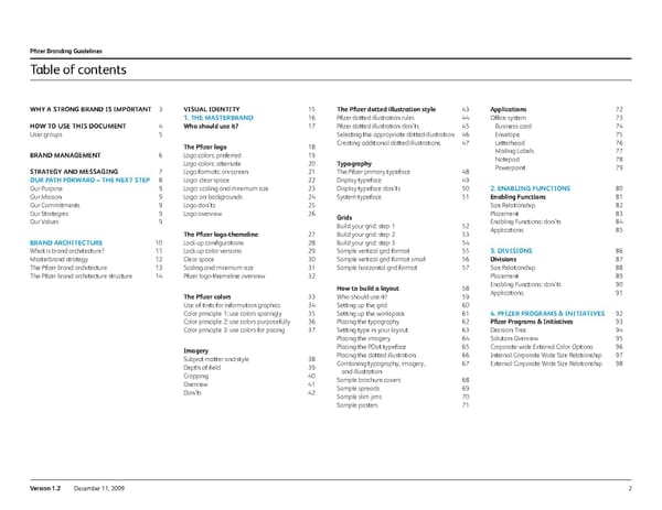
Pfizer Branding Guidelines 2 Version 1.2 December 11, 2009 Why a stron G B rand is im P ortant h o W to use this document User groups Brand mana G ement s trate G y and messa G in G o ur P ath for W ard – t he next ste P Our Purpose Our Mission Our Commitments Our Strategies Our Values Brand architecture What is brand architecture? Masterbrand strategy The Pfizer brand architecture The Pfizer brand architecture structure Visual identity 1. t he master B rand Who should use it? the Pfizer logo Logo colors: preferred Logo colors: alternate Logo formats: on-screen Logo: clear space Logo: scaling and minimum size Logo: on backgrounds Logo don’ts Logo overview the Pfizer logo-themeline Lock-up configurations Lock-up color versions Clear space Scaling and minimum size Pfizer logo-themeline overview the Pfizer colors Use of tints for information graphics Color principle 1: use colors sparingly Color principle 2: use colors purposefully Color principle 3: use colors for pacing imagery Subject matter and style Depth of field Cropping Overview Don’ts the Pfizer dotted illustration style Pfizer dotted illustration rules Pfizer dotted illustration don’ts Selecting the appropriate dotted illustration Creating additional dotted illustrations t ypography The Pfizer primary typeface Display typeface Display typeface don’ts System typeface Grids Build your grid: step 1 Build your grid: step 2 Build your grid: step 3 Sample vertical grid format Sample vertical grid format small Sample horizontal grid format how to build a layout Who should use it? Setting up the grid Setting up the workspace Placing the typography Setting type in your layout Placing the imagery Placing the PDot typeface Placing the dotted illustration Combining typography, imagery, and illustration Sample brochure covers Sample spreads Sample slim jims Sample posters applications Office system Business card Envelope Letterhead Mailing Labels Notepad Powerpoint 2. e na B lin G functions enabling f unctions Size Relationship Placement Enabling Functions: don’ts Applications 3. d i V isions divisions Size Relationship Placement Enabling Functions: don’ts Applications 4. P fizer P ro G rams & initiati V es Pfizer Programs & initiatives Decision Tree Solution Overview Corporate-wide External Color Options Internal Corporate Wide Size Relationship External Corporate Wide Size Relationship Table of contents 3 4 5 6 7 8 9 9 9 9 9 10 11 12 13 14 15 16 17 18 19 20 21 22 23 24 25 26 27 28 29 30 31 32 33 34 35 36 37 38 39 40 41 42 43 44 45 46 47 48 49 50 51 52 53 54 55 56 57 58 59 60 61 62 63 64 65 66 67 68 69 70 71 72 73 74 75 76 77 78 79 80 81 82 83 84 85 86 87 88 89 90 91 92 93 94 95 96 97 98
3 Version 1.2 December 11, 2009 Pfizer Branding Guidelines Pfizer is driven by a clear purpose: Working together for a healthier world. Living our Purpose means that across the Pfizer organization, we are unified in our approach and collaborative in our efforts to make a difference in the lives of the people we touch. This effort applies to everything we do — from our scientific methodology, to our manufacturing processes, to the tone, look, and feel of our communications. This document was developed to help us work together to build consistent, branded communications that collectively build Pfizer’s reputation in the communities we serve. Using these guidelines will enable us to create materials that speak to specific audiences while maintaining one, unified voice. Together, we can contribute to Pfizer’s reputation as a leader in global health and well-being Why a strong brand is important
4 Version 1.2 December 11, 2009 Pfizer Branding Guidelines / how to use this document How to use this document 1. understand our goals The strategy and messaging section provides key information regarding the strategy, messaging, and architecture that organize and drive us as a company. 2. learn our visual tools The visual identity section starts with our masterbrand and then extends into the remaining parts of our brand architecture. Everyone should understand the overarching visual system as well as the specific part that applies to your division, business unit, program, etc. 3. i dentify what is needed The visual tools and applications in these guidelines are designed for a range of user types. First, select the application you are creating and then identify the corresponding user level that is required for that application type. The user groups are outlined on the next page. General users c ommunications Professionals design agencies
5 Version 1.2 December 11, 2009 Pfizer Branding Guidelines / how to use this document User groups There are three main groups of users who will use these guidelines. Based upon the following criteria, determine to which group you belong. Then observe those rules that apply: General users General users make use of predesigned templates; however, for those interested, the information included here is an excellent aid to understanding the principles at work in Pfizer communications pieces. c ommunications professionals Communications professionals work within Pfizer to develop communication pieces for the company on a daily basis. These samples provide guidance for creating variety while staying on-brand. design agencies Design agencies partner with Pfizer via a structured creative process to develop materials. Agencies provide expert design application skills, strategic advice, and broad conceptual abilities. They will find this information to be an excellent starting point for the development process. Gener al Users C ommunic ations P r of essionals Design Agencies Refer to the upper right hand corner of the page for your group designation. General users c ommunications Professionals design agencies
6 Version 1.2 December 11, 2009 Pfizer Branding Guidelines Who to ask: Robert Neufeld Worldwide Communications Corporate Brand Management, Pfizer Inc 235 East 42nd Street New York, NY 10017 212.573.2137 [email protected] Joshua Weitzman 235 East 42nd Street New York, NY 10017 212.733.5387 [email protected] Where to find resources: id.pfizer.com Brand management
7 Version 1.2 December 11, 2009 Pfizer Branding Guidelines Our Path Forward – The Next Step Brand architecture Strategy and messaging
8 Version 1.2 December 11, 2009 Pfizer Branding Guidelines / strategy and messaging Our Path Forward – The Next Step Our Path Forward – The Next Step articulates the essence of what we do. Its reach is broader than day-to-day activities. It conveys the strategic value of our organization and is consistently communicated by our actions and communications. It ensures that our audiences gain a true understanding of our purpose and a sense of our significance for world health.
9 Version 1.2 December 11, 2009 Pfizer Branding Guidelines / strategy and messaging Our Path Forward – The Next Step our Purpose The definitive statement about the difference we are trying to make in the world: Working together for a healthier world™ It is the reason we exist and why we come to work each day. We are in the noble business in bringing better health care to more people around the world. how We Work t ogether for a healthier World: our mission Our Path Forward initially focused on transforming Pfizer, so we can serve our customers more effectively. Pfizer is now much more diversified and far-reaching, that is why we have extended our mission to reflect these changes. Pfizer’s new mission is to: Apply science and our global resources to improve health and well-being at every stage of life. the Promise We make: our c ommitments Having built a track record of keeping commitments, we can now ask ourselves: How can Pfizer uniquely serve the world’s diverse health needs like no other company? The answer is in the seven commitments that showed the world what we can contribute. We will: • Advance wellness, prevention, treatments, and cures • Bring the best scientific minds together to challenge the most feared diseases of our time • Set the standard for quality, safety, and value of medicines • Use our global presence and scale to make a difference in local communities and the world around us • Promote curiosity, inclusion, and a passion for our work • Be a leading voice for improving everyone’s ability to have reliable and affordable health care • Maximize our financial performance so we can meet our commitments to all who rely on us our strategies Generalized statements of the long-term tactics we aim to achieve to advance the business • Optimize the patent-protected portfolio • Find and capitalize on new opportunities for established products • Grow in emerging markets • Grow our diversified businesses • Instill a culture of innovation and continuous improvement What We stand f or: our Values Our values represent our core beliefs. They inform our decisions and guide our actions every day. This reflects our increased focus on serving the needs of our customers. We need to work more closely with partners inside and outside of Pfizer, and the concept of collaboration expresses this orientation more precisely. These are Pfizer’s enduring values: • Customer focus • Community • Respect for people • Performance • Collaboration • Leadership • Integrity • Quality • Innovation They describe the type of company we want to be, and we should demonstrate them in everything we do. General users c ommunications Professionals design agencies
10 Version 1.2 December 11, 2009 What is brand architecture? Masterbrand strategy The Pfizer brand architecture The Pfizer brand architecture structure Brand architecture Pfizer Branding Guidelines / strategy and messaging
11 Version 1.2 December 11, 2009 Brand architecture helps define an organization by rationalizing how businesses and products are communicated—it is not an organizational strategy. An architecture strategy is essential in communicating our breadth and depth of offerings, as well as clarifying the relationship between various entities. It defines the relationships of tangible assets: • Trademarks • Names • Graphic identities • Taglines the benefits of a defined brand architecture The Pfizer architecture should: • Create clarity • Drive long-term shareholder value • Establish Pfizer as a leader in healthcare • Generate cost savings • Support market-focused branding • Reinforce the vision of “One Pfizer” It should help customers find exactly what they are looking for. Through a clear set of rules and an accompanying signature system, we can protect and promote the equity of the Pfizer identity. What is brand architecture? Pfizer Branding Guidelines / strategy and messagin / Brand architecture General users c ommunications Professionals design agencies
12 Version 1.2 December 11, 2009 Pfizer enforces a masterbrand strategy to build the Pfizer brand. The chart illustrates the cyclical nature of the pharmaceutical business and that, over time, the only constant is the Pfizer brand. Product brands have significant life spans, but eventually their patents expire, and the Pfizer brand helps to take the product forward. The Pfizer brand carries more weight from the beginning for nonbranded generics. Divisions and business units might have a long life cycle, but they also retire as the marketplace changes. Therefore, all elements need to work together to enhance the value of the Pfizer masterbrand. This strategy will benefit the organization overall as the brand value will extend to all supported elements in the long run. The following pages explain the relationships among the entities within Pfizer. Functions, divisions, programs, and products all help tell the Pfizer story and have clearly defined relationships to the Pfizer brand. As a result, Pfizer receives credit for the contributions these groups are making to building healthcare around the world. Masterbrand strategy Pfizer Branding Guidelines / strategy and messagin / Brand architecture Brand Equity Pfizer m aster brand d ivisions Time Products Business u nits General users c ommunications Professionals design agencies
13 Version 1.2 December 11, 2009 Pfizer’s functions, divisions, programs, and products form eight layers that serve as the foundation of the architecture system. A masterbrand strategy requires that a single brand—Pfizer—play an important role in all eight layers. Entities must link to the Pfizer masterbrand by communicating within a standard visual and signature system. Entities toward the top of this structure are centralized corporate functions and indicators of the organizational structure, and should only use the Pfizer visual identity system. Their names are not locked up with the Pfizer logo. Entities closer to the bottom require more flexibility to communicate with specific audience groups. These entities have more flexibility with the visual system, and use the Pfizer logo somewhere on the page. 2 Enabling Functions 1 Pfizer Masterbrand 3 Divisions 6 Business Units 4 Internal Programs and Initiatives 5 External Programs and Initiatives 7 Business Units Programs and Initiatives 8 Products and Product Marketing The Pfizer brand architecture Pfizer Branding Guidelines / strategy and messagin / Brand architecture General users c ommunications Professionals design agencies
14 Version 1.2 December 11, 2009 Pfizer Branding Guidelines / strategy and messagin / Brand architecture The Pfizer brand architecture structure 1 Pfizer Master brand INTERNAL/EXTERNAL INTERNAL 2 Enabling Functions (Internal) 5 External Programs & Initiatives (Corporate-wide and Division-wide) 7 BU Programs & Initiatives (Internal and External) 8 Products & Product Marketing CORPORATE-WIDE External Programs and Initiatives span the entire organization and are stewards of the company’s reputation. They help establish Pfizer as a leader in healthcare by touching more than one Division within Pfizer and providing resources for external audiences. (e.g., Pfizer Investments in Health) Each Division is composed of Business Units, and each Business Unit serves a specific purpose, need, and audience. Not all Business Units are customer facing, therefore each needs to be evaluated independently. Products are the revenue drivers of the organization and have the most visible presence in the marketplace. EXTERNAL Business Unit Programs and Initiatives originate in only one Business Unit, and external audiences engage with Pfizer through these Programs and Initiatives. They provide resources and serve specific audience needs. (e.g., First Resource, Global Access, All Eyes on Glaucoma, etc.) DIVISION-WIDE External Programs and Initiatives originate in a Division of Pfizer and touch more than one Business Unit. External audiences engage with Pfizer through these Programs and Initiatives. They serve a targeted external audience and provide a common resource for key audiences. (e.g., Pfizer Helpful Answers, Pfizer Pro, etc.) INTERNAL Business Unit Programs and Initiatives originate in only one Business Unit and provide resources and support for employees. (e.g., Area Commercial Team, PAH Online, etc.) 6 Business Units The masterbrand establishes Pfizer as the corporate umbrella under which all programs, initiatives, and products are created and communicated. The logo is the primary representation of the masterbrand. Enabling Functions include the permanent departments and sub-departments that provide guidance, support, and resources for Divisions and Business Units throughout Pfizer. Though they are not customer facing, Enabling Functions span the breadth of Pfizer, supporting all its business areas and employees. (e.g., Global Operations, Finance, Legal, Corporate Travel, etc.) 3 Divisions The five Divisions represent and manage the key operating areas where Pfizer generates business value. Each Division represents a specific area of expertise. (i.e., Pharmatherapeutics Research and Development Group, Biotherapeutics Research and Development Group, Diversified Businesses, Manufacturing.) 4 Internal Programs & Initiatives (Corporate-wide and Division-wide) CORPORATE-WIDE Internal Programs and Initiatives span the entire organization and provide common resources and support for all Pfizer employees. They are temporary and/or reoccurring events established and controlled by an Enabling Function. (e.g., Healthy Pfizer) DIVISION-WIDE Internal programs and Initiatives originate in a Division of Pfizer and touch more than one Business Unit. They are temporary and/or reoccurring events, and they provide a common resource for and unify the Division. INTERNAL EXTERNAL PFIZER HUMAN RESOURCES Biopharmaceutical Businesses General users c ommunications Professionals design agencies
15 Version 1.2 December 11, 2009 Pfizer Branding Guidelines 1. The masterbrand 2. Enabling functions 3. Divisions 4. Internal programs and initiatives 5. External programs and initiatives 6. Business units 7. Business unit programs and initiatives 8. Products and product marketing Visual identity
16 Version 1.2 December 11, 2009 Who should use it? The Pfizer logo The Pfizer themeline The Pfizer colors The Pfizer imagery The Pfizer dotted illustration style Typography Grids How to build a layout Applications Pfizer Branding Guidelines / Visual i dentity 1. The masterbrand
17 Version 1.2 December 11, 2009 Who should use it? Pfizer Branding Guidelines / Visual i dentity / 1. the masterbrand There are three main groups who use these guidelines. Determine which group you belong based on the following: General users General users make use of predesigned templates; however, for those interested, the information included here is an excellent aid to understanding the principles at work in Pfizer communications pieces. c ommunications professionals Communications professionals work within Pfizer to develop communication pieces for the company on a daily basis. These samples provide guidance for creating variety while staying on-brand. design agencies Design agencies partner with Pfizer via a structured creative process to develop materials. Agencies provide expert design application skills, strategic advice, and broad conceptual abilities. They will find this information to be an excellent starting point for the development process.. General users c ommunications Professionals design agencies Gener al Users C ommunic ations P r of essionals Design Agencies Refer to the upper right hand corner of the page for your group designation.
18 Version 1.2 December 11, 2009 The Pfizer logo Pfizer Branding Guidelines / Visual i dentity / section 1: the masterbrand The Pfizer logo is the primary symbol of our corporation. It unifies us across businesses and geographies, and signals to the market who we are and what we stand for. Our logo has recently evolved to tell a more complete story. The “Pfizer oval” was introduced in 1991. Over time, we built a great deal of equity in that logo, and it is widely recognized around the world. But today, Pfizer is a different company. We’ve changed through global growth, numerous acquisitions, entry into new therapeutic areas, and development of life-changing medicines. Our new logo keeps much of our existing equity, but asks people to take a fresh look at Pfizer because we are not the same company we were in 1991. The refreshed Pfizer logo is still blue, but we have brightened the color and added a gradient to signal Pfizer’s optimism and warmth. The typeface is still italic, but we have adopted a more contemporary type where the letters are rounder and friendlier. We are more accessible and less formal. Finally, the logo still uses an oval as a basic shape, but it is tilted slightly upwards, signaling positive change and forward momentum. General users c ommunications Professionals design agencies
19 Version 1.2 December 11, 2009 Logo colors: preferred Preferred logos We have seven (7) logo versions, so be sure to use the proper logo for the right application. Use the 2-color positive logo whenever possible. Use the preferred CMYK positive logo when only CMYK printing is available. These versions of the logo are provided as scalable vector artwork (EPS). EPS format allows high-quality print reproduction. EPS files can be scaled to any size without sacrificing image quality. You may use these files in page layout and graphics programs for print projects. Additionally, EPS format files may also be used to create files in any of the other image formats at exactly the sizes required. Please note that the letters of the logo are transparent. They should reveal the background on which the logo is placed while maintaining legibility. 2-color (positive) Use this version for premium print applications. The 2-color (positive) logo consists of Cyan and PMS Reflex Blue. Please note: The 2-color file is built with overprinting gradients. It is recommended to use the AI file in Adobe ® Creative Suite ® version 3 and later for the best appearance on-screen, in composite printing and in PDF files. Using the EPS file and/or other software may cause the logo to appear incorrect, although the logo will color separate correctly. cmyK (positive) Use this version when only CMYK printing is available. Pfizer Branding Guidelines / Visual i dentity / section 1: the masterbrand / the Pfizer logo General users c ommunications Professionals design agencies
20 Version 1.2 December 11, 2009 Logo colors: alternate Pfizer Branding Guidelines / Visual i dentity / section 1: the masterbrand / the Pfizer logo 1-color alternate logos Use these logos when 2-color and CMYK logos cannot be used. They are designed to provide legibility for specific application types. These versions of the logo are provided as scalable vector artwork (EPS). EPS format allows high-quality print reproduction. EPS files can be scaled to any size without sacrificing image quality. You may use these files in page layout and graphics programs for print projects. Additionally, EPS format files may also be used to create files in any of the other image formats at exactly the sizes required. Please note that the letters of the logo are transparent. They should reveal the background on which the logo is placed while maintaining legibility. White Use this version when the application requires a simplified mark in white and the background is too dark to allow use of the preferred mark or the 1-color alternate version (e.g., reverse applications, premium items, small sizes, silkscreen, etc.). 1-color Blue Use this version when the application requires a 1-color or simplified mark (e.g., stationery, premium items, small sizes, silkscreen, etc.). The logo prints in PMS Process Blue. Black Use this version when the application requires a simplified mark in black (e.g., fax sheet, premium items, small sizes, silkscreen, etc.). General users c ommunications Professionals design agencies
21 Version 1.2 December 11, 2009 Logo formats: on-screen Pfizer Branding Guidelines / Visual i dentity / section 1: the masterbrand / the Pfizer logo on-screen logos These versions are used for all desktop and on-screen applications. RGB logo files are provided in JPG and PNG file formats in 2" sizes. These versions are also provided as scalable vector artwork (EPS). Additionally, EPS format files may also be used to create files in any of the other image formats at exactly the sizes required. Use JPG format logos for PowerPoint ® presentations, Microsoft ® Word ® documents, and other office applications. You may use JPG files for printing on low-resolution printers such as laser or ink-jet printers. JPG format logos are never used for high- resolution printing, and they are never scaled to larger sizes. Use PNG format logos for higher-quality laser print reproduction (Microsoft ® Word ® and PowerPoint ® ), screen and web applications where a higher- quality logo may be needed. They can be scaled down in size, but they are never scaled to larger sizes. Additionally, use PNG files when transparent backgrounds are required, such as websites and when placing the logo on a background that is not white. Please note that the letters of the logo are transparent in EPS and PNG files. They should reveal the background on which the logo is placed while maintaining legibility. rGB (positive) This is the preferred version for internet, video, TV, email signatures, Microsoft applications, etc. rGB (reverse) Use this version when the application requires a simplified mark in white and the background is too dark to allow use of the preferred mark. General users c ommunications Professionals design agencies
22 Version 1.2 December 11, 2009 Logo: clear space Pfizer Branding Guidelines / Visual i dentity / section 1: the masterbrand / the Pfizer logo Always surround the Pfizer logo with the amount of clear space shown to ensure that the logo is easily identifiable as well as visible and legible wherever it appears. Clear space is the minimum “breathing room” maintained around our logo. It also defines the minimum distance between the logo and the edge of a printed piece. The clear space around our logo is equal to the height of the Pfizer logo. Do not position any text, graphic elements, or other visual marks inside the recommended clear space. Please note that this distance may sometimes be adjusted for select online or exterior signage applications where space is limited. General users c ommunications Professionals design agencies
23 Version 1.2 December 11, 2009 Logo: scaling and minimum size Pfizer Branding Guidelines / Visual i dentity / section 1: the masterbrand / the Pfizer logo Preferred logo minimum size 1-color logo minimum size 0.3125" 0.1875" scaling the Pfizer logo EPS logo files may be scaled to any size necessary for the application, as long as the minimum size requirements are met. For most applications, the logo will be sized at heights of less than 1". minimum size Minimum size refers to the smallest allowable logo size. The logo is available in one size that can be scaled down to a minimum size of 0.3125" high for the preferred logo. The 1-color alternate logos can be scaled down to a minimum size of 0.1875" high. Always maintain the logo’s aspect ratio when scaling. General users c ommunications Professionals design agencies
24 Version 1.2 December 11, 2009 Logo: on backgrounds on backgrounds Place the logo on backgrounds that provide good contrast and legibility to ensure that it is clearly recognizable. Please note that the letters of the logo are transparent. They should reveal the background on which the logo is placed while maintaining legibility. Pfizer Branding Guidelines / Visual i dentity / section 1: the masterbrand / the Pfizer logo General users c ommunications Professionals design agencies
25 Version 1.2 December 11, 2009 Logo don’ts Pfizer Branding Guidelines / Visual i dentity / section 1: the masterbrand / the Pfizer logo Ensure that our logo is clearly recognizable by using it properly, and do not alter it in any circumstances. Consider the logo version and the background it is placed on to provide the best legibility. The examples show various uses to avoid. DO NOT change the logo’s color. DO NOT use the preferred logo on a dark background. DO NOT use the logo in a holding box or other shape. DO NOT change the logo’s proportion. DO NOT add drop shadows or other effects to the logo. DO NOT outline the logo. DO NOT apply color or knock out the letterforms inside the logo. DO NOT crop the logo. DO NOT rotate the logo. DO NOT lock up product identifiers or product descriptions with the logo. DO NOT place the logo on a complicated background or a background that reduces its legibility. DO NOT remove the Pfizer wordmark from the oval. General users c ommunications Professionals design agencies
26 Version 1.2 December 11, 2009 Logo overview Pfizer Branding Guidelines / Visual i dentity / section 1: the masterbrand / the Pfizer logo Composed of Cy an an d Magen ta P ref erred 2-color f or CMYK Pr ef erre d gr adient mark s fo r pr in t Composed of Cy an an d PM S Re fle x Blue pfi ze r_ cm yk _p os . eps pfi ze r_ 1c _p os . eps pfi ze r_ 2c _p os . eps P ref erred 2-color Use the pr ef er re d 2- color ve rs ion of the logo whenev er p ossible . Use the pr ef er re d 4- color ve rs ion of the logo when only CMYK printing is av ailable. Do no t us e co lo r logo s fo r re ve rs e back gr ound printing . Al te rnat e flat mark s fo r pr in t S cr ee n File nomenclat ur e C lear spac e M inimum size PM S Pr oces s Blue - Do no t reproduc e in ot he r colo rs . pfi ze r_ wh t_ re v. eps Alternat e 1-color Whit e Use the 1- color bla ck ve rs ion when the 1- color blue ve rs ion cannot be used . Use the 1- color white ve rs ion fo r al l re ve rs e back gr oun d printing . Use the RGB ve rs ion of the ar tw or k on scr ee n an d in digital applications . Th e clea r spac e ar ound ou r logo is equal to th e fu ll height of th e loze ng e shape. Th e pr ef er re d logo ca n be scaled down to a mini mu m height of 0.3 12 5" . Al wa ys maintain th e logo ’s as pe ct ra ti o when sca lin g. Th e al te rnat e logo s ca n be scaled down to a mini mu m height of 0. 18 75 ". Do no t re pr oduc e in other colo rs . P rimary RGB/Screen pfi ze r_ rg b_ pos.pn g .jpg pfi ze r_ bl k_ pos.eps Alternat e 1-color Blue Use the 1- color blue ve rs ion when a simplified mar k is re quir ed fo r pr emiu m item s, si lk sc re en, et c. Alternat e 1-color Black pfi ze r_ rg b_ po s. pn g Id en tifie r Back - ground Forma t .e ps ve ct or file fo r prin t .jpg RGB fo r scr ee n .p ng RGB fo r scr ee n po s re v Colo r 1c 2c cm yk blk wht rgb Alternat e RGB/Screen pfi ze r_ rg b_ re v. pn g 0.3125" 0.1875" General users c ommunications Professionals design agencies
27 Version 1.2 December 11, 2009 The Pfizer themeline The Pfizer themeline is a concise statement of our company’s purpose. When it is locked up with the Pfizer logo it communicates our key reason for being in a clear, direct, and engaging manner. Pfizer Branding Guidelines / Visual i dentity / section 1: the masterbrand / the Pfizer logo-themeline General users c ommunications Professionals design agencies
28 Version 1.2 December 11, 2009 logo-themeline lock-up Use the lock-ups when applying the themeline to corporate marketing communications. This is the preferred lock-up for most applications. The logo is followed by the themeline, and the themeline is placed on the same baseline as the text of the logo. Place the first word of the themeline a distance of “P” from the right edge of the logo. Pfizer logo-themeline: lock-up configurations Pfizer Branding Guidelines / Visual i dentity / section 1: the masterbrand / the Pfizer logo-themeline Detail for spacing and alignment of TM General users c ommunications Professionals design agencies
29 Version 1.2 December 11, 2009 Using the proper lock-up for an application is key. We have five (5) lock-up color versions. Use the version that provides the best contrast and legibility for your application. Please note that the letters of the logo are transparent. They should reveal the background on which the logo is placed while maintaining legibility. Pfizer logo-themeline: color versions Pfizer Branding Guidelines / Visual i dentity / section 1: the masterbrand / the Pfizer logo-themeline Preferred two-color (reflex blue & cyan) logo with two-color themeline CMYK blue logo with CMYK themeline PMS Process Blue logo with PMS Process Blue themeline Black logo with black themeline White logo with white themeline General users c ommunications Professionals design agencies
30 Version 1.2 December 11, 2009 Pfizer logo-themeline: clear space Pfizer Branding Guidelines / Visual i dentity / section 1: the masterbrand / the Pfizer logo-themeline Clear space is the minimum “breathing room” maintained around the lock-up. It is kept free of graphics, text, and other marks. It also defines the minimum distance between the lock-up and the edge of a printed piece. The clear space around our logo-themeline lock-up is equal to the height of the logo. Please note that this distance may sometimes be adjusted for select online or exterior signage applications where space is limited. General users c ommunications Professionals design agencies
31 Version 1.2 December 11, 2009 scaling the lock-up The EPS Pfizer logo-themeline lock-up files may be scaled to any size necessary for the application. Do not scale the logo or themeline separately. For most applications, the logo will be sized at heights of less than 1". Always maintain the lock-up’s aspect ratio when scaling. minimum size Minimum size refers to the smallest allowable lock-up size. The lock-up is available in one size that can be scaled down to a minimum size of 0.3125" high for the lock-up with the preferred logo. The lock-up with 1-color alternate logo can be scaled down to a minimum size of 0.25" high. Always maintain the lock-up’s aspect ratio when scaling. Pfizer logo-themeline: scaling and minimum size Pfizer Branding Guidelines / Visual i dentity / section 1: the masterbrand / the Pfizer logo-themeline 0.3125" Minimum size for preferred logo with themeline 0.25" Minimum size for 1-color logo with themeline Maintain a consistent aspect ratio when scaling General users c ommunications Professionals design agencies
32 Version 1.2 December 11, 2009 Pfizer logo-themeline overview Pfizer Branding Guidelines / Visual i dentity / section 1: the masterbrand / the Pfizer logo-themeline Pr ef erre d gr adient mark s fo r pr in t Composed of Cy an an d PM S Re fle x Blue pfi ze rt ag _2 c_ pos.ep s P ref erred 2-color* Use the pr ef er re d 2- color ve rs ion whenev er p ossible . Use the pr ef er re d 4- color ve rs ion of the themeline when only CMYK printing is av ailable. Do no t us e co lo r themelines fo r re ve rs e back gr ound printing . Al te rnat e flat mark s fo r pr in t S cr ee n File nomenclat ur e C lear spac e M inimum size Alternate 1-color White Use the RGB ve rs ion of the ar tw or k on scr ee n an d in digital applications . Th e clea r spac e ar ound ou r logo is equal to th e fu ll height of th e loze ng e shape . Th e pr ef er re d themelin e ca n be scaled down to a mini mu m height of 0.3 12 5" . Al wa ys maintain th e logo an d themelin e as pe ct ra ti o when scal in g. Th e on e- color themeline can be scaled down to a mini mu m height of 0. 25 ". Alternate 1-color PMS P rocess Blue Use the 1- color blue ve rs ion when a simplified mar k is re quir ed fo r pr emiu m it ems, silk scr e en, et c. Do no t re pr oduc e in ot he r co lors . Use the 1- color bla ck ve rs ion when the 1- color blue ve rs ion cannot be us ed . Use the 1- color white ve rs ion fo r al l re ve rs e back gr ound printing . Alternate 1-color Black pfi ze rt ag _r gb _p os .p ng Id en tifie r Back - ground Forma t .e ps ve ct or file fo r prin t .jpg RGB fo r scr ee n .p ng RGB fo r scr ee n po s re v Colo r 1c 2c cm yk blk wht rgb pfi ze r_ rg b_ re v. pn g Composed of Cy an an d Mage nt a P ref erred 2-color f or CMYK pfi ze rt ag _c my k_ pos.eps Do no t reproduc e in ot he r colo rs . pfi ze r_ rg b_ pos.png .jp g P rimaryRGB/Screen Alternate RGB/Screen 0.25" 0.3125" pfi ze rt ag _1 c_ pos.eps pfi ze rt ag _b lk _p os . eps pfi ze rt ag _w ht _p os . eps * Please note: The 2-color file is built with overprinting gradients. It is recommended to use the AI file in Adobe ® Creative Suite ® version 3 and later for the best appearance on-screen, in composite printing and in PDF files. Using the EPS file and/or other software may cause the logo to appear incorrect, although the logo will color separate correctly. General users c ommunications Professionals design agencies
33 Version 1.2 December 11, 2009 Pfizer Branding Guidelines / Visual i dentity / 1. the masterbrand / c olor palette The Pfizer colors General users c ommunications Professionals design agencies The color palette is made up of the Pfizer blue and supportive neutral colors (black, gray, and white). The secondary color palette consists of a complementary set of bright colors that convey boldness and optimism. The colors represented on this page have not been evaluated by Pantone, Inc and may not match the Pantone system. Consult a Pantone Color Formula Guide for reference. Pfizer Blue C100, M10, Y0, K10 R0, G147, B207 Hex #0093D0 PMS Process Blue Black C0, M0, Y0, K100 R0, G0, B0 Hex #000000 White C0, M0, Y0, K0 R255, G255, B255 Hex #FFFFFF secondary color palette Primary color palette Gray C0, M0, Y0, K60 R97, G99, B101 Hex #616365 PMS Cool Gray 10 light Green C50, M0, Y100, K0 R125, G186, B0 Hex #7DBA00 PMS 376C/375U c yan C100, M0, Y0, K0 R0, G174, B238 Hex #00AEEF PMS Process Cyan orange C0, M48, Y100, K0 R248, G151, B29 Hex #F8971D PMS 144C/U y ellow C0, M10, Y100, K0 R247, G212, B23 Hex #F7D417 PMS 109C/108U Pink C0, M100, Y0, K0 R214, G0, B110 Hex #D6006E PMS Process Magenta light Blue C43, M0,Y10, K0 R117, G209, B224 Hex #75D1E0 PMS 310 C/U Green C94, M0, Y100, K0 R0, G169, B79 Hex #00A950 PMS 355C/U Purple C78, M100, Y0, K33 R74, G36, B94 Hex #4A245E PMS 269C/268U r ed C0, M100, Y99, K4 R204, G41, B43 Hex #CC292B PMS 1797C/U light r ed C0, M75, Y75, K0 R242, G102, B73 Hex #F26649 PMS 7417C/U
34 Version 1.2 December 11, 2009 Use of tints for information graphics Pfizer Branding Guidelines / Visual i dentity / 1. the masterbrand / c olor palette General users c ommunications Professionals design agencies Only use tints of colors when treating information graphics, otherwise use the color at 100%. Visual representations of data are conveyed more clearly and are better understood when color is properly used. Using pairs of colors that have adequate contrast will make the design of information graphics more effective. Specific screens (i.e., 75%, 50%, and 25%) of each color are designed to add visual depth and flexibility and to convey additional levels of information hierarchy. 50% 75% 25% Pfizer Blue 100% Pink 100% 50% 75% 25% light Blue 100% 50% 75% 25% 50% 75% 25% c yan 100% light Green 100% 50% 75% 25% r ed 100% 50% 75% 25% orange 100% 50% 75% 25% y ellow 100% 50% 75% 25% 50% 75% 25% Green 100% Purple 100% 50% 75% 25% light r ed 100% 50% 75% 25%
35 Version 1.2 December 11, 2009 Color principle 1: use colors sparingly Pfizer Branding Guidelines / Visual i dentity / 1. the masterbrand / c olor palette use 1–3 secondary colors at a time In addition to neutral colors (black, gray, or white), use only 1–3 secondary colors. This helps to keep the content from looking too complex and cluttered. 06 05 Investigationes demon straverunt lectores legere me lius quod ii legunt saepius. Mirum est notare quam littera gothica, quam nunc putamus parum claram, anteposuerit litterarum formas humanitatis per sea culaqu arta decima et quinta decima non habent. Mirum est notare quam littera gothica, quam nunc putamus parum claram, anteposuerit litterarum formas humanitatis per sea culaqu arta decima et quinta decima non habent claritatem insitam; est usus legentis in iis qui facit eorum claritatem. Investigationes demon straverunt lectores legere me lius quod ii legunt saepius. Mhabent claritatem insitam; est usus legentis in iis qui facit eorum claritatem. Investigationes demon straverunt lectores legere me lius quod ii legunt saepiu irum est notare quam littera. Investigationes demon straverunt lectores legere me lius quod ii legunt saepius. Mirum est notare quam littera gothica, quam nunc putamus parum claram, anteposuerit litterarum formas humanitatis per sea culaqu arta decima et quinta decima non habent. Non habent claritatem est usus legentis in iis qui facit eorum claritatem. Investigationes demon straverunt lectores legere me lius quod ii legunt saepius. Claritas est etiam processus dynamicus, qui sequitur mutationem consuetudium lectorum. Mirum est notare quam littera gothica, quam nunc putamus parum claram, anteposuerit litterarumNon habent claritatem insitam; est usus legentis in iis qui facit eorum claritatem. Investiga- tiones demon straverunt lectores legere me lius quod ii legunt saepius. Claritas est etiam processus dynamicus, qui sequitur mutationem consuetudium lectorum. Mirum est notare quam littera gothica, quam nunc putamus parum claram, anteposuerit litterarumNon habent claritatem insitam; est usus legentis in iis qui facit eorum claritatem. Investigationes demon straverunt lectores legere me lius quod ii legunt saepius. Claritas est etiam processus dynamicus, qui sequitur mutationem consuetudium lectorum. Mirum est notare quam littera gothica, quam nunc putamus parum claram, anteposuerit litterarumNon habent claritatem insitam; est usus legentis in iis qui facit eorum claritatem. Investiga- tiones demon straverunt lectores legere me lius quod ii legunt saepius. Claritas est etiam processus dynamicus, qui sequitur mutationem consuetudium lectorum. Mirum est notare quam littera gothica, quam nunc putamus padynamicus, qui sequitur mutationem consuetudium lectorum. Mirum est notare quam littera gothidynamicus, qui sequitur mutationem consuetudium lectorum. Mirum est notare quNonm littera gothirum claram, ante 06 05 Mirum est notare quam littera gothica, quam nunc putamus parum claram, anteposuerit litterarum formas humanitatis per sea culaqu arta decima et quinta decima non habent claritatem insitam; est usus legentis in iis qui facit eorum claritatem. Investigationes demon straverunt lectores legere me lius quod ii legunt saepius. Mhabent claritatem insitam; est usus legentis in iis qui facit eorum claritatem. Investigationes demon straverunt lectores legere me lius quod ii legunt saepiu irum est notare quam littera. Investigationes demon straverunt lectores legere me lius quod ii legunt saepius. Mirum est notare quam littera gothica, quam nunc putamus parum claram, anteposuerit litterarum formas humanitatis per sea culaqu arta decima et quinta decima non habent. Non habent claritatem est usus legentis in iis qui facit eorum claritatem. Investigationes demon straverunt lectores legere me lius quod ii legunt saepius. Claritas est etiam processus dynamicus, qui sequitur mutationem consuetudium lectorum. Mirum est notare quam littera gothica, quam nunc putamus parum claram, anteposuerit litterarumNon habent claritatem insitam; est usus legentis in iis qui facit eorum claritatem. Investiga- tiones demon straverunt lectores legere me lius quod ii legunt saepius. Claritas est etiam processus dynamicus, qui sequitur mutationem consuetudium lectorum. Mirum est notare quam littera gothica, quam nunc putamus parum claram, anteposuerit litterarumNon habent claritatem insitam; est usus legentis in iis qui facit eorum claritatem. Investigationes demon straverunt lectores legere me lius quod ii legunt saepius. Claritas est Mirum est notare quam littera gothica, quam nunc putamus parum claram, anteposuerit litterarum formas humanitatis per sea culaqu arta decima et quinta decima non habent claritatem insitam; est usus legentis in iis qui facit eorum claritatem. Investigationes demon straverunt lectores legere me lius quod ii legunt saepius. Mhabent claritatem insitam; est usus legentis in iis qui facit eorum claritatem. Investigationes demon straverunt lectores legere me lius quod ii legunt saepiu irum est notare quam littera. Investigationes demon straverunt lectores legere me lius quod ii legunt saepius. Mirum est notare quam littera gothica, quam nunc putamus parum claram, anteposuerit litterarum formas humanitatis per sea culaqu arta decima et quinta decima non habent. etiam processus dynamicus, qui sequitur mutationem consuetudium lectorum. Mirum est notare quam littera gothica, quam nunc putamus parum claram, anteposuerit litterarumNon habent claritatem insitam; est usus legentis in iis qui facit eorum claritatem. Investiga- tiones demon straverunt lectores legere me lius quod ii legunt saepius. Claritas est etiam processus dynamicus, qui sequitur mutationem consuetudium lectorum. Mirum est notare quam littera gothica, quam nunc putamus padynamicus, qui sequitur mutationem consuetudium lectorum. Mirum est notare quam littera gothidynamicus, qui sequitur mutationem consuetudium lectorum. Mirum est notare quNonm littera gothirum claram, ante 06 05 Mirum est notare quam littera gothica, quam nunc putamus parum claram, anteposuerit litterarum formas humanitatis per sea culaqu arta decima et quinta decima non habent claritatem insitam; est usus legentis in iis qui facit eorum claritatem. Investigationes demon straverunt lectores legere me lius quod ii legunt saepius. Mhabent claritatem insitam; est usus legentis in iis qui facit eorum claritatem. Investigationes demon straverunt lectores legere me lius quod ii legunt saepiu irum est notare quam littera. Investigationes demon straverunt lectores legere me lius quod ii legunt saepius. Mirum est notare quam littera gothica, quam nunc putamus parum claram, anteposuerit litterarum formas humanitatis per sea culaqu arta decima et quinta decima non habent. 0 5 10 15 20 25 Non habent claritatem insitam; est usus legentis in iis qui facit eorum claritatem. Investigationes demon straverunt lectores legere me lius quod ii legunt saepius. Claritas est 9 0 % Mirum est notare quam littera gothica, quam nunc putamus parum claram, anteposuerit litterarum formas humanitatis per sea culaqu arta decima et quinta decima non habent claritatem insitam; est usus legentis in iis qui facit eorum claritatem. Investigationes demon straverunt lectores legere me lius quod ii legunt saepius. Mhabent claritatem insitam; est usus legentis in iis qui facit eorum claritatem. Investigationes demon straverunt lectores legere me lius quod ii legunt saepiu irum est notare quam littera. Investigationes demon straverunt lectores legere me lius quod ii legunt saepius. Mirum est notare quam littera gothica, quam nunc putamus parum claram, anteposuerit litterarum formas humanitatis per sea culaqu arta decima et quinta decima non habent. etiam processus dynamicus, qui sequitur mutationem consuetudium lectorum. Mirum est notare quam littera gothica, quam nunc putamus parum claram, anteposuerit litterarum 06 05 Investigationes demon straverunt lectores legere me lius quod ii legunt saepius. Mirum est notare quam littera gothica, quam nunc putamus parum claram, anteposuerit litterarum formas humanitatis per sea culaqu arta decima et quinta decima non habent. Mirum est notare quam littera gothica, quam nunc putamus parum claram, anteposuerit litterarum formas humanitatis per sea culaqu arta decima et quinta decima non habent claritatem insitam; est usus legentis in iis qui facit eorum claritatem. Investigationes demon straverunt lectores legere me lius quod ii legunt saepius. Mhabent claritatem insitam; est usus legentis in iis qui facit eorum claritatem. Investigationes demon straverunt lectores legere me lius quod ii legunt saepiu irum est notare quam littera. Investigationes demon straverunt lectores legere me lius quod ii legunt saepius. Mirum est notare quam littera gothica, quam nunc putamus parum claram, anteposuerit litterarum formas humanitatis per sea culaqu arta decima et quinta decima non habent. Non habent claritatem est usus legentis in iis qui facit eorum claritatem. Investigationes demon straverunt lectores legere me lius quod ii legunt saepius. Claritas est etiam processus dynamicus, qui sequitur mutationem consuetudium lectorum. Mirum est notare quam littera gothica, quam nunc putamus parum claram, anteposuerit litterarumNon habent claritatem insitam; est usus legentis in iis qui facit eorum claritatem. Investiga- tiones demon straverunt lectores legere me lius quod ii legunt saepius. Claritas est etiam processus dynamicus, qui sequitur mutationem consuetudium lectorum. Mirum est notare quam littera gothica, quam nunc putamus parum claram, anteposuerit litterarumNon habent claritatem insitam; est usus legentis in iis qui facit eorum claritatem. Investigationes demon straverunt lectores legere me lius quod ii legunt saepius. Claritas est etiam processus dynamicus, qui sequitur mutationem consuetudium lectorum. Mirum est notare quam littera gothica, quam nunc putamus parum claram, anteposuerit litterarumNon habent claritatem insitam; est usus legentis in iis qui facit eorum claritatem. Investiga- tiones demon straverunt lectores legere me lius quod ii legunt saepius. Claritas est etiam processus dynamicus, qui sequitur mutationem consuetudium lectorum. Mirum est notare quam littera gothica, quam nunc putamus padynamicus, qui sequitur mutationem consuetudium lectorum. Mirum est notare quam littera gothidynamicus, qui sequitur mutationem consuetudium lectorum. Mirum est notare quNonm littera gothirum claram, ante 06 05 Mirum est notare quam littera gothica, quam nunc putamus parum claram, anteposuerit litterarum formas humanitatis per sea culaqu arta decima et quinta decima non habent claritatem insitam; est usus legentis in iis qui facit eorum claritatem. Investigationes demon straverunt lectores legere me lius quod ii legunt saepius. Mhabent claritatem insitam; est usus legentis in iis qui facit eorum claritatem. Investigationes demon straverunt lectores legere me lius quod ii legunt saepiu irum est notare quam littera. Investigationes demon straverunt lectores legere me lius quod ii legunt saepius. Mirum est notare quam littera gothica, quam nunc putamus parum claram, anteposuerit litterarum formas humanitatis per sea culaqu arta decima et quinta decima non habent. Non habent claritatem est usus legentis in iis qui facit eorum claritatem. Investigationes demon straverunt lectores legere me lius quod ii legunt saepius. Claritas est etiam processus dynamicus, qui sequitur mutationem consuetudium lectorum. Mirum est notare quam littera gothica, quam nunc putamus parum claram, anteposuerit litterarumNon habent claritatem insitam; est usus legentis in iis qui facit eorum claritatem. Investiga- tiones demon straverunt lectores legere me lius quod ii legunt saepius. Claritas est etiam processus dynamicus, qui sequitur mutationem consuetudium lectorum. Mirum est notare quam littera gothica, quam nunc putamus parum claram, anteposuerit litterarumNon habent claritatem insitam; est usus legentis in iis qui facit eorum claritatem. Investigationes demon straverunt lectores legere me lius quod ii legunt saepius. Claritas est Mirum est notare quam littera gothica, quam nunc putamus parum claram, anteposuerit litterarum formas humanitatis per sea culaqu arta decima et quinta decima non habent claritatem insitam; est usus legentis in iis qui facit eorum claritatem. Investigationes demon straverunt lectores legere me lius quod ii legunt saepius. Mhabent claritatem insitam; est usus legentis in iis qui facit eorum claritatem. Investigationes demon straverunt lectores legere me lius quod ii legunt saepiu irum est notare quam littera. Investigationes demon straverunt lectores legere me lius quod ii legunt saepius. Mirum est notare quam littera gothica, quam nunc putamus parum claram, anteposuerit litterarum formas humanitatis per sea culaqu arta decima et quinta decima non habent. sequitur mutationem consuetudium lectorum. Mirum est notare quam littera gothica, quam nunc putamus parum claram, anteposuerit litterarumNon habent claritatem insitam; est usus legentis in iis qui facit eorum claritatem. Investiga- tiones demon straverunt lectores legere me lius quod ii legunt saepius. Claritas est etiam processus dynamicus, qui sequitur mutationem consuetudium lectorum. Mirum est notare quam littera gothica, quam nunc putamus padynamicus, qui sequitur mutationem consuetudium lectorum. Mirum est notare quam littera gothidynamicus, qui sequitur mutationem consuetudium lectorum. Mirum est notare quNonm littera gothirum claram, ante 06 05 Mirum est notare quam littera gothica, quam nunc putamus parum claram, anteposuerit litterarum formas humanitatis per sea culaqu arta decima et quinta decima non habent claritatem insitam; est usus legentis in iis qui facit eorum claritatem. Investigationes demon straverunt lectores legere me lius quod ii legunt saepius. Mhabent claritatem insitam; est usus legentis in iis qui facit eorum claritatem. Investigationes demon straverunt lectores legere me lius quod ii legunt saepiu irum est notare quam littera. Investigationes demon straverunt lectores legere me lius quod ii legunt saepius. Mirum est notare quam littera gothica, quam nunc putamus parum claram, anteposuerit litterarum formas humanitatis per sea culaqu arta decima et quinta decima non habent. 0 5 10 15 20 25 Non habent claritatem insitam; est usus legentis in iis qui facit eorum claritatem. Investigationes demon straverunt lectores legere me lius quod ii legunt saepius. Claritas est 9 0 % Mirum est notare quam littera gothica, quam nunc putamus parum claram, anteposuerit litterarum formas humanitatis per sea culaqu arta decima et quinta decima non habent claritatem insitam; est usus legentis in iis qui facit eorum claritatem. Investigationes demon straverunt lectores legere me lius quod ii legunt saepius. Mhabent claritatem insitam; est usus legentis in iis qui facit eorum claritatem. Investigationes demon straverunt lectores legere me lius quod ii legunt saepiu irum est notare quam littera. Investigationes demon straverunt lectores legere me lius quod ii legunt saepius. Mirum est notare quam littera gothica, quam nunc putamus parum claram, anteposuerit litterarum formas humanitatis per sea culaqu arta decima et quinta decima non habent. etiam processus dynamicus, qui sequitur mutationem consuetudium lectorum. Mirum est notare quam littera gothica, quam nunc putamus parum claram, anteposuerit litterarum General users c ommunications Professionals design agencies
36 Version 1.2 December 11, 2009 Color principle 2: use colors purposefully Pfizer Branding Guidelines / Visual i dentity / 1. the masterbrand / c olor palette highlight important information Color can help to create emphasis, clarify hierarchy, and organize information on a layout. Lorem ipsum dolor sit amet, consect etuer adipiscing elit sed diam nonmmy nibh euis. Ruod mazim placerat facer possim assum. 05 04 TUER ADIPISCING ELIT SED DIAM nonummy nibh euis. Ruod mazim placerat facer possim assum. Typi non habent claritatem insitam; est usus lequi facit eorum claritatem. Investigationes demonstraverunt lectores legere me lius quod ii legunt saepius. Claritas est etiam proce ssus dyn amicus, qui sequitur mutation em consuetudium lectorum. Mirum est notare quam littera gothica, quam nunc putamus parum claram, anteposuerit litter arumuer adipiscing elit sed diam nonummy nibh euis. Ruod mazim placerat facer possim assum. Typi non habent claritatem insitam; est usus legentis in iis qui facit eorum claritatem. Investigationes demonstraverunt lectores legere me lius quod ii legunt saepius. Claritas est etiam proce ssus dyn amicus, qui sequitur mutation em consuetudium lectorum. d ii legunt saepius. Claritas est etiam proce ssus dyn amicus, qui sequitur mutation em consuetudium lectorum. Mirum est notare quam littera gothica, quam nunc putamus parum claram, anteposuerit litter arumuer adipiscing elit sed diam nonummy nibh euis. Ruod mazim placerat facer possim assum. Typi non habent claritatem insitam; est usus legentis in iis qui facit eoru qui facit eorum claritatem. Investigationes demonstraverunt lectores legere me lius quod ii legunt saepius. Claritas est etiam proce ssus dyn amicus, qui sequitur mutation em consuetudium lectorum. Mirum est notare quam littera gothica, quam nunc putamus parud ii legunt saepius. Claritas est etiam proce ssus dyn amicus, qui sequitur mutation em consuetudium lectorum. Mirum est notare quam littera gothica, quam nunc putamus parum claram, anteposuerit litter arumuer adipiscing elit sed diam nonummy nibh euis. Ruod mazim placerat facer possim assum. Typi non habent claritatem insitam; est usus legentis in iis qui facit eorum claram, anteposuerit litterarum. d ii legunt saepius. Claritas est etiam proce ssus dyn amicus, qui sequitur mutation em consuetudium lectorum. Mirum est notare quam littera gothica, quam nunc putamus parum claram, anteposuerit litter arumuer adipiscing elit sed diam nonummy nibh euis. Ruod mazim placerat facer possim assum. Typi non habent claritatem insitam; est usus legentis in iis qui facit eorud ii legunt saepius. Claritas est etiam proce ssus dyn amicus, qui sequitur mutation em consuetudium lectorum. Mirum est notare quam littera gothica, quam nunc putamus parum claram, anteposuerit litter arumuer adipiscing elit sed diam nonummy nibh euis. Ruod mazim placerat facer possim assum. Typi non habent claritatem insitam; est usus legentis in iis qui facit eoru Tuer adipiscing elit sed diam nonummy nibh euis. Ruod mazim placerat facer possim assum. Typi non habent claritatem insitam; est usus legentis in iis qui facit eorum claritatem. Investigationes demonstraverunt lectores legere me lius quod ii legunt saepius. Claritas est etiam proce ssus dyn amicus, qui sequitur mutation em consuetudium lectorum. Mirum est notare quam littera gothica, quam nunc putamus parum claram, anteposuerit litter arumuer adipiscing elit uer adipiscing elit sed diam nonummy nibh euis. Ruod mazim placerat facer possim assum. Typi non habent claritatem insitam; est usus legentis in iis qui facit eorum claritatem. Investigationes demonstraverunt lectores legere me lius quod ii legunt saepius. Claritas est etiam proce ssus dyn amicus, qui sequitur mutation em consuetudium lectorum. Mirum est notare quam littera gothica, Lorem ipsum Lorem ipsum dolor Tuer adipiscing elit sed diam nonummy nibh euis. Ruod mazim placerat facer possim assum. Typi non habent claritatem insitam; est usus legentis in iis qui facit eorum claritatem. Investigationes demonstraverunt lectores legere me lius quod ii legunt saepius. Claritas est etiam proce ssus dyn amicus, qui sequitur mutation em consuetudium lectorum. Mnon habent claritatem insitam; est usem. Investi gationes demons traverunt lectores legere me lius quod ii legunt saepius. Claritas est etiam proce ssus dyn amicus, qui sequitur mutaqui ion em consu etudium lecto rum. quiput amus parum claram, antepquiosuerit littquie rarum.irum est notare quam littera gothica, quam nunc putamus parum claram, anteposuerit litterarum. 05 04 Lorem amet consect Tuer adipiscing elit sed diam nonummy nibh euis. Ruod mazim placerat facer possim assum. Typi non habent claritatem insitam; est usem. Investi gationes demons traverunt lectores legere me lius quod ii legunt saepius. Claritas est etiam proce sstores legere me lius quod ii legunt saepius. Claritas est etiam proce ssus dyn amicus, qui sequitur mutation em consue tudium lectorum. Mnon habent clarittores legere me lius quod ii legunt saepius. Claritas est etiam proce ssus dyn amicus, qui sequitur mutation em consu etudium lectorum. Mnon habent claritus dyn amicus, qui sequitur mutaqui ion em consu etudium lecto rum. quiput amus parum claram, antepquiosuerit littquie rarum. Mirum est notare quam littera gothica, quam nunc putamus parum claram, anteposuerit litterarum formas humanitatis per sea culaqu arta decima et quinta decima non habent claritatem insitam; est usus legentis in iis qui facit eorum claritatem. Investigationes demon straverunt lectores legere me lius quod ii legunt saepius. Mhabent claritatem insitam; est usus legentis in iis qui facit eorum claritatem. Investigationes demon straverunt lectores legere me lius quod ii legunt saepiu irum est notare quam littera. Lorem ipsum dolor sit amet, consect etuer adipiscing elit sed diam non ummy nibh euis. Ruod mazim placerat facer possim assum. Typi non habent claritatem insitam; est usus. Lorem ipsum dolor sit amet consect Tuer adipiscing elit sed diam nonummy nibh euis. Ruod mazim placerat facer possim assum. Typi non habent claritatem insitam; est usus legentis in iis qui facit eorum claritatem. Investigationes demonstraverunt lectores legere me lius quod ii legunt saepius. Claritas est etiam proce ssus dyn amicus, qui sequitur mutation em consuetudium lectorum. Mirum est notare quam littera gothica, quam nunc putamus parum claram, anteposuerit litterarum. Lorem ipsum dolor sit amet consect Tuer adipiscing elit sed diam nonummy nibh euis. Ruod mazim placerat facer possim assum. Typi non habent claritatem insitam; est usus legentis in iis qui facit eorum claritatem. 05 04 Investigationes demonstraverunt lectores legere me lius quod ii legunt saepius. Claritas est etiam proce ssus dyn amicus, qui sequitur mutation em consuetudium lectorum. Mirum est notare quam littera gothica, quam nunc putamus parum claram, anteposuerit litterarum. qui facit eorum claritatem. Investigationes demonstraverunt lectores legere me lius quod ii legunt saepius. Claritas est etiam proce ssus dyn amicus, qui sequitur mutation em consuetudium lectorum. Mirum est notare quam littera gothica, quam nunc putamus parum claram, anteposuerit litterarum. Lorem ipsum dolor sit amet, consect etuer adipiscing elit sed diam nonmmy nibh euis. Ruod mazim placerat facer possim assum. 05 04 TUER ADIPISCING ELIT SED DIAM nonummy nibh euis. Ruod mazim placerat facer possim assum. Typi non habent claritatem insitam; est usus lequi facit eorum claritatem. Investigationes demonstraverunt lectores legere me lius quod ii legunt saepius. Claritas est etiam proce ssus dyn amicus, qui sequitur mutation em consuetudium lectorum. Mirum est notare quam littera gothica, quam nunc putamus parum claram, anteposuerit litter arumuer adipiscing elit sed diam nonummy nibh euis. Ruod mazim placerat facer possim assum. Typi non habent claritatem insitam; est usus legentis in iis qui facit eorum claritatem. Investigationes demonstraverunt lectores legere me lius quod ii legunt saepius. Claritas est etiam proce ssus dyn amicus, qui sequitur mutation em consuetudium lectorum. d ii legunt saepius. Claritas est etiam proce ssus dyn amicus, qui sequitur mutation em consuetudium lectorum. Mirum est notare quam littera gothica, quam nunc putamus parum claram, anteposuerit litter arumuer adipiscing elit sed diam nonummy nibh euis. Ruod mazim placerat facer possim assum. Typi non habent claritatem insitam; est usus legentis in iis qui facit eoru qui facit eorum claritatem. Investigationes demonstraverunt lectores legere me lius quod ii legunt saepius. Claritas est etiam proce ssus dyn amicus, qui sequitur mutation em consuetudium lectorum. Mirum est notare quam littera gothica, quam nunc putamus parud ii legunt saepius. Claritas est etiam proce ssus dyn amicus, qui sequitur mutation em consuetudium lectorum. Mirum est notare quam littera gothica, quam nunc putamus parum claram, anteposuerit litter arumuer adipiscing elit sed diam nonummy nibh euis. Ruod mazim placerat facer possim assum. Typi non habent claritatem insitam; est usus legentis in iis qui facit eorum claram, anteposuerit litterarum. d ii legunt saepius. Claritas est etiam proce ssus dyn amicus, qui sequitur mutation em consuetudium lectorum. Mirum est notare quam littera gothica, quam nunc putamus parum claram, anteposuerit litter arumuer adipiscing elit sed diam nonummy nibh euis. Ruod mazim placerat facer possim assum. Typi non habent claritatem insitam; est usus legentis in iis qui facit eorud ii legunt saepius. Claritas est etiam proce ssus dyn amicus, qui sequitur mutation em consuetudium lectorum. Mirum est notare quam littera gothica, quam nunc putamus parum claram, anteposuerit litter arumuer adipiscing elit sed diam nonummy nibh euis. Ruod mazim placerat facer possim assum. Typi non habent claritatem insitam; est usus legentis in iis qui facit eoru Tuer adipiscing elit sed diam nonummy nibh euis. Ruod mazim placerat facer possim assum. Typi non habent claritatem insitam; est usus legentis in iis qui facit eorum claritatem. Investigationes demonstraverunt lectores legere me lius quod ii legunt saepius. Claritas est etiam proce ssus dyn amicus, qui sequitur mutation em consuetudium lectorum. Mirum est notare quam littera gothica, quam nunc putamus parum claram, anteposuerit litter arumuer adipiscing elit uer adipiscing elit sed diam nonummy nibh euis. Ruod mazim placerat facer possim assum. Typi non habent claritatem insitam; est usus legentis in iis qui facit eorum claritatem. Investigationes demonstraverunt lectores legere me lius quod ii legunt saepius. Claritas est etiam proce ssus dyn amicus, qui sequitur mutation em consuetudium lectorum. Mirum est notare quam littera gothica, Lorem ipsum Lorem ipsum dolor Tuer adipiscing elit sed diam nonummy nibh euis. Ruod mazim placerat facer possim assum. Typi non habent claritatem insitam; est usus legentis in iis qui facit eorum claritatem. Investigationes demonstraverunt lectores legere me lius quod ii legunt saepius. Claritas est etiam proce ssus dyn amicus, qui sequitur mutation em consuetudium lectorum. Mnon habent claritatem insitam; est usem. Investi gationes demons traverunt lectores legere me lius quod ii legunt saepius. Claritas est etiam proce ssus dyn amicus, qui sequitur mutaqui ion em consu etudium lecto rum. quiput amus parum claram, antepquiosuerit littquie rarum.irum est notare quam littera gothica, quam nunc putamus parum claram, anteposuerit litterarum. 05 04 Lorem amet consect Tuer adipiscing elit sed diam nonummy nibh euis. Ruod mazim placerat facer possim assum. Typi non habent claritatem insitam; est usem. Investi gationes demons traverunt lectores legere me lius quod ii legunt saepius. Claritas est etiam proce sstores legere me lius quod ii legunt saepius. Claritas est etiam proce ssus dyn amicus, qui sequitur mutation em consue tudium lectorum. Mnon habent clarittores legere me lius quod ii legunt saepius. Claritas est etiam proce ssus dyn amicus, qui sequitur mutation em consu etudium lectorum. Mnon habent claritus dyn amicus, qui sequitur mutaqui ion em consu etudium lecto rum. quiput amus parum claram, antepquiosuerit littquie rarum. Mirum est notare quam littera gothica, quam nunc putamus parum claram, anteposuerit litterarum formas humanitatis per sea culaqu arta decima et quinta decima non habent claritatem insitam; est usus legentis in iis qui facit eorum claritatem. Investigationes demon straverunt lectores legere me lius quod ii legunt saepius. Mhabent claritatem insitam; est usus legentis in iis qui facit eorum claritatem. Investigationes demon straverunt lectores legere me lius quod ii legunt saepiu irum est notare quam littera. Lorem ipsum dolor sit amet, consect etuer adipiscing elit sed diam non ummy nibh euis. Ruod mazim placerat facer possim assum. Typi non habent claritatem insitam; est usus. Lorem ipsum dolor sit amet consect Tuer adipiscing elit sed diam nonummy nibh euis. Ruod mazim placerat facer possim assum. Typi non habent claritatem insitam; est usus legentis in iis qui facit eorum claritatem. Investigationes demonstraverunt lectores legere me lius quod ii legunt saepius. Claritas est etiam proce ssus dyn amicus, qui sequitur mutation em consuetudium lectorum. Mirum est notare quam littera gothica, quam nunc putamus parum claram, anteposuerit litterarum. Lorem ipsum dolor sit amet consect Tuer adipiscing elit sed diam nonummy nibh euis. Ruod mazim placerat facer possim assum. Typi non habent claritatem insitam; est usus legentis in iis qui facit eorum claritatem. 05 04 Investigationes demonstraverunt lectores legere me lius quod ii legunt saepius. Claritas est etiam proce ssus dyn amicus, qui sequitur mutation em consuetudium lectorum. Mirum est notare quam littera gothica, quam nunc putamus parum claram, anteposuerit litterarum. qui facit eorum claritatem. Investigationes demonstraverunt lectores legere me lius quod ii legunt saepius. Claritas est etiam proce ssus dyn amicus, qui sequitur mutation em consuetudium lectorum. Mirum est notare quam littera gothica, quam nunc putamus parum claram, anteposuerit litterarum. General users c ommunications Professionals design agencies
37 Version 1.2 December 11, 2009 Color principle 3: use colors for pacing Pfizer Branding Guidelines / Visual i dentity / 1. the masterbrand / c olor palette create a rhythm Use color to create a rhythm and to signal places for the eye to rest when designing pieces that span across multiple pages. Do not repeat the same color approach on every spread. This will help to keep the content engaging. 20,234 people Dvulputate velit esse molestie consequat, vel illum dolore eu feugiat nulla facilisis at vero eros et accumsan et iusto odio dignissim qui blandit praesent luptatum zzril delenit augue 22% population Nam liber tempor cum soluta nobis eleifend option congue nihil imper dieoming id quod mazim placerat facer possim Lorem ipsum dolor sit amet, consect etuer adipiscing elit sed diam non ummy nibh euis. Ruod mazim placerat facer possim assum. Typi non habent claritatem insitam; est usus legentis in iis qui facit eorum claritatem. Investigationes demonstraverunt lectores legere me lius quod ii legunt saepius. Claritas est etiam proce ssus dynamicus, qui sequitur mutation em consuetudium lectorum. Mirum est notare quam littera gothica, quam nunc putamus parum claram, antep osuerit litterarum formas humanitatis per seacula quarta decima. Lorem ipsum dolor sit amet consect Tuer adipiscing elit sed diam nonummy nibh euis. Ruod mazim placerat facer possim assum. Typi non habent claritatem insitam; est usus legentis in iis qui facit eorum claritatem. Investigationes demonstraverunt lectores legere me lius quod ii legunt saepius. Claritas est etiam proce ssus dyn amicus, qui sequitur mutation em consuetudium lectorum. Mirum est notare quam littera gothica, quam nunc putamus parum claram, anteposuerit litterarum. 05 04 06 05 Mirum est notare quam littera gothica, quam nunc putamus parum claram, anteposuerit litterarum formas humanitatis per sea culaqu arta decima et quinta decima non habent claritatem insitam; est usus legentis in iis qui facit eorum claritatem. Investigationes demon straverunt lectores legere me lius quod ii legunt saepius. Mhabent claritatem insitam; est usus legentis in iis qui facit eorum claritatem. Investigationes demon straverunt lectores legere me lius quod ii legunt saepiu irum est notare quam littera. Investigationes demon straverunt lectores legere me lius quod ii legunt saepius. Mirum est notare quam littera gothica, quam nunc putamus parum claram, anteposuerit litterarum formas humanitatis per sea culaqu arta decima et quinta decima non habent. 0 5 10 15 20 25 Non habent claritatem insitam; est usus legentis in iis qui facit eorum claritatem. Investigationes demon straverunt lectores legere me lius quod ii legunt saepius. Claritas est 9 0 % Mirum est notare quam littera gothica, quam nunc putamus parum claram, anteposuerit litterarum formas humanitatis per sea culaqu arta decima et quinta decima non habent claritatem insitam; est usus legentis in iis qui facit eorum claritatem. Investigationes demon straverunt lectores legere me lius quod ii legunt saepius. Mhabent claritatem insitam; est usus legentis in iis qui facit eorum claritatem. Investigationes demon straverunt lectores legere me lius quod ii legunt saepiu irum est notare quam littera. Investigationes demon straverunt lectores legere me lius quod ii legunt saepius. Mirum est notare quam littera gothica, quam nunc putamus parum claram, anteposuerit litterarum formas humanitatis per sea culaqu arta decima et quinta decima non habent. etiam processus dynamicus, qui sequitur mutationem consuetudium lectorum. Mirum est notare quam littera gothica, quam nunc putamus parum claram, anteposuerit litterarum Sustain 15 14 0 5 10 15 20 45,000 10,000 2,000 20,000 15,000 10,000 10,000 dynamicus, qui sequitur mutationem consuetudium lectorum. Mirum est notare quam littera gothica, quam nunc putamus parum claram, anteposuerit litterarumon habent claritatem insitam; est usus legentis in iis qui facit eorum claritatem. Investiga- tiones demon straverunt lectores legere me lius quod ii legunt saepius. Claritas est etiam processus dynamicus, qui sequitur mutationem consuetudium lectorum. Mirum est notare quam lit sequitur mutationem consuetudium lectorum. Mirum est notare quam littera gothica, quam nunc putamus parum claram, anteposuerit litterarum Improve Sustain Tuer adipiscing elit sed diam nonummy nibh euis. Ruod mazim placerat facer possim assum. Typi non habent claritatem insitam; est usus legentis in iis qui facit eorum claritatem. Investigationes demonstraverunt lectores legere me lius quod ii legunt saepius. Claritas est etiam proce ssus dyn amicus, qui sequitur mutation em consuetudium lectorum. Mirum est notare quam littera gothica, quam nunc putamus parum claram, anteposuerit litterarum. 15 14 Non habent claritatem insitam; es usus legentis in iis qui facit eorum claritatem. Investigationes demon straverunt lectores legere me lius quod ii legunt saepius. Claritas est etiam processus dynamicus, uitur mutationem consuetudium lect orum. Mirum est notare littera got ca, quam nunc putamp arum claram, anteposu litterarum form humanitatis sea 0 5 10 15 20 25 45,000 10,000 2,000 20,000 15,000 10,000 10,000 Lorem ipsum dolor sit amet, consect etuer adipiscing elit sed diam non ummy nibh euis. Ruod mazim placerat facer possim assum. Typi non habent claritatem insitam; est usus legentis in iis qui facit eorum claritatem. Investigationes demonstraverunt lectores legere me lius quod ii legunt saepius. Claritas est etiam proce ssus dynamicus, qui sequitur mutation em consuetudium lectorum. Mirum est notare quam littera gothica, quam nunc putamus parum claram, antep osuerit litterarum formas humanitatis per seacula quarta decima. Lorem ipsum dolor sit amet consect lorem ipsum 05 20,234 people Dvulputate velit esse molestie consequat, vel illum dolore eu feugiat nulla facilisis at vero eros et accumsan et iusto odio dignissim qui blandit praesent luptatum zzril delenit augue 22% population Nam liber tempor cum soluta nobis eleifend option congue nihil imper dieoming id quod mazim placerat facer possim Lorem ipsum dolor sit amet, consect etuer adipiscing elit sed diam non ummy nibh euis. Ruod mazim placerat facer possim assum. Typi non habent claritatem insitam; est usus legentis in iis qui facit eorum claritatem. Investigationes demonstraverunt lectores legere me lius quod ii legunt saepius. Claritas est etiam proce ssus dynamicus, qui sequitur mutation em consuetudium lectorum. Mirum est notare quam littera gothica, quam nunc putamus parum claram, antep osuerit litterarum formas humanitatis per seacula quarta decima. Lorem ipsum dolor sit amet consect Tuer adipiscing elit sed diam nonummy nibh euis. Ruod mazim placerat facer possim assum. Typi non habent claritatem insitam; est usus legentis in iis qui facit eorum claritatem. Investigationes demonstraverunt lectores legere me lius quod ii legunt saepius. Claritas est etiam proce ssus dyn amicus, qui sequitur mutation em consuetudium lectorum. Mirum est notare quam littera gothica, quam nunc putamus parum claram, anteposuerit litterarum. 05 04 General users c ommunications Professionals design agencies 06 05 Mirum est notare quam littera gothica, quam nunc putamus parum claram, anteposuerit litterarum formas humanitatis per sea culaqu arta decima et quinta decima non habent claritatem insitam; est usus legentis in iis qui facit eorum claritatem. Investigationes demon straverunt lectores legere me lius quod ii legunt saepius. Mhabent claritatem insitam; est usus legentis in iis qui facit eorum claritatem. Investigationes demon straverunt lectores legere me lius quod ii legunt saepiu irum est notare quam littera. Investigationes demon straverunt lectores legere me lius quod ii legunt saepius. Mirum est notare quam littera gothica, quam nunc putamus parum claram, anteposuerit litterarum formas humanitatis per sea culaqu arta decima et quinta decima non habent. 0 5 10 15 20 25 Non habent claritatem insitam; est usus legentis in iis qui facit eorum claritatem. Investigationes demon straverunt lectores legere me lius quod ii legunt saepius. Claritas est 9 0 % Mirum est notare quam littera gothica, quam nunc putamus parum claram, anteposuerit litterarum formas humanitatis per sea culaqu arta decima et quinta decima non habent claritatem insitam; est usus legentis in iis qui facit eorum claritatem. Investigationes demon straverunt lectores legere me lius quod ii legunt saepius. Mhabent claritatem insitam; est usus legentis in iis qui facit eorum claritatem. Investigationes demon straverunt lectores legere me lius quod ii legunt saepiu irum est notare quam littera. Investigationes demon straverunt lectores legere me lius quod ii legunt saepius. Mirum est notare quam littera gothica, quam nunc putamus parum claram, anteposuerit litterarum formas humanitatis per sea culaqu arta decima et quinta decima non habent. etiam processus dynamicus, qui sequitur mutationem consuetudium lectorum. Mirum est notare quam littera gothica, quam nunc putamus parum claram, anteposuerit litterarum
38 Version 1.2 December 11, 2009 Pfizer Branding Guidelines / Visual i dentity / 1. the masterbrand / imagery Imagery: subject matter and style style • Natural lighting (no extensive photo-retouching) • Bright tonal range • Clear/Sharp focus on subject matter • Clean, simple areas of “white space” subject matter • Real life (not staged, posed, or fictional) • Optimistic and warm (or neutral) • Singular concept/subject per image • Advancing progress/positive change General users c ommunications Professionals design agencies
39 Version 1.2 December 11, 2009 Pfizer Branding Guidelines / Visual i dentity / 1. the masterbrand / imagery Imagery: depth of field Background imagery • Broad view of a non-detailed environment • Serves as a contextual backdrop, allowing the dotted illustrations or the PDot typeface to carry the story • Use as a contextual backdrop midground imagery • Midrange view of clearly focused subject matter • Able to carry the story with or without the PDot typeface or dotted illustrations • Use to support headline or copy f oreground imagery • Macro view of clearly focused subject matter • Able to carry the story with or without the PDot typeface or dotted illustrations • Use to support headline or copy depth of field When selecting images for an application, consider the various typographic and graphic components that will coexist with the image. General users c ommunications Professionals design agencies
40 Version 1.2 December 11, 2009 Imagery: cropping Pfizer Branding Guidelines / Visual i dentity / 1. the masterbrand / imagery crop appropriately A communications piece will have more impact when an image is appropriately scaled and cropped. original Start with an appropriate foreground, midground, or background image. cropping Select an area that is an appropriate size for your document. original cropped original cropped original cropped f inal image should • Focus on a single subject • Be free of clutter (distracting shapes) • Provide ample clear space for typography and graphic elements General users c ommunications Professionals design agencies
41 Version 1.2 December 11, 2009 Imagery overview Pfizer Branding Guidelines / Visual i dentity / 1. the masterbrand / imagery style • Natural lighting (no extensive photo-retouching) • Bright tonal range • Clear/Sharp focus on subject matter • Clean, simple areas of “white space” scale • Foreground • Midground • Background cropping • Focus on a single subject • Be free of clutter (distracting shapes) • Provide ample clear space for dotted illustration or PDot typeface subject matter • Real life (not staged, posed, or fictional) • Optimistic and warm (or neutral) • Singular concept/subject per image • Advancing progress/positive change General users c ommunications Professionals design agencies
42 Version 1.2 December 11, 2009 Imagery don’ts Pfizer Branding Guidelines / Visual i dentity / 1. the masterbrand / imagery DO NOT use dark imagery. DO NOT use oversaturated imagery. DO NOT use depressing or graphic imagery. DO NOT use imagery with a busy background. DO NOT use stylized (posed) imagery. DO NOT distort imagery. General users c ommunications Professionals design agencies
43 Version 1.2 December 11, 2009 Possibilities science humanity leadership themes su B- themes exam P les The Pfizer dotted illustration style Pfizer Branding Guidelines / Visual i dentity / 1. the masterbrand / dotted illustration Ideas Imagination Pathways Progress Research Data Information Discovery Quality Global Access Collaboration Care Compassion Vision Hope Impact Breakthrough Integrity Pfizer dotted illustration style The subject matter captured by the illustrations brings the concepts within Our Path Forward to life. The illustrations are divided into themes that elevate and support messaging to help tell an overall story. The dotted illustration style conveys the aspirational qualities within Pfizer’s purpose and mission. Illustrations can be found in the Pfizer dotted illustration library at: id.pfizer.com General users c ommunications Professionals design agencies
44 Version 1.2 December 11, 2009 e ye Wash station e ye Wash station Pfizer illustration style The Pfizer dotted illustrations will help to create a proprietary look across Pfizer communications as well as convey the aspirational qualities within Pfizer’s Purpose and Mission. The illustrations are divided into themes that elevate and support messaging to help tell an overall story. use only one dotted illustration per application Over solid Pfizer color fields, or background imagery always use as white that is knocked out Over solid Pfizer color fields, or background imagery use the dotted illustration as a large concept Do not use as literal iconography. Pfizer dotted illustration rules Pfizer Branding Guidelines / Visual i dentity / 1. the masterbrand / dotted illustration General users c ommunications Professionals design agencies
45 Version 1.2 December 11, 2009 Pfizer dotted illustration don’ts incorrect usage of the dotted illustrations Use the dotted illustrations as shown on the previous page. Incorrect use harms the integrity of the visual system. Clean Do not use more than one dotted illustration or PDot typeface together on the same application. Do not distort the dotted illustrations. Do not scale the dotted illustrations as a smaller graphic. Do not use dotted illustrations on a busy background. Do not color the dots. It is always used as a knockout to white. Do not use the dotted illustrations as literal icons. vision care step 1 step 2 step 3 Pfizer Branding Guidelines / Visual i dentity / 1. the masterbrand / dotted illustration General users c ommunications Professionals design agencies
46 Version 1.2 December 11, 2009 Selecting the appropriate dotted illustration When selecting a dotted illustration for an application, you must consider the overall messaging. Dotted illustrations serve to support and enhance the headline and messaging, so it is important to make sure the two are properly aligned. If you are unable to find a category that properly aligns with the messaging, it will be necessary to create additional illustrations. Opportunities to Build Partnerships New acquisitions for a healthier world Opportunities to Build Partnerships New acquisitions for a healthier world Theme: Collaboration/Partnership/Community/Unity # 9065322 # 9065325 # 9065452 # 9065669 Opportunities to Build Partnerships New acquisitions for a healthier world Opportunities to Build Partnerships New acquisitions for a healthier world Theme: Collaboration/Partnership/Community/Unity # 9065322 # 9065325 # 9065452 # 9065669 Opportunities to Build Partnerships New acquisitions for a healthier world Opportunities to Build Partnerships New acquisitions for a healthier world Theme: Collaboration/Partnership/Community/Unity # 9065322 # 9065325 # 9065452 # 9065669 step 1 Determine the key message. step 2 Choose a theme in the illustration library that aligns with the messaging. step 3 Choose an appropriate illustration from that category that fits within the layout. Pfizer Branding Guidelines / Visual i dentity / 1. the masterbrand / dotted illustration General users c ommunications Professionals design agencies
47 Version 1.2 December 11, 2009 Creating additional dotted illustrations If you are unable to find an illustration that aligns with the messaging, you will have to create additional illustrations. Following these directions will enable you to create a dotted illustration that is consistent with the existing image library. c onceptual vs. literal The dotted illustrations are intended to serve a supporting role by enhancing the headline and overall messaging. The dotted illustration is NOT intended to communicate the messaging on its own. Do not draw the dotted illustrations as literal icons. Instead they should be used to communicate metaphors and large concepts. 1, 3, 3 rule When creating additional illustrations, remember to keep them simple. Your dotted illustration should consist of 1 design motif. You may repeat this design motif, but DO NOT exceed 3 different sizes when repeating the motif, and DO NOT exceed 3 different weights among the repeated motifs. Locate the Stroke palette under window in the navagation bar. Choose the line weight that provides enough contrast for your specific application. Select rounded end caps. Set “dash” to zero and set “gap” size to double the weight of your line. 1 design motif 3 different sizes 3 different weights step 1 Begin by drawing a solid line in Adobe Illustrator. step 2 Convert the solid line drawing into a dotted line: step 3 Convert the dotted line illustr ation to artwork by following these directions: Pfizer Branding Guidelines / Visual i dentity / 1. the masterbrand / dotted illustration General users c ommunications Professionals design agencies
48 Version 1.2 December 11, 2009 Pfizer Branding Guidelines / Visual i dentity / 1. the masterbrand / t ypography Pfizer’s primary typeface is FS Albert. Modern, flexible, easy to read, open, and accessible, FS Albert is uniquely suited for a wide range of visual communications. Multiple levels of typographic hierarchy are defined both for impact and clarity of our communications. When to use Use FS Albert for all Pfizer printed communications where possible. Use FS Albert in rendered form for online and electronic applications. When use of FS Albert is not possible, use the recommended system typeface (see page X). The weights shown for FS Albert are approved for use. Purchasing the font Pfizer does not own a company-wide license for FS Albert, and international copyright law forbids us from sharing the font both internally and externally. If you are a colleague or vendor who needs to use FS Albert, a license can be purchased from: ( http://www.fontsmith.com) FS Albert Thin FS Albert Thin Italic FS Albert Light FS Albert Light Italic FS Albert FS Albert Italic fs albert Bold FS Albert Bold Italic The Pfizer primary typeface General users c ommunications Professionals design agencies
49 Version 1.2 December 11, 2009 Pfizer Branding Guidelines / Visual i dentity / 1. the masterbrand / t ypography Display typeface PDot is a display font designed exclusively for Pfizer. PDot is derived from the dotted illustration style of the Pfizer visual system and can be used in combination with FS Albert. PDot helps to create a unique look and proprietary narrative feel for the Pfizer brand. When to use Only use PDot in sentence case and for display purposes at a type size no smaller than 36pts and for short headlines. Always use the PDot typeface to knock out to white, and never color the typeface. usage rights Pfizer retains the exclusive rights to PDot. When sharing the font with external agencies, colleagues should have written agreements that prevent the usage of the font for projects other than Pfizer’s. The font can be downloaded from the Intranet at: (id.pfizer.com) PDot is a display typeface. Always knock out the typeface to white. ABCDEFGHIJKLMNOPQRSTUVW XYZ abcdefghijklmnopqrstuvwxy z!@#$%^&*()_+{}[]|\?.,;’ General users c ommunications Professionals design agencies
50 Version 1.2 December 11, 2009 Pfizer Branding Guidelines / Visual i dentity / 1. the masterbrand / t ypography Display typeface don’ts DO NOT use the display font in a multi-line headline. DO NOT distort the display font. DO NOT use the display font in body copy. DO NOT use the display font on a busy background. DO NOT color the display font. Always use it as a knockout to white. DO NOT crop the display font. Donec euismod nisi sed urna sagittis ultricies Discovery Integer non neque sem. Quisque pretium sodales nulla, vitae aliquet lorem accumsan sed. Phasellus libero nisi, ornare sed faucibus vel, luctus id eros. eleifend commodo. Praesent venenatis lorem vel lectus pharetra tempor. Nulla viverra dapibus. Discovery Discovery DO NOT use the diaplay font in all caps. DISCOVERY General users c ommunications Professionals design agencies
51 Version 1.2 December 11, 2009 Pfizer Branding Guidelines / Visual i dentity / 1. the masterbrand / t ypography System typeface Pfizer’s system typeface is Arial. Only use it when FS Albert is not available. When to use Situations where FS Albert cannot be used include but are not restricted to: Microsoft PowerPoint, Microsoft Word documents, or HTML content on web applications. Arial Regular Arial Italic Arial Bold Arial Bold Italic General users c ommunications Professionals design agencies
52 Version 1.2 December 11, 2009 Build your grid: step 1 Pfizer Branding Guidelines / Visual i dentity / 1. the masterbrand / Grids General users c ommunications Professionals design agencies 0.25" 0.25" 0.5" 0.5" 0.5" image margin text margin set your margins Set your margins based upon the document size you are building. In the following U.S. letter size sample, the image margin is set to 0.25" inches. The text margin is set to 0.5" inches. scaling your margins When setting margins for formats larger than U.S. letter size. Scale the image and text margins proportionally using the 0.25” margins of the U.S. letter size as the foundation. image margin = 0.25" text margin = 0.5" 8.5" x 11" U.S. Letter Size image margin = 0.3125" text margin = 0.625" 11" x 17" Tabloid image margin = 0.625" text margin = 1.25" 20" x 30" Poster image margin = 0.75" text margin = 1.5" 24" x 36" Poster image margin = 0.1875" text margin = 0.375" 3.6875" x 8.5" Slim Jim
53 Version 1.2 December 11, 2009 Build your grid: step 2 Pfizer Branding Guidelines / Visual i dentity / 1. the masterbrand / Grids General users c ommunications Professionals design agencies 0.2" 0.25" 0.25" 0.5" 0.5" 0.5" 1 2 3 4 5 6 7 Columns 8 9 10 1. create 10 columns within the text margin. 2. set the gutter to 0.2" inches. For an image and text margin of 0.5", set your gutter at 0.2" . Use this ratio of margins to gutter size (1 : 4) to determine gutter sizes for printed communications larger than a standard U.S. letter size document. Grids for layouts smaller than a standard U.S. letter size should use 6 or 3 columns. U.S. letter size is used for sample purposes.
54 Version 1.2 December 11, 2009 Build your grid: step 3 Pfizer Branding Guidelines / Visual i dentity / 1. the masterbrand / Grids General users c ommunications Professionals design agencies set the typographic baseline at 3pt increments relative to the top margin. 0.2" 0.25" 0.25" 0.5" 0.5" 0.5" U.S. letter size is used for sample purposes.
55 Version 1.2 December 11, 2009 Cover Spread Pfizer Branding Guidelines / Visual i dentity / section 1: the masterbrand / Grids Sample vertical grid format General users c ommunications Professionals design agencies
56 Version 1.2 December 11, 2009 Spread Pfizer Branding Guidelines / Visual i dentity / section 1: the masterbrand / Grids Sample vertical grid format small Cover General users c ommunications Professionals design agencies
57 Version 1.2 December 11, 2009 Spread Sample horizontal grid format Pfizer Branding Guidelines / Visual i dentity / 1. the masterbrand / Grids Cover General users c ommunications Professionals design agencies
58 Version 1.2 December 11, 2009 This section provides guidance for creating Pfizer materials. It shows how to combine key elements: the typeface (FS Albert and PDot), color, imagery, and illustration. It also includes samples that demonstrate how to use these elements while adhering to solid graphic design concepts to create on-brand materials. How to build a layout Pfizer Branding Guidelines / Visual i dentity / 1. the masterbrand General users c ommunications Professionals design agencies
59 Version 1.2 December 11, 2009 Pfizer Branding Guidelines / Visual i dentity / 1. the masterbrand / how to build a layout Who should use it? It’s helpful for all users to understand the information in this section; however, it will be primarily used by communications professionals and creative agencies. There are three main groups who will use these guidelines, so be sure to determine which group you belong to based on the following: General users General users make use of predesigned templates; however, for those interested, the information included here is an excellent aid to understanding the principles at work in Pfizer communications pieces. c ommunications professionals Communications professionals work within Pfizer to develop communication pieces for the company on a daily basis. These samples provide guidance for creating variety while staying on-brand. design agencies Design agencies partner with Pfizer via a structured creative process to develop materials. Agencies provide expert design application skills, strategic advice, and broad conceptual abilities. They will find this information to be an excellent starting point for the development process. General users c ommunications Professionals design agencies
60 Version 1.2 December 11, 2009 Setting up the grid Pfizer Branding Guidelines / Visual i dentity / 1. the masterbrand / how to build a layout General users c ommunications Professionals design agencies 0.2" 0.25" 0.25" 0.5" 0.5" 0.5" U.S. letter size is used for sample purposes. step 1 Set your margins based upon the document size you are building. For this 8.5" x 11" example, the image margin is 0.25" inches and the text margin is 0.5" inches. step 2 Create 10 columns within the text margin, and set the gutter width to 0.2" inches. Use this ratio of margins to gutter size (1 : 4) to determine gutter sizes for printed communications larger than a standard U.S. letter size document. step 3 Set the typographic baseline at 3pt increments relative to the top margin.
61 Version 1.2 December 11, 2009 c ontent area Full bleed images may encompass the entire length of the workspace. Use the designated content area for all other content (type, imagery, and illustration). Brand area This defined space is reserved for the logo, themeline, and branded art. The upper-most limit of the brand area is governed by the clear space of the Pfizer logo. Content area Y X Brand area full bleed image area Setting up the workspace Pfizer Branding Guidelines / Visual i dentity / 1. the masterbrand / how to build a layout U.S. letter size is used for sample purposes. Maximum height of the alternate image area is half the document height. General users c ommunications Professionals design agencies
62 Version 1.2 December 11, 2009 Title Header Intro text Body text Side bar/Caption Subhead Quote/Callout Description text Brand area Content area This is sidebar copy porta lectus et ultrices. Donec vehicula lectus id lacus rhoncus sit amet iverra neque cursus. Nullam ante lorem. Cras ac erat a nibh tempus dignissim sit amet vitae erat. Suspendisse potenti. Nunc tempor tincidunt auctor. Donec at erat libero, et sagittis diam. Donec vestibulum pulvinar augue id pellentesque. Donec sapien ligula, vulputate a venenatis sit amet, gravida id ligula. Estib um ac augue et enim vehicula tincidunt in interdum odio. Ebi vitae elit tortor. Donec bibendum lacus ut augue entum eleifend. Etiam porttitor vestibulum leo, ac commodo dui porttitor sit amet. Donec congue, tellus sit amet blandit scelerisque Subhead This is Body copy dignissim sit amet vitae erat. Suspendisse potenti. Nunc tempor tincidunt auctor. Donec at erat libero, et sagittis diam. Donec vestibulum pulvinar augue id pellentesque. Donec sapien ligula, vulputate a venenatis sit amet, gravida id ligula. Stibulum ac augue et enim vehicula tincidunt in interdum odio. Morbi vitae elit tortor. Donec bibendum lacus ut auguesio condimentum eleifend. Etiam porttitor vestibulum leo, ac commodo dui porttitor sit amet. Donec congue, tellus sit amet blandit scelerisque Header line 1 Header line 2 Intro copy line 1 Intro copy line 2 Intro copy line 3 “This is the quote or callout risus id eleifend convallis, enim urna egestas quam, nec bibendum massa nisl eget nisl. Curabitur nibh arcu, gravida in fermentum id, feugiat eu eros. Donec nisi tortor, laoreet vel rutrum in, lobortis vitae ante. Pellentesque adipiscing dolor non arcu gravida volutpat. Sed mattis augue ac enim placerat porttitor.” Title line 1 Title line2 Duis auctor, risus id eleifend convallis, enim urna egestas quam Use the following type hierarchy to set type in your layout. Adhering to these styles will ensure a consistent style across all Pfizer communications. title FS Albert Light 36/42 pt description text FS Albert Light 12/15 pt Quote/c allout FS Albert Light Italic 18/21 pt header FS Albert Light 18/21 pt intro text FS Albert Light 12/15 pt subhead FS Albert Bold 9/12 pt side bar/c aption FS Albert Light 7/9 ptt Body text FS Albert Light 9/12 pt Placing the typography Pfizer Branding Guidelines / Visual i dentity / 1. the masterbrand / how to build a layout U.S. letter size is used for sample purposes. General users c ommunications Professionals design agencies
63 Version 1.2 December 11, 2009 Opportunities to Build Partnership New acquisitions for a healthier world image area Content area Brand area Opportunities to Build Partnership New acquisitions for a healthier world U.S. letter size is used for sample purposes. Setting type in your layout Pfizer Branding Guidelines / Visual i dentity / 1. the masterbrand / how to build a layout step 1 Determine the title and additional text for your document. step 2 Set title copy in FS Albert Light, 36pt/42pt inside the text margins and along the designated grid and left-aligned with the Pfizer logo. Opportunities to Build Partnership New acquisitions for a healthier world image area Content area Brand area Opportunities to Build Partnership New acquisitions for a healthier world General users c ommunications Professionals design agencies
64 Version 1.2 December 11, 2009 Content area Brand area Opportunities to Build Partnership New acquisitions for a healthier world image area Opportunities to Build Partnership New acquisitions for a healthier world Placing the imagery Pfizer Branding Guidelines / Visual i dentity / 1. the masterbrand / how to build a layout step 1 Choose an image. step 2 Crop the image within the designated image margins or crop the image within the entire content area for a full bleed approach. Ensure sufficient contrast and legibility for typography, illustrations, and the Pfizer logo. U.S. letter size is used for sample purposes. Content area Brand area Opportunities to Build Partnership New acquisitions for a healthier world image area Opportunities to Build Partnership New acquisitions for a healthier world General users c ommunications Professionals design agencies
65 Version 1.2 December 11, 2009 Placing the PDot typeface Content area Brand area Opportunities to Build Partnership New acquisitions for a healthier world Opportunities to Build Partnership New acquisitions for a healthier world Pfizer Branding Guidelines / Visual i dentity / 1. the masterbrand / how to build a layout step 1 Choose a word or words or a short headline to render in PDot. step 2 Typeset your selection in PDot and render in white. Ensure that the PDot typeface is at least twice the size of the title and that there is sufficient contrast to ensure readability. Do not use size the PDot typeface below 36 pts. U.S. letter size is used for sample purposes. Content area Brand area Opportunities to Build Partnership New acquisitions for a healthier world Opportunities to Build Partnership New acquisitions for a healthier world General users c ommunications Professionals design agencies
66 Version 1.2 December 11, 2009 Placing the dotted illustration Content area Brand area Opportunities to Build Partnership New acquisitions for a healthier world Opportunities to Build Partnership New acquisitions for a healthier world Pfizer Branding Guidelines / Visual i dentity / 1. the masterbrand / how to build a layout step 1 Choose a theme in the illustration library that aligns with the messaging. step 2 Place the chosen dotted illustration in the content area. Render the dotted illustration in white, ensuring there is sufficient contrast for legibility and that the illustration does not violate or obscure other elements within the layout (typography and imagery). U.S. letter size is used for sample purposes. Content area Brand area Opportunities to Build Partnership New acquisitions for a healthier world Opportunities to Build Partnership New acquisitions for a healthier world General users c ommunications Professionals design agencies
67 Version 1.2 December 11, 2009 Combining typography, imagery, and illustration Balancing the main elements of the Pfizer visual system in layouts is useful for telling strong Pfizer stories. The following shows examples of Pfizer visual elements, and the layout demonstrates how to most effectively combine these pieces. Inspire Opportunities to Build Partnership imagery t ypography FS Albert PDot logo Grid c olor Pfizer Branding Guidelines / Visual i dentity / 1. the masterbrand / how to build a layout General users c ommunications Professionals design agencies
68 Version 1.2 December 11, 2009 Opportunities to Build Partnerships New acquisitions for a healthier world Opportunities to Build Partnerships New acquisitions for a healthier world Opportunities to Build Partnerships New acquisitions for a healthier world Discovery c over 1 Type and image combine to tell a complete story. c over 2 Use dotted illustration to enhance story. c over 3 PDot display type is used to emphasize the message communicated by the image and headline. Sample brochure covers Pfizer Branding Guidelines / Visual i dentity / 1. the masterbrand / how to build a layout Cover 1 Cover 2 Cover 3 General users c ommunications Professionals design agencies
69 Version 1.2 December 11, 2009 Enim porttitor mi, eu commodo magna urna sed augue. Duis eget enim diam, et venenatis felis. Quisque vulputate, lorem et suscipit venenatis, augue enim egestas augue, eu aliquet felis metus vitae dolor. Proin enim est, malesu ada eu adipiscing ultrices, dictum sit amet massa. Donec vulputate felis a diam blandit id ornare turpis commodo. Sed lectus metus, Praesent tincidunt nibh vel Mauris vulputate ultricies. Donec luctus, ante vitae consectetur fermentum, nunc felis scelerisque orci, et fringilla magna ligula non tortor. Nam a sem eget ante pulvinar iaculis nec eu tortor. Suspendisse potenti. Suspendisse imperdiet nisl vitae felis consectetur eleifend. Duis libero est, accumsan mattis suscipit eu, tincidunt nec ipsum. Nulla vulputate, nulla sit amet aliquam elementum, est justo scelerisque justo, sed luctus arcu lectus fringilla massa. Maecenas tincidunt, odio sed euismod elementum, elit nisl malesuada tortor, vitae tempor nunc libero non sem. Suspendisse bibendum, est vel tempus luctus, nisl diam condimentum dui, vitae blandit purus nisi tempor metus. Cras vehicula mollis mauris, vel consectetur nunc scelerisque in. Nulla facilisi. Quisque quis odio eu dui fringilla egestas in vel mi. Mauris sollicitudin pulvinar magna vel malesuada. Integer odio nulla, venenatis eget condimentum vel, cursus in elit. Sed et mi enim. Donec et diam est. Donec at neque purus. Tras vehicula, dui nec porta imperdiet, purus dui iaculis magna, sed eleifend dui sem non lectus. Nunc aliquam lacinia felis, quis mollis mauris suscipit sit amet. Phasellus varius facilisis tristique. Aliquam erat volutpat. Maecenas elementum malesuada euismod. Nunc sed augue massa, at lobortis purus. Nunc dapibus nibh quis diam consequat non vehicula sem tincidunt. Cras eget vestibulum sem Maecenas ultricies nibh et nisi tristique imperdiet. Donec nec sapien massa, in ultrices sem. Proin faucibus justo id mi congue quis ullamcorper turpis aliquam. Sed mattis, purus ut vestibulum fermentum. Curabitur egestas tellus sed lorem egestas bibendum euismod tortor 17 “This is the quote or callout risus id eleifend convallis, enim urna egestas quam, nec bibendum massa nisl eget nisl. Curabitur nibh arcu, gravida in fermentum id, feugiat eu eros. Donec nisi tortor, laoreet vel rutrum in, lobortis vitae ante. Pellentesque adipiscing dolor non arcu gravida volutpat. Sed mattis augue ac enim placerat porttitor.” enim porttitor mi, eu commodo magna urna sed augue. Duis eget enim diam, et venenatis felis. Quisque vulputate, lorem et suscipit venenatis, augue enim egestas augue, eu aliquet felis metus vitae dolor. Praesent tincidunt nibh vel Mauris vulputate ultricies. Donec luctus, ante vitae consectetur fermentum, nunc felis scelerisque orci, et fringilla magna ligula non tortor. Nam a sem eget ante pulvinar iaculis nec eu tortor. Suspendisse potenti. Suspendisse imperdiet nisl vitae felis consectetur eleifend. Duis libero est, accumsan mattis suscipit eu, tincidunt nec ipsum. Nulla vulputate, nulla sit amet aliquam elementum, est justo scelerisque justo sed luctus arcu lectus fringilla massa. Maecenas tincidunt, odio sed euismod elementum, elit nisl malesuada tortor, vitae tempor nunc libero non sem. Suspendisse bibendum, est vel tempus luctus, nisl diam condimentum dui, vitae blandit purus nisi tempor metus. Cras vehicula mollis mauris, vel consectetur nunc scelerisque in. Nulla facilisi. Quisque quis odio eu dui fringilla egestas in vel mi. Mauris sollicitudin pulvinar magna vel malesuada. Integer odio nulla, venenatis eget condimentum vel, cursus in elit. Sed et mi enim. Donec et diam est. Donec at neque purus. Tras vehicula, dui nec porta imperdiet, purus dui iaculis magna, sed eleifend dui sem non. Lacinia felis, quis mollis mauris suscipit sit amet. Phasellus varius facilisis tristique. Aliquam erat volutpat. Maecenas elementum malesuada euismod. Nunc sed augue massa, at lobortis purus. Nunc dapibus nibh quis diam consequat non vehicula sem tincidunt ultricies nibh et nist Nullam malesuada risus vitae elit mollis eget sagittis eros tempor 17 1 Pellentesque posuere, lectus nec imperdiet auctor, erat lectus egestas mauris, quis dapibus ligula mi vel dui. Sed laoreet, nibh a fringilla pulvinar, orci ante euismod sem, 2 Duis imperdiet mi at dui blandit tristique. Nunc ultrices odio eget massa pulvinar accumsan. Etiam malesuada ligula et ligula cursus tincidunt. 3 Donec vel est ipsum. Aenean tortor augue, ornare vitae mollis eget, dapibus vitae odio. Vivamus erat leo, bibendum eu 4 Nullam malesuada risus vitae elit mollis eget sagittis eros tempor. placerat vitae, vestibulum sed nunc. of cases Praesent tincidunt nibh vel Mauris vulputate ultricies. Donec luctus, ante vitae consectetur fermentum, nunc felis scelerisque orci, et fringilla magna ligula non tortor. Nam a sem eget ante pulvinar iaculis nec eu tortor. Suspendisse potenti. Suspendisse imperdiet nisl vitae felis consectetur eleifend. Duis libero est, accumsan mattis suscipit eu, tincidunt nec ipsum. Nulla vulputate, nulla sit amet aliquam elementum, est justo scelerisque justo, sed luctus arcu lectus fringilla massa. Maecenas tincidunt, odio sed euismod elementum, elit nisl malesuada tortor, vitae tempor nunc libero non sem. Suspendisse bibendum, est vel tempus luctus, nisl diam condimentum dui, vitae blandit purus nisi tempor metus. Cras vehicula mollis mauris, vel consectetur nunc scelerisque in. Nulla facilisi. Quisque quis odio eu dui fringilla egestas in vel mi. Mauris sollicitudin pulvinar magna vel malesuada. Integer odio nulla, venenatis eget condimentum vel, cursus in elit. Sed et mi enim. Donec et diam est. Donec at neque purus. Tras vehicula, dui nec porta imperdiet, purus dui iaculis magna, sed eleifend dui sem non lectus. Nunc aliquam lacinia felis, quis mollis mauris suscipit sit amet. Phasellus varius facilisis tristique. Aliquam erat volutpat. Maecenas elementum malesuada euismod. Nunc sed augue massa, at lobortis purus. Nunc dapibus nibh quis diam consequat non vehicula sem tincidunt. 06 05 2 9 % 20,234 people Dvulputate velit esse molestie consequat, vel illum dolore eu feugiat nulla facilisis at vero eros et accumsan et iustoe 22% population Nam liber tempor cum soluta nobis eleifend option congue nihil imper dieoming id quod mazim placerat facer possim Pellentesque varius, mi id tempus interdum, tellus enim mollis eros, ac consequat dolor odio nec eros. Vivamus vel nulla non lorem luctus tristique nec vel turpis. Aliquam id nibh quam, a commodo orci. Nullam quis lorem id ligula laoreet tincidunt. Curabitur vitae lacinia libero. In aliquam malesuada semper. Ut adipiscing vulputate dolor a molestie. Mauris elit justo, volutpat non pharetra non, vestibulum ut mauris. Nulla felis metus, posuere sed iaculis id, eleifend at lorem. In mauris erat, blandit quis aliquet quis, semper in lacus. Nullam sit amet enim felis, ac placerat est. Fusce viverra vestibulum tellus a laoreet. Nulla massa sapien, aliquet a porttitor eu, vulputate et dolor. Nulla aliquam dolor a est tristique vel pulvinar odio pharetra. Wonder Sample spreads These examples demonstrate how type, imagery, color, and illustration can be combined to create a distinct Pfizer look and feel. spread 1 Typographic hierarchy (using FS Albert), dotted illustration on a color background, and imagery combine on this spread to tell a complete story. spread 2 Typographic hierarchy (using FS Albert), PDot display type, and imagery combine on this spread to tell a complete story. spread 3 Typographic hierarchy (using FS Albert) and imagery combine on this spread to tell a complete story. spread 4 Typographic hierarchy (using FS Albert) and imagery combine on this spread to tell a complete story. Spread 1 Spread 3 Spread 2 Spread 4 Pfizer Branding Guidelines / Visual i dentity / 1. the masterbrand / how to build a layout General users c ommunications Professionals design agencies
70 Version 1.2 December 11, 2009 These examples demonstrate the flexibility that is possible when using the various elements properly. slim jim 1 Type and image combine to tell a complete story. slim jim 2 Use dotted illustration to enhance a story. slim jim 3 Type and image combine to tell a complete story. Sample slim jims Pfizer Branding Guidelines / Visual i dentity / 1. the masterbrand / how to build a layout Improving Access to Good Medicine Sed tincidunt diam in augue sagittis molestie tempor neque vehicula. Vivamus nec odio nulla, id luctus est. Phasellus convallis commodo lacus, eget aliquam quam ultrices a. Cras a augue mi, vitae posuere dolor. Improving Access to Good Medicine Care Sed tincidunt diam in augue sagittis molestie tempor neque vehicula. Vivamus nec odio nulla, id luctus est. Phasellus convallis commodo lacus, eget aliquam quam ultrices a. Cras a augue mi, vitae posuere dolor. Improving Access to Good Medicine Slim jim 1 Slim jim 2 Slim jim 3 General users c ommunications Professionals design agencies
71 Version 1.2 December 11, 2009 Sample posters demonstrate how the elements come together to support and enhance the messaging. They also show how a story can be energized by varying image styles and placement of type on the Pfizer grid. Poster 1 Typographic hierarchy (using FS Albert), PDot display type and imagery combine on this spread to tell a complete story. Poster 2 Typographic hierarchy (using FS Albert), dotted illustration, and imagery combine on this poster to tell a complete story. Sample posters Pfizer Branding Guidelines / Visual i dentity / 1. the masterbrand / how to build a layout Providing High-value Medicines for People Around The World Donec fermentum leo eu metus pharetra pharetra. Proin convallis malesuada orci in rutrum. Sed mattis malesuada lacinia. Ut tempor ante et leo iaculis ut lacinia eros pharetra. Sed turpis lorem, sagittis vel fringilla a, tincidunt aliquet leo. Nam egestas sollicitudin viverra. Quisque sed augue non elit blandit tristique sit amet eu ligula. Fusce non sapien sit amet eros euismod pharetra porta non velit. Vivamus vitae sem a risus aliquet feugiat vestibulum sit amet odio. Sed fermentum convallis vestibulum. Integer tempus, diam id fringilla pretium, tellus urna vehicula lacus, sit amet viverra velit enim eget metus. Fusce interdum ligula eu risus pellentesque eleifend. Integer sit amet semper sem. Pellentesque tincidunt nisi sit amet eros tempor egestas. Mauris feugiat nunc quis odio tincidunt nec hendrerit mi venenatis. Sed sit amet dictum tellus. Duis lacinia dapibus quam, sed commodo ante cursus faucibus. Morbi aliquam interdum ligula, id dapibus eros condimentum eu. Cras dapibus commodo malesuada. Imagine tomorrow Donec fermentum leo eu metus pharetra pharetra. Proin convallis malesuada orci in rutrum. Sed mattis malesuada lacinia. Ut tempor ante et leo iaculis ut lacinia eros pharetra. Sed turpis lorem. Poster 1 Poster 2 General users c ommunications Professionals design agencies
72 Version 1.2 December 11, 2009 Pfizer Branding Guidelines / Visual identity Applications
73 Version 1.2 December 11, 2009 Pfizer Branding Guidelines / Visual i dentity Office System Stationery reflects upon individuals as well as on the Corporation. It is particularly critical that stationery project the desired Pfizer image. The approved layouts for various stationery items are shown in this section. Specifications cover paper stock, color, typography and positioning of typographic elements.
74 Version 1.2 December 11, 2009 t ypography name: FS Albert Bold 8/10 pts. title: FS Albert Light 8/10 pts. division or Business unit: FS Albert Light 8/10 pts. address: FS Albert Light 7/9 pts. Phone & f ax: FS Albert Light 7/9 pts. email: FS Albert Light 7/9 pts. Set all text u&lc, flush left, ragged right, normal tracking Use two letter, all capital abbreviations for states c olor Pfizer logo: PMS Process Blue t ext: Black logo width 0.5” or 1.27 cm Printing method: Offset Paper Bright White 100lb advanced professional degree designation Advanced professional degree designation should be used only for situations in which there is a strong business reason. Only advanced degrees approved by Pfizer HR such as M.D., Ph.D., PharmD or similar should be used. General users c ommunications Professionals design agencies Pfizer Branding Guidelines / Visual i dentity / 1. the masterbrand / applications / office system Business card 3.5” .85” 1.8” .2” .34” .65” .18” .375” Employee Name Title Line 1 Division or Business Unit Pfizer Inc 235 East 42nd Street, New York, NY 10017-5755 Tel 212 733 0000 Fax 212 733 0000 Email [email protected]
75 Version 1.2 December 11, 2009 f ormat No. 10 (9.5” x 4.125”) t ypography Pfizer inc: FS Albert Bold 10/11 pts. address: FS Albert Light 9/11 pts. Set all text u&lc, flush left, ragged right, normal tracking Use two letter, all capital abbreviations for states c olor Pfizer logo: PMS Process Blue t ext: Black logo width: 0.75” Printing method Offset Paper Bright White 100lb General users c ommunications Professionals design agencies Pfizer Branding Guidelines / Visual i dentity / 1. the masterbrand / applications / office system Corporate No. 10 Envelope Pfizer Inc 235 E ast 42nd Street New York, NY 10017 9.5” .25” 4.125” .25” .75”
76 Version 1.2 December 11, 2009 f ormat 8.5” x 11” t ypography Pfizer inc: FS Albert Bold 10/11 pts. address: FS Albert Light 9/11 pts. Web address: FS Albert Bold 10 pt. Set all text u&lc, flush left, ragged right, normal tracking Use two letter, all capital abbreviations for states c olor Pfizer logo: PMS Process Blue t ext: Black url: PMS Process Blue logo height: 0.5” or 1.27 cm” Printing method: Offset Paper: Bright White 100lb General users c ommunications Professionals design agencies Pfizer Branding Guidelines / Visual i dentity / 1. the masterbrand / applications / office system Letterhead www.pfizer.com 8.5” 1.25” .35” 10.65” 1.5” 1.5” .35” Pfizer Inc 235 E ast 42nd Street New York, NY 10017
77 Version 1.2 December 11, 2009 f ormat 6” x 3” t ypography Pfizer inc: FS Albert Bold 10/11 pts. address: FS Albert Light 9/11 pts. Set all text u&lc, flush left, ragged right, normal tracking Use two letter, all capital abbreviations for states c olor Pfizer logo: PMS Process Blue t ext: Black logo width: 0.75” Printing method: Offset Paper: Bright White 100lb Mailing Label Pfizer Branding Guidelines / Visual i dentity / 1. the masterbrand / applications / office system General users c ommunications Professionals design agencies Pfizer Inc 235 E ast 42nd Street New York, NY 10017 .25” .25” .75” 6” 3”
78 Version 1.2 December 11, 2009 f ormat 8.5” x 8.25” t ypography employee name: FS Albert Bold 10/11 pts. Pfizer inc: FS Albert Bold 9/11 pts. division or Business unit: FS Albert Light 9/11 pts. Set all text u&lc, flush left, ragged right, normal tracking Use two letter, all capital abbreviations for states c olor Pfizer logo: PMS Process Blue t ext: Black logo width: 0.75” Printing method: Offset Paper: Bright White 100lb advanced professional degree designation Advanced professional degree designation should be used only for situations in which there is a strong business reason. Only advanced degrees approved by Pfizer HR such as M.D., Ph.D., PharmD or similar should be used. Notepad Pfizer Branding Guidelines / Visual i dentity / 1. the masterbrand / applications / office system General users c ommunications Professionals design agencies 8.5” .25” 8.25” 1.125” Emplo y ee Name T itle Line 1 T itle Line 2 Pfizer Inc Division or Business Unit .25”
79 Version 1.2 December 11, 2009 This is a basic PowerPoint template than can be used by the five Divisions that represent and manage the key operating areas where Pfizer generates business value as well as enabling Functions that include the permanent departments and sub-departments that provide guidance, support, and resources for Divisions and Business Units throughout Pfizer. title option 1 Option for presentation title slide title option 2 Option for presentation title slide t ext slide Powerpoint General users c ommunications Professionals design agencies Main Pr esenta tion Title Second Line Main Presentation Sub-T itle Sub Title Second Line 10/12/09 Division or Department Name Title of Slide • Level One Information – Level T wo Information • Level Three Information – Level Four Information 10/12/09 Division or Department Name Division or Department Name Main Pr esenta tion Title Second Line Main Presentation Sub-T itle Sub-T itle Second Line 10/12/09 Title Option 1 Text Slide Title Option 2 Pfizer Branding Guidelines / Visual i dentity / 1. the masterbrand / applications / office system
80 Version 1.2 December 11, 2009 Size Relationship Placement Enabling Functions: don’ts Applications Pfizer Branding Guidelines / Visual i dentity 2. Enabling Functions
81 Version 1.2 December 11, 2009 Enabling Functions Enabling Functions are a core part of the Pfizer brand and can help build Pfizer’s reputation and should not be branded. The following pages show how Enabling Functions should be expressed using a consistent typographical system that links closely with the Pfizer masterbrand. Pfizer Branding Guidelines / Visual i dentity / 2. enabling f unctions General users c ommunications Professionals design agencies
82 Version 1.2 December 11, 2009 size r elationship The name of the enabling function should be expressed in FS Albert all caps black. The size of the font is 1/4 of the height of the logo. This is not a lockup and is only an indication of size. Size Relationship Pfizer Branding Guidelines / Visual i dentity / 2. enabling f unctions General users c ommunications Professionals design agencies
83 Version 1.2 December 11, 2009 Placement The name of the enabling function can be placed on the upper left hand corner or the lower right hand corner of a publication. Placement Pfizer Branding Guidelines / Visual i dentity / 2. enabling f unctions E n a b l i n g F u n c t i o n s : S i z e R e l a tio n s h i p Master Brand Enabling Function Name Alternative Placement Delit p ra t niam, quam, sequamc onsent iure v eliqui psusci te eugiat. Ut v ercipisl ut in v olortin ea augueri uscidunt at inisl ipisisl eu fa ccum dolore magniam, quatet ullam, corem ilit vulla f accum diamcoreet incidui piscil ut autpat. X erostrud tismolobore conse tet niam nullupt atincilit wis ad ta tuer aesto consed magnit lamcore dunt la ad dit il ing erilissit lore et dunt la f eugait num zzriliq uamet, commolor susto odigna commy nos niamcon sectet lorero et digna consecte dignismodio ea f accumm odipis nostrud essim v elit incilissed tiniat lore ve nim quisit esto dolorer ate et et, sit, quis alisim zzrit laore ta tis nim v endreet loborpero odolum quisci bla f accumm olupt ate commod dolorpero cortinibh et nim delissi bla accummy nit nullu ta tum nonulpute dolobor tisisl dolortio dolessequis dionsecte molor se del dolut at dipsumsan hendignibh euisi. Applying High Science to Dif fi cult Pr oblems X 1/4X General users c ommunications Professionals design agencies E n a b l i n g F u n c t i o n s : S i z e R e l a tio n s h i p Master Brand Enabling Function Name Alternative Placement Delit p ra t niam, quam, sequamc onsent iure v eliqui psusci te eugiat. Ut v ercipisl ut in v olortin ea augueri uscidunt at inisl ipisisl eu fa ccum dolore magniam, quatet ullam, corem ilit vulla f accum diamcoreet incidui piscil ut autpat. X erostrud tismolobore conse tet niam nullupt atincilit wis ad ta tuer aesto consed magnit lamcore dunt la ad dit il ing erilissit lore et dunt la f eugait num zzriliq uamet, commolor susto odigna commy nos niamcon sectet lorero et digna consecte dignismodio ea f accumm odipis nostrud essim v elit incilissed tiniat lore ve nim quisit esto dolorer ate et et, sit, quis alisim zzrit laore ta tis nim v endreet loborpero odolum quisci bla f accumm olupt ate commod dolorpero cortinibh et nim delissi bla accummy nit nullu ta tum nonulpute dolobor tisisl dolortio dolessequis dionsecte molor se del dolut at dipsumsan hendignibh euisi. Applying High Science to Dif fi cult Pr oblems X 1/4X
84 Version 1.2 December 11, 2009 Enabling Functions: don’ts Pfizer Branding Guidelines / Visual i dentity / 2. enabling f unctions General users c ommunications Professionals design agencies DO NOT lockup with logo. DO NOT create special logos. DO NOT use as a Business Unit signature. DO NOT add drop shadows or other effects. DO NOT use in upper and lower case. DO NOT use in color.
85 Version 1.2 December 11, 2009 Applying High Science to Difficult Problems Care Applying High Science to Difficult Problems Lorem ipsum sum amet. Applying High Science to Difficult Problems c over 1 Enabling function name in black type. c over 2 Enabling function name in alternative placement. c over 3 Enabling function name in knockout text. Applications Pfizer Branding Guidelines / Visual i dentity / 2. enabling f unctions Cover 1 Cover 2 Cover 3 General users c ommunications Professionals design agencies
86 Version 1.2 December 11, 2009 Size Relationship Placement Divisions: don’ts Applications Pfizer Branding Guidelines / Visual i dentity 3. Divisions
87 Version 1.2 December 11, 2009 Divisions Divisions are centralized corporate functions and indicators of the organizational structure, and should only use the Pfizer visual identity system. The following pages show how Divisions should be expressed using a consistent typographical system that aligns closely with the Pfizer masterbrand. Pfizer Branding Guidelines / Visual i dentity / 3. divisions General users c ommunications Professionals design agencies
88 Version 1.2 December 11, 2009 size r elationship The name of the dvision should be expressed in FS Albert Title Case Pfizer blue. The size of the font is 1/3 of the height of the logo. This is not a lockup and is only an indication of size. Size Relationship Pfizer Branding Guidelines / Visual i dentity / 3. divisions 1 /3X General users c ommunications Professionals design agencies
89 Version 1.2 December 11, 2009 Placement The name of the division can be placed on the upper left hand corner or the lower right hand corner of a publication. Placement Pfizer Branding Guidelines / Visual i dentity / 3. divisions Master Brand Division Name Alternative Placement Delit pra t niam, quam, sequamc onsent iure v eliqui psusci te eugiat. Ut v ercipisl ut in v olortin ea augueri uscidunt at inisl ipisisl eu fa ccum dolore magniam, quatet ullam, corem ilit vulla f accum diamcoreet incidui piscil ut autpat. X erostrud tismolobore conse tet niam nullupt atincilit wis ad ta tuer aesto consed magnit lamcore dunt la ad dit il ing erilissit lore et dunt la f eugait num zzriliq uamet, commolor susto odigna commy nos niamcon sectet lorero et digna consecte dignismodio ea f accumm odipis nostrud essim v elit incilissed tiniat lore ve nim quisit esto dolorer ate et et, sit, quis alisim zzrit laore ta tis nim v endreet loborpero odolum quisci bla f accumm olupt ate commod dolorpero cortinibh et nim delissi bla accummy nit nulluta tum nonulpute dolobor tisisl dolortio dolessequis dionsecte molor se del dolut at dipsumsan hendignibh euisi. Applying High Science to Diffi cult Pr oblems General users c ommunications Professionals design agencies Master Brand Division Name Alternative Placement Delit pra t niam, quam, sequamc onsent iure v eliqui psusci te eugiat. Ut v ercipisl ut in v olortin ea augueri uscidunt at inisl ipisisl eu fa ccum dolore magniam, quatet ullam, corem ilit vulla f accum diamcoreet incidui piscil ut autpat. X erostrud tismolobore conse tet niam nullupt atincilit wis ad ta tuer aesto consed magnit lamcore dunt la ad dit il ing erilissit lore et dunt la f eugait num zzriliq uamet, commolor susto odigna commy nos niamcon sectet lorero et digna consecte dignismodio ea f accumm odipis nostrud essim v elit incilissed tiniat lore ve nim quisit esto dolorer ate et et, sit, quis alisim zzrit laore ta tis nim v endreet loborpero odolum quisci bla f accumm olupt ate commod dolorpero cortinibh et nim delissi bla accummy nit nulluta tum nonulpute dolobor tisisl dolortio dolessequis dionsecte molor se del dolut at dipsumsan hendignibh euisi. Applying High Science to Diffi cult Pr oblems
90 Version 1.2 December 11, 2009 Division Name Divisions: don’ts Pfizer Branding Guidelines / Visual i dentity / 3. divisions General users c ommunications Professionals design agencies DO NOT lockup with logo. DO NOT create special logos. DO NOT use as a Business Unit signature. DO NOT add drop shadows or other effects. DO NOT use in all upper case DO NOT use in any color but blue or knockout.
91 Version 1.2 December 11, 2009 Applying High Science to Difficult Problems Care Applying High Science to Difficult Problems Lorem ipsum sum amet. Applying High Science to Difficult Problems c over 1 Division name in blue type. c over 2 Division name in alternative placement. c over 3 Division name in knockout text. Applications Pfizer Branding Guidelines / Visual i dentity / 3. divisions Cover 1 Cover 2 Cover 3 General users c ommunications Professionals design agencies
92 Version 1.2 December 11, 2009 Decision Tree Solution Overview Corporate-wide External Color Options Internal Corporate Wide Size Relationship External Corporate Wide Size Relationship Pfizer Branding Guidelines / Visual i dentity 4. Pfizer Programs & Initiatives
93 Version 1.2 December 11, 2009 Pfizer Programs & Initiatives Overarching Programs and Initiatives should have a consistent look and feel, and help demonstrate Pfizer’s leadership in health care. The following pages show how Programs and Initiatives should be expressed using a consistent typographical system that links closely with the Pfizer masterbrand and ensures Pfizer is receiving credit for the contributions that different programs and initiatives across the organization are making to the many facets of health care. Pfizer Branding Guidelines / Visual i dentity / 4. Pfizer Programs & initiatives General users c ommunications Professionals design agencies
94 Version 1.2 December 11, 2009 decision t ree A decision tree is a useful tool to guide us to the correct solution for expressing a program or initative. Programs and initiatives can fall into two basic categories, Internal and External and the tree can lead from that point on by helping to make an informed, objective business decision. Each intersection leads to either a new question or a path that in turn leads to the solution. Decision Tree Pfizer Branding Guidelines / Visual i dentity / 4. Pfizer Programs & initiatives C o rp o r a t e - wid e / Div i s i on - wi d e I n t e rn a l Y e s N o Y e s N o Y e s N o Y e s N o Y e s N o Y e s N o Ext e r n a l Ques t ion s S o l u t i o n s A re t he re ou t si d e p ar tn ers i n volv ed t ha t play a mo re d omi n an t role ? A re t he re any n e g ative p oli t ic a l i m plic at io n s o f g oi n g to mar ket a s P fiz e r ? Mu s t be fl e xibl e ba s e d on p ar tn er r el at ionshi p In d epe n de n t I d en ti t y Mu s t be fl e xibl e ba s e d on p ar tn er r el at ionshi p In d epe n de n t I d en ti t y Cor p o r ate- wi d e I nte rn a l M a in Pro g ra m ( O p ti on A ) Cor p o r ate- wi d e I nte rn a l S u b -pr o gram ( O p ti on B ) Cor p o r ate- wi d e Ex te r na l S u b - p r og r a m ( O p ti on B ) Cor p o r ate- wi d e Ex te r na l M ai n P r o g ra m ( O p ti on A ) Su b- p ro g ra m? ( Pa rt of a l a rg e r pro gr a m or initi at iv e ) Internal o r External ? General users c ommunications Professionals design agencies
95 Version 1.2 December 11, 2009 Solution Overview Pfizer Branding Guidelines / Visual i dentity / 4. Pfizer Programs & initiatives C o r po r a t e -w i d e I n t e r na l O p t i o n A Ex t . C o r p - w i d e P r o g r a m C o r po r a t e -w i d e E x t e r na l Progra m N a m e ® A P r o g r a m P ro g r a m N a m e ® A P r o g r a m Applying High Science to Diffi cult P roblems O p t i o n A I n t . C o r p - w i d e P r o g r a m Applying High Science to Diffi cult P roblems P R OG R A M NA M E P R OG R A M NA M E O p t i o n B I n t . C o r p - w i d e Su b - p r o g r a m P R OG R A M NA M E Applying High Science to Diffi cult P roblems S u b - p r o g r a m S u b - p r og r a m O p t i o n B Ex t . C o r p - w i d e S u b - p r o g r a m Progra m Nam e ® A P r o g r a m P rogr a m Nam e ® A P r o g r a m Applying High Science to Diffi cult P roblems S u b - p r o g r a m S u b - p r og r a m P R OG R A M NA M E General users c ommunications Professionals design agencies
96 Version 1.2 December 11, 2009 The Program Name can be used in any color in the Pfizer palette. Corporate-wide External Color Options Pfizer Branding Guidelines / Visual i dentity / 4. Pfizer Programs & initiatives A P r o g r a m A P r o g r a m A P r o g r a m A P r o g r a m A P r o g r a m A P r o g r a m A P r o g r a m A P r o g r a m A P r o g r a m ® Program Name ® Program Name ® Program Name ® Program Name ® Program Name ® Program Name ® Program Name ® Program Name ® Program Name General users c ommunications Professionals design agencies
97 Version 1.2 December 11, 2009 size r elationship The name of the program or initiative should be expressed in FS Albert all caps Pfizer blue. The size of the font is 1/4 of the height of the logo. This is not a lockup and is only an indication of size. Internal Corporate Wide Size Relationship Pfizer Branding Guidelines / Visual i dentity / 4. Pfizer Programs & initiatives General users c ommunications Professionals design agencies
98 Version 1.2 December 11, 2009 size r elationship The name of the program or initiative should be expressed in upper and lower case FS Albert Bold. The designation “A Pfizer Program” should be placed underneath in FS Albert Bold Italic Pfizer blue and according to the size relationship shown. External Corporate Wide Size Relationship Pfizer Branding Guidelines / Visual i dentity / 4. Pfizer Programs & initiatives P ro g r a m N a m e ® A P r o g r a m General users c ommunications Professionals design agencies